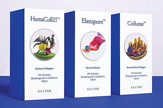
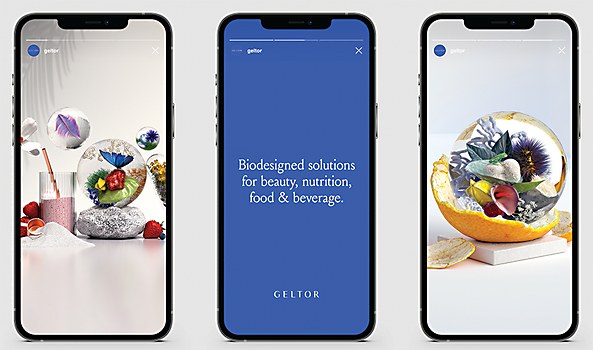
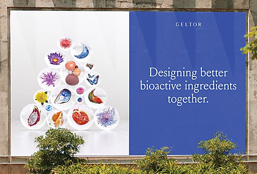
When looking for the most succinct way to describe the depth and breadth of New York–based design firm &Walsh’s creativity, perhaps there’s no better example to point to than its work for Geltor, a biotech company producing animal-free proteins for beauty products and nutrition.
If you think of the typical visual language for biotech companies—and no offense to any designers who have worked on projects like these and may be reading this—you’ll likely imagine majestic photos of mountains, circular graphics of flowers or chemical compounds and fonts that wouldn’t feel out of place in a sci-fi film. But for Geltor, &Walsh created a playful world inhabited by 3-D orbs, each a floating terrarium of flowers, insects or marine life. Not only do the visuals stand out in the biotech sector, but they quickly communicate the inspiration behind the company’s products.
This ingenious solution could only be possible through &Walsh’s extensive analysis of Geltor’s values and a synergetic approach to understand how to convey them visually—a process corroborated by Erin Kim, then creative director at Geltor and now a consultant for the biotech industry. “The team asked really good questions to understand the brand ethos and the complex biological processes behind our company’s technology,” she recalls, “and there was a genuine, mutual excitement to be working together and diving into this new, strange and exciting world of biotech finally being applied in industries beyond just pharma—especially in a vibrant, innovative industry such as beauty.”
Browse Projects
And, most important of all, the energy and collaboration that the design firm brought to the project gave Geltor the keys to own its new visual language. “The level of interest from &Walsh and how organic and easy it was to work together was particularly noteworthy because that isn’t something you can take for granted,” Kim notes. “It gave rise to the creation of almost an entire brand ‘universe’ for us to play with and grow creatively.”
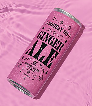
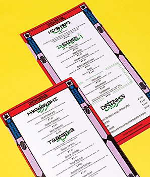
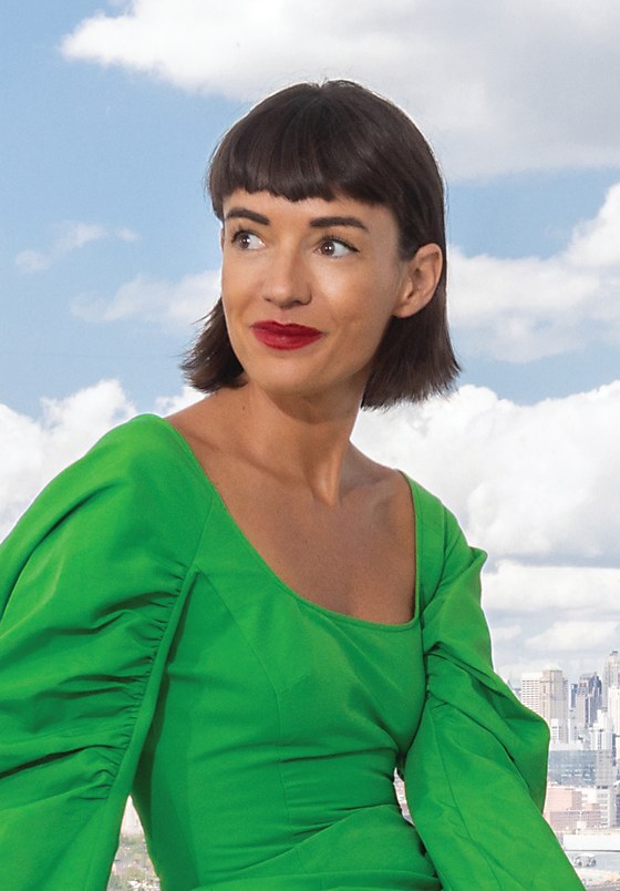
Both the profundity in Geltor’s imagery and the zeal in Kim’s responses speak to the passion for remarkable design that fuels &Walsh. Established by founder Jessica Walsh in 2019, the firm has worked on branding, art direction, ad campaigns and production for clients across all kinds of sectors, from bio-tech to technology to entertainment to fashion to food. And its output is as diverse as its clients, with solutions including packaging, environmental design, websites, motion graphics, illustration and photography. There seem to be very few limits to what Walsh and her team will explore in their quest to make influential design; as she says, “I believe brands that not only have great products but also make honest and real connections with consumers are the ones that will be poised to make the biggest impacts on our culture.”
&Walsh’s office sits on the waterfront in the Brooklyn neighborhood of Williamsburg, facing the city skyline. The space includes a photo studio where the in-person team works on plenty of client and self-initiated projects alike. “It’s magical, and I pinch myself every day that we get to work in such a beautiful space,” Walsh says. She chose the location as a hub for the design firm’s team of 35 as many of them live in the Brooklyn area. Others work remotely from global locations. “It’d be very difficult to not allow remote work in this day and age for positions and roles that can work from home as you’d really limit your talent pool,” she says. “There are obviously some positions that need to be done in person or in the office, but most of our design team can work remotely just as well!”
Walsh has the character of a true trailblazer: not only does she chart new frontiers, she also does so with the intent to bring others with her. “Being able to pass down my knowledge was something I always strived to do,” she recalls. “Even when I was in my teens, I created a website to teach other designers how to code and design their own websites.”
While she initially got her start in coding and web development, Walsh found herself attracted to the fine arts and learning a new craft in college. Her path led her to the Rhode Island School of Design (RISD), where she dove into a foundation year full of tactile media like ceramics, painting and wood working. While unfamiliar to her at first, she soon discovered that these fine art techniques could be incorporated into graphic design. “In my second year, I declared design as my major and learned to combine my art and handmade elements with my digital skills, helping me become the graphic designer I am today,” she says.
After graduating from RISD, Walsh developed a signature photo illustration style with vibrant, handcrafted sets and continued to explore atypical design techniques—such as bodypainting. This led to her getting noticed by all kinds of editorial clients, but after a few years, she noticed her style beginning to become trendy. “I didn’t want to be pigeonholed into doing this one kind of illustration style, especially as it no longer felt as fresh or unique as when I had started,” Walsh explains. “It was at this point that I decided I wanted to start a design and branding studio, so I would have varied clients and challenges.”
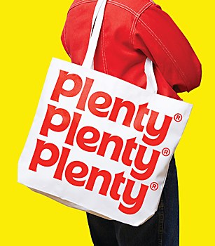
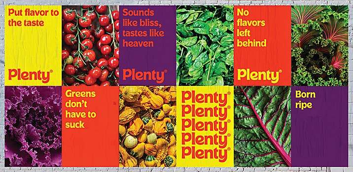
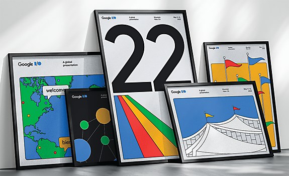
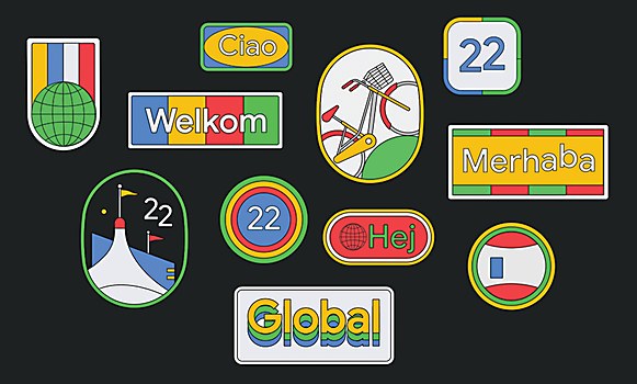
Beginning her agency’s name with an ampersand leaves space for the client to complete a statement of collaboration, one that “puts our partnerships and clients before us,” as Walsh describes. “Each project on our website is named according to our client, such as ‘Google &Walsh,’ ‘Lex &Walsh’ and ‘Plenty &Walsh,’ and so on,” she says. “Building strong relationships with our clients and really listening to them are the most crucial parts of a successful project.”
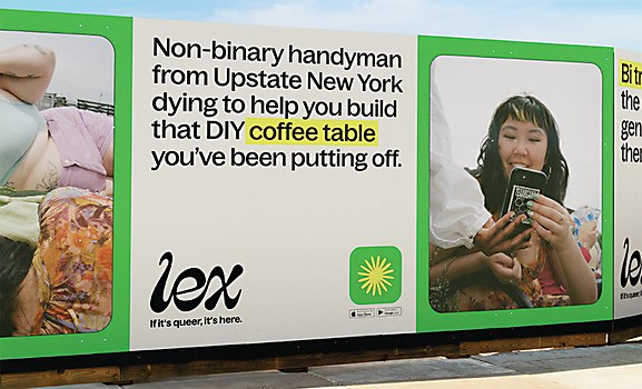
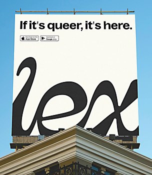
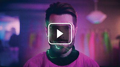
For Lex, an app for the LGBT+ community that fosters connection and community through platonic relationships, &Walsh came up with the idea that the social network functions like a queer-friendly playground. The identity eschews the expected rainbow colors and instead opts for a vernal color palette, organic textures and imperfect patterns. Illustrated abstract forms of natural shapes, such as blossoms and flames, help convey growth and celebration to people on the app.
“Lex had a slew of vintage, visual inspiration we’d collected over some months to share with &Walsh,” says Kel Rakowski, founder and chief executive officer of Lex. “There was also a lot of writing we’d done on how we wanted Lex to be experienced. We were able to have lively, fun conversations of what Lex was looking for while &Walsh crafted our swirling, wild ideas into three strong directions.”
“When we onboard new clients, we take them through ‘brand therapy,’” Walsh says before explaining the process: a multiprong effort that includes interviews with stakeholders and workshops. “A great brand is like a great person: true and honest about who they are and unafraid to show their true colors,” she says. “Too often, brands are told to suppress idiosyncrasies or opinions out of fear of how consumers will respond. When you try to please everyone and avoid anything that might offend someone, you wind up with a ‘vanilla’ brand that says nothing. No one hates those brands, but no one truly loves them either. The most successful brands stand for who they are unapologetically.”
And brand therapy proves to be a successful part of &Walsh’s practice. “After the first presentation [for Lex], I was sold on the logo and color story,” Rakowski says. “It was like watching your favorite movie or cheering at a sporting event: lots of clapping and laughing and joy.”
Another striking branding project is &Walsh’s TED Countdown campaign for the nonprofit’s 2020 event discussing how to halve carbon emissions around the world by 2030. With in-your-face copy; a color palette of black, white and neon yellow; and moving type inspired by flip clocks, the branding and campaign galvanizes even the most jaded of audience members with the urgency surrounding climate change—which was exactly what Mike Femia, director of brand and marketing at TED, had hoped for. “We needed a visual approach that would feel right on a city street, at a major event or in a business discussion,” he explains. “It needed to have a real point of view that evolved beyond ineffective ways of discussing the climate crisis. It needed to feel surprising, be sharable and feel like a logical evolution from the TED brand.” And even though Femia notes that the project required a relatively short engagement between TED and the design firm, he was surprised by the variety of work that &Walsh presented them with. “&Walsh delivered a first round of work that was shockingly good,” he recalls. “I’m not sure that I’ve ever been that impressed by a round-one presentation. Each direction felt fully realized and nearly ready to deploy. Importantly, each was conceptually unique, so there were real decisions to make about how we wanted TED Countdown to come alive.”
Beyond showing the world how revolutionary design can be, &Walsh also wants to change the design industry. Despite many pushes for more progressive representation, women and nonbinary people are still refused opportunities for leadership roles. This provided some of the impetus for Walsh to found her own design firm. “Only 0.1 percent of creative agencies are founded by women, and that percentage is even smaller for women and nonbinary folks of color,” she says. “As part of this 0.1 percent, I am determined to make &Walsh not only known for producing top-quality creative and strategy work for top clients, but also to be one of the best places to work in terms of agency culture. I’m excited to build an agency that provides equal opportunity for all to learn and grow creatively and climb the ranks toward leadership.”
One way Walsh is working on creating change is through Ladies, Wine & Design (LW&D), a nonprofit initiative that engenders a community around women and nonbinary people in the creative industry supporting each other. “This was born out of personal experiences I had with sexism in our industry—not only from men but from other women,” she explains. “Sometimes women were unsupportive of one another, possibly because our chances of reaching the top are much slimmer than for men.”
From its humble beginnings as a small chapter in New York City, LW&D has evolved into an organization with 300-plus chapters based around the world. “The chapters host monthly events that create international safe spaces for women and nonbinary folks to develop meaningful creative connections and learn from peers as well as industry leaders,” Walsh states. “My hope is that as our chapters grow, the organization continues to be a space for folks to learn new skills and network their way into leadership positions, ultimately changing archaic statistics that show white cis men dominating our industry. And it’s the folks leading these chapters that are making this happen!”
Truly this proves &Walsh’s position as one of the most influential design firms of our time. With the directions that Walsh goes and the challenges she and her team solve, other designers are inspired to follow, to meet challenges of their own and change the design industry forever. ca


