Responses by Patrick Heng, creative developer.
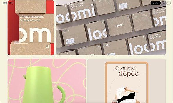
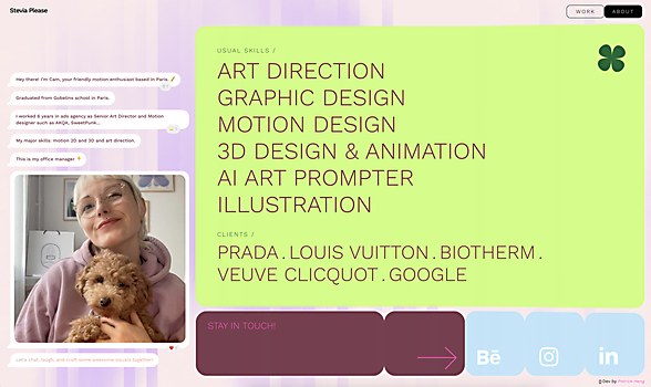
Background: Working with senior art director, illustrator and motion designer Camille Frairot, also known as Stevia Please, we created a website that showcases her amazing work. We always wanted to work on something creative together, and this project was the perfect opportunity. The goal was simple: to highlight Camille’s unique design style in a fun, engaging way. The site is filled with vibrant colors and playful interactions, all designed to reflect her artistic vibe.
This wasn’t just about building a portfolio—it was about creating something that truly represents Camille’s world. It was a lot of fun to work on, and we hope that comes through when you explore the site.
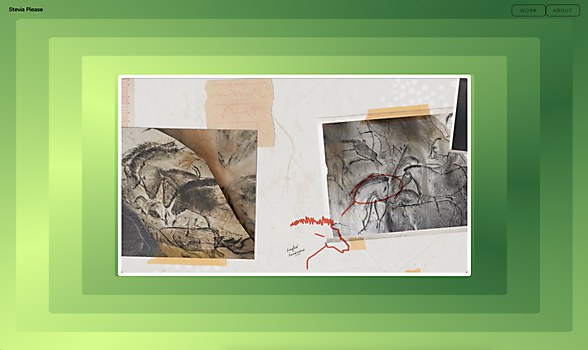
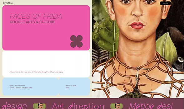
Design core: To make the site more fun and engaging, we focused on a bold color palette. We chose vibrant, saturated greens and pinks to perfectly capture Camille’s universe. These colors really help the site pop!
The design also features playful, blobby UI elements with physics-based interactions that make using the mouse feel more dynamic. We added subtle microinteractions, like fluid and frosted-glass effects that respond to mouse movements, as well as Camille’s 3-D Memoji that appears when you hover over certain elements. The chat-like bubbles on the About page add an extra touch of personality.
We’re really proud of these small details that reflect Camille’s style. One of our favorite features is the infinite slider on the homepage, which keeps things lively and ties into our goal of making everything highly interactive.
Challenges: Finding a way to fit all of our ideas without impacting the site’s performance while also ensuring everything worked seamlessly together. We had a lot of creative concepts, but balancing them with smooth functionality required us to simplify some of our initial plans. In the process, though, we discovered some great microinteractions and motion ideas that worked even better than what we originally envisioned.
Alternate paths: If we could start over, we’d probably spend more time in the early stages experimenting with different ideas before moving to development. While our process of brainstorming in Figma and then prototyping in code worked well, a bit more exploration up front might have led to even more creative solutions.
New lessons: We learned a lot about balancing creativity with performance and the importance of iteration. Testing ideas in a rough prototype before fine-tuning them allowed us to see how they worked with real interactions. This process also taught us that simplifying complex ideas can sometimes lead to even better results.
Navigation structure: The navigation follows a classic portfolio layout to keep things intuitive for users. However, we wanted to add an element of fun—especially on the homepage—to increase engagement. That’s where the infinite blobby slider comes in; it’s designed to be both interactive and visually interesting.
We focused on creating simple yet dynamic page transitions. These transitions help maintain a smooth user experience while adding a bit of flair to the overall design.
Technology: For rendering, we used WebGL with three.js to create the interactive visuals. The front end was built with Vue.js and Nuxt, which provided a solid framework for the site’s structure. For animations, we relied on GSAP to bring everything to life. We also managed the app’s state with Pinia and used Prismic as our CMS. On the back end, we used Node.js to handle server-side processes.


