Responses by Vito Balen, copywriter, Holographik; and Ilja van Eck, developer.
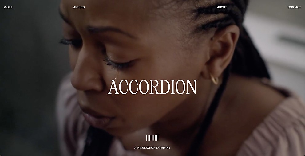
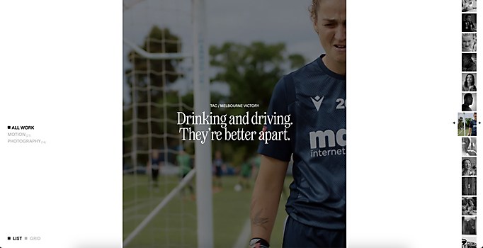
Background: The main purpose of this website is to promote production company Accordion and to highlight the artists who have collaborated with it in the past. The primary target audience are people interested in working with Accordion; however, the website was made to be visually appealing so that anyone can enjoy it and learn more about Accordion’s projects.
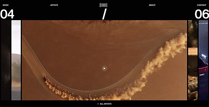
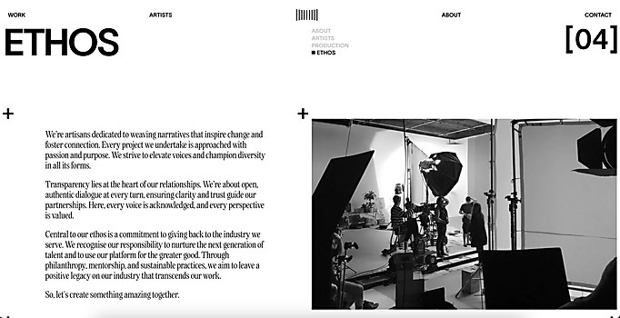
Design core: The website’s main style revolves around a clean layout that highlights Accordion’s work rather than distracting from it. The design elements are mostly simple graphic shapes inspired by a physical accordion; they can be seen throughout the website in the logo, on page transitions and in footage showcases, for example.
Favorite details: While we are satisfied and proud of the entire website, one element we could highlight is the page transitions. It features the graphic element of an accordion, and through intuitive motion graphics, it notifies viewers of a change of pages.
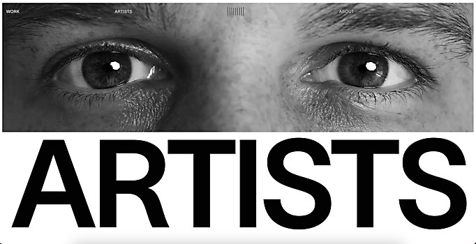
Challenges: Striking the right balance of graphical elements and the production company’s project visuals. We went through multiple variations that relied more heavily on pure graphical elements, but in the end, we settled on a more minimalistic approach that focused more on Accordion’s work. One aspect of the website that really emphasized this challenge is the artist pages. It was important to highlight the work of the various artists that have worked with Accordion, but we also had to present it in an interesting way. Ultimately, we settled on a masonry-style layout.
New lessons: We are constantly refining our creative process with every project we complete. One aspect of the workflow that stands out is the time difference we had with the clients since they are located in Australia. However, the Accordion team was super responsive and made the collaboration very enjoyable.
Navigation structure: The navigation follows a relatively simple structure, featuring all the pages in the order of their importance for the website and its goals. Something worth pointing out is the central location of the homepage button: since the homepage button is presented as the logo of the website, which was made in tandem, it is closely tied with the overall site design.
Technology: The site was built in the Webflow CMS. All animations were done with either CSS or GSAP, of which we used the CustomEase, Flip and ScrollTrigger plugins. For smooth scrolling, we used Lenis, and for page transitions, we used barba.js.
Special technical features: The client has complete control over building and designing unique photo galleries for case studies powered by Webflow. The lightbox functionality for this same gallery is completely custom built with Vanilla JS and the GSAP Flip plugin. And, of course, the page transitions that use the Accordion logo as a mask and a transition container.


