Responses by Tobias Frere-Jones, type designer, Frere-Jones Type.
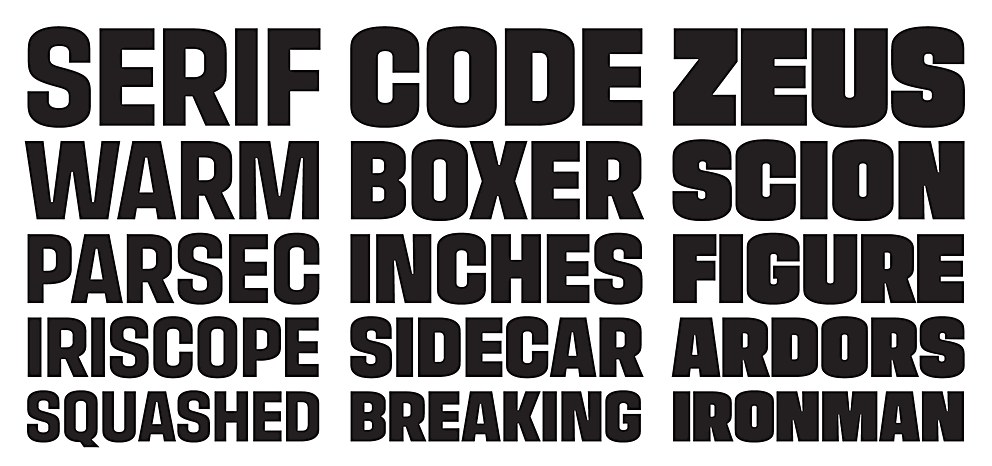
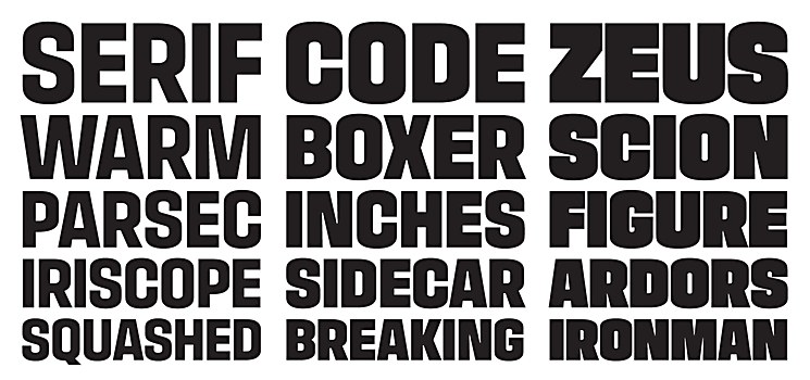
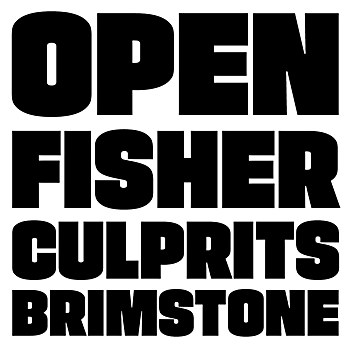
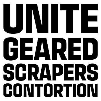
Background: Supermassive is a self-initiated type family. To a large extent, I started the family as a stylistic exploration and an experiment in visual stability. Dark, dense proportions often feel static and immovable, and I wanted to see if there was an alternative. The target audience is our retail customers and anyone needing a potent headline in print or online.
Design thinking: The Supermassive family is built around a feeling of teetering balance, and this effect relies on a substantial stroke weight. It doesn’t work as a Regular or even a Medium weight; the effect unravels when the stroke weights are thinner than the white space inside the letters. Even the lightest weight for this family must be quite heavy.
Challenges: As ever, getting all of the shapes to cooperate successfully and consistently.
New lessons: Something so heavy and dense can still be delicate in its own way, responding straight away to changes of weight and curvature.
Visual influences: American and European handlettering styles from the 1960s.
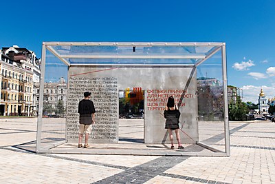
Specific project demands: This was made specifically for large sizes, which meant that we had fewer constraints on how we drew the letters. We didn’t need to worry about how this would look at six point!


