Responses by Laura Stein, chief creative officer, Bruce Mau Design.
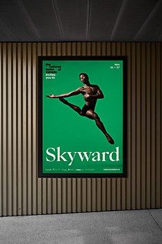
Background: The National Ballet of Canada (NBOC), under the leadership of its new artistic director Hope Muir, is evolving to welcome more diverse talent, audiences and perspectives. The NBOC wanted to create a new visual expression that would signal a more creative, inclusive and bolder organization. We were tasked to create something that would invite more people in.
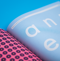
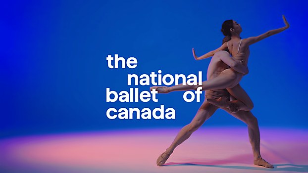
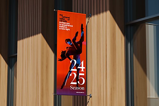
Design thinking: In order to attract new audiences, it was important to address “the uncertainty gap”—where people are less likely to engage in something if they don’t understand it. We created a new wordmark that could also act as an invitational narrative and developed a visual system that could position the NBOC differently. The identity actively pushes against gender tropes like the use of pink as well as perceptions of exclusivity and elitism.
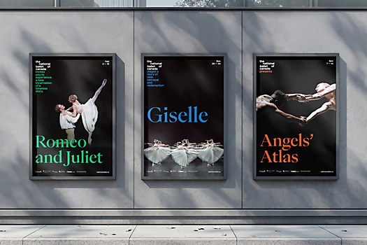
Challenges: Some of the most challenging aspects involved addressing tensions inherent in ballet. We needed to make sure that the identity could frame both the classical works that they produced, such as Giselle and Swan Lake, but could also signal new ideas and creative works that Muir was bringing to the company. Similarly, we were creating a brand for both old and new audiences, ensuring we honor the tradition of classical ballet while also paving the way for the future.
Favorite details: Creating a wordmark that is also a storyteller was a unique solution. It piques curiosity and draws on themes that everyone can relate to. The narratives can be charming, such as Alice’s Adventures in Wonderland’s “falls further down the rabbit hole,” or evocative, such as Swan Lake’s central question of “What would you do for love?” The narrative aims to tease some of the story, so that people who know nothing about a ballet like Onegin intuitively understand that it deals with exciting and dramatic themes of love and betrayal. This unique approach lets us give audiences a different way into the art form and the breadth of stories ballet has to offer.
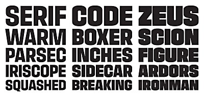
New lessons: To aid in consistency and ease of use of the identity, we created a tool for the creative team at the NBOC. We worked with Displaay Type Foundry to develop a glyph that would let designers type in the logo with a key stroke and simply continue typing to write the narratives. The tool enables anyone to easily use the logo and write a narrative without fussing with alignment, scale and leading, ensuring that it looks good every time.
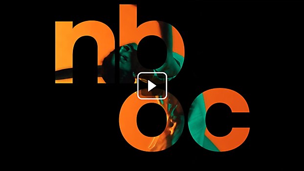
Specific project demands: Motion was a self-imposed constraint for this project. While we believe every identity needs to have motion behaviors as part of the toolkit, in this case, motion was even more important. Movement is integral to what the NBOC does. The identity needed to reflect the dynamism of dance, and we decided early on to imbue motion into the identity at every turn—from implied to explicit.


