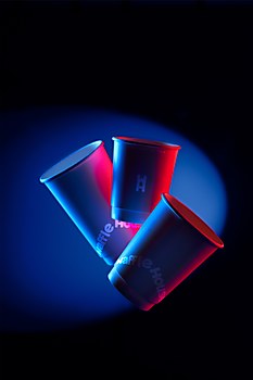
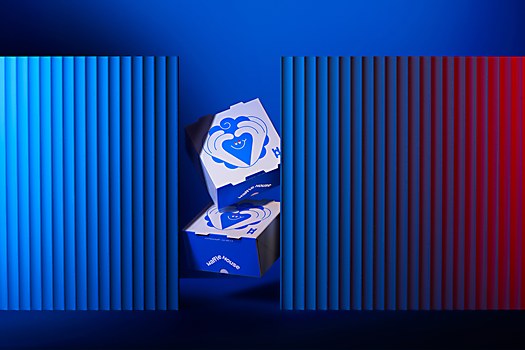
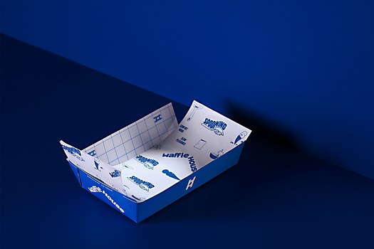
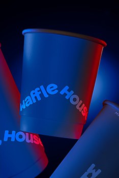
Responses by Luminous Design.
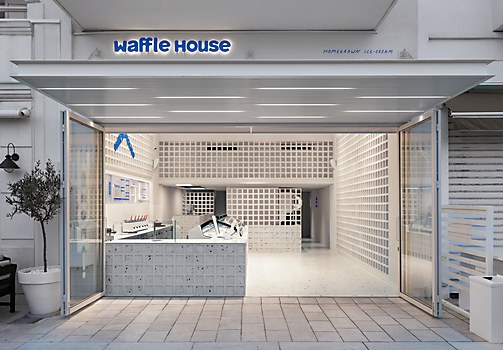
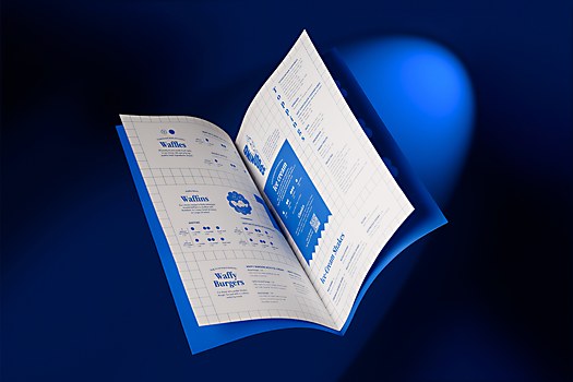
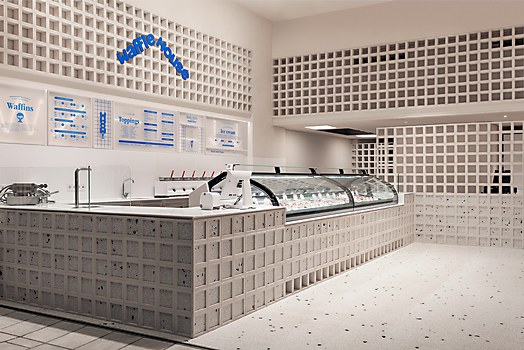
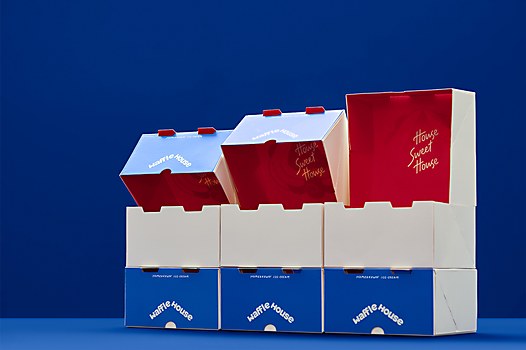
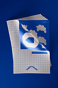
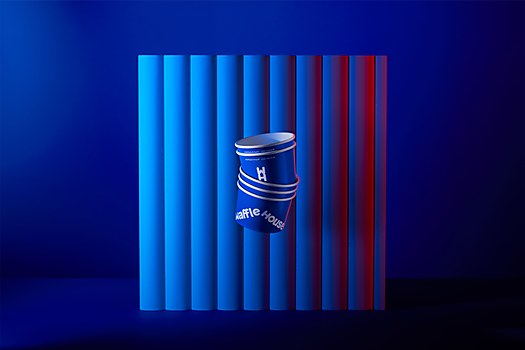
Background: Waffle House, the brand that puts the concept of freshness into practice with the most famous freshly baked waffles and daily-made ice cream in Greece, trusted us to develop its new identity. Over the years, Waffle House stores have evolved into meeting points for ice cream lovers, offering an authentic, tasty experience akin to homemade ice cream.
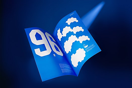
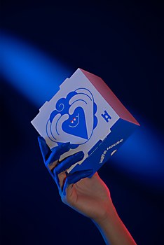
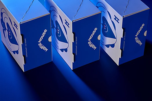
Design thinking: For Waffle House’s lovers, ice cream is much more than a frozen treat. It has its own ritual, and its enjoyment brings fulfillment, joy and excitement. Homemade ice cream calls for a unique identity, expressing values found in the brand’s personality, such as freshness and bravery.
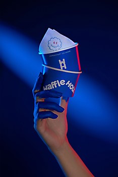
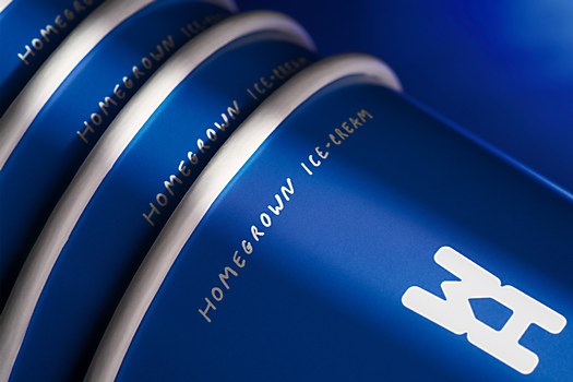
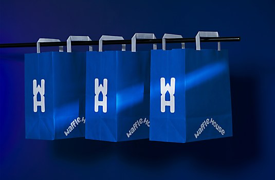
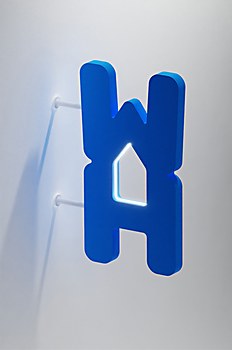
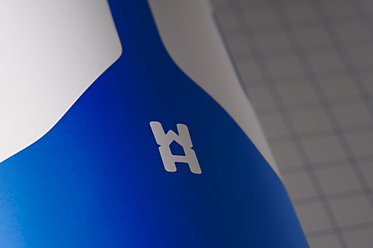
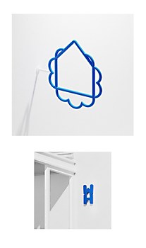
Challenges: Creating an almost monochromatic visual universe to express values for a brand whose main products are related to color. And also creating a new logotype for a brand name with the word house in it without clearly drawing a house.
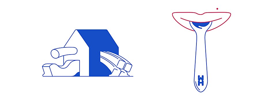
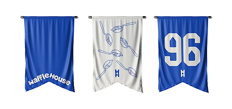
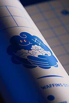
Favorite details: One differentiating element of the Waffle House is that the flavors of its ice creams do not come from powders but require actual pastry—for example, a cheesecake. Another thing that differentiates the brand is that before ordering ice cream, you can have a tasting. The visual representation of these processes is what holds the most fun, also making us glad about developing such an unconventional narrative.
New lessons: A new thing we learned during this project was a unique recipe for making the perfect cheesecake!
Specific project demands: Changing the logotype of a well-known brand has a certain level of difficulty. Waffle House is among the most recognizable brands for waffle and ice cream in Greece. Highlighting the brand’s DNA while keeping a reference to the old logo in a smart, effective way was one of the harder project demands.
Alternate paths: If we restarted the project from scratch, we would definitely eat less ice cream.


