Responses by Robert Petrie, creative, Preymaker; and Jonathan Santana, group creative director, Johannes Leonardo.
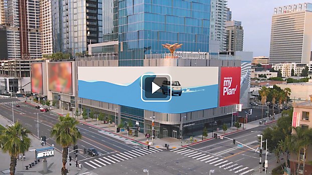
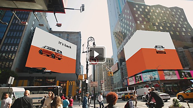
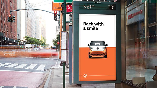
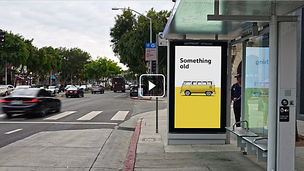
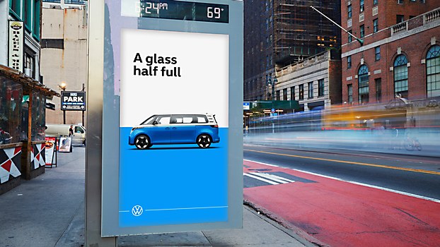
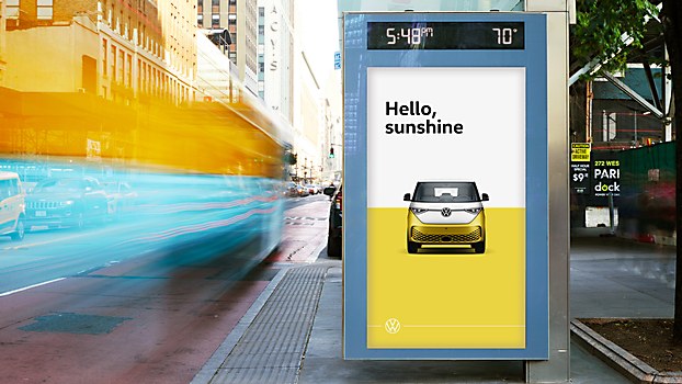
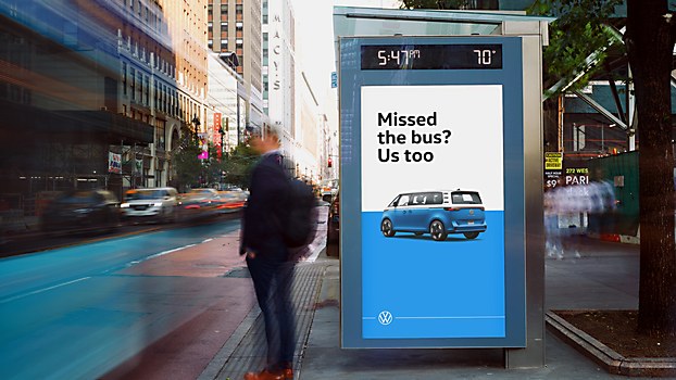
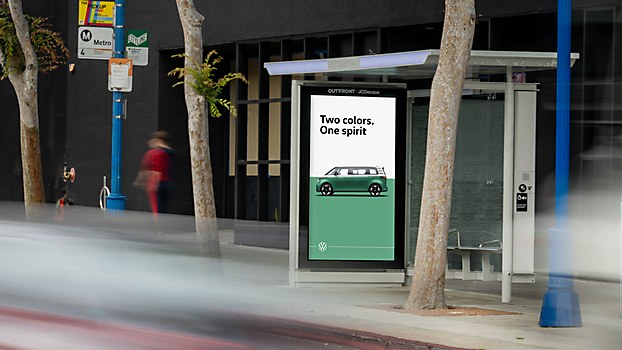
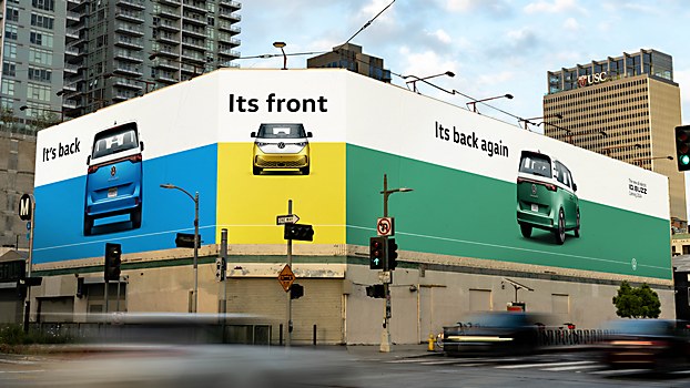
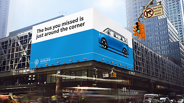
Background: “This campaign set out to reintroduce America to an icon,” says Jonathan Santana. “Inspired by the original Volkswagen Bus, the ID. Buzz reboot has been modernized as an electric vehicle. The Reveal event was held in Huntington Beach, California, on June 2nd. To support this momentous event in Volkswagen history, we debuted a paid media campaign to extend beyond the event itself, from OOH billboards that ran along major bus routes in Los Angeles and New York to social and digital. This wasn’t just another car reveal but the rebirth of one of the most iconic cars in American history.”
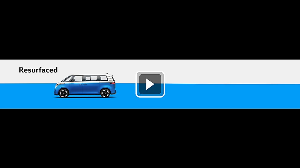
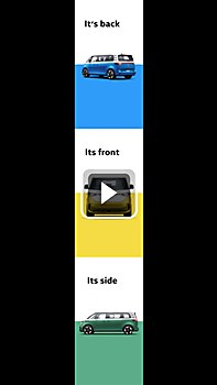
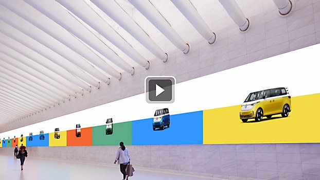
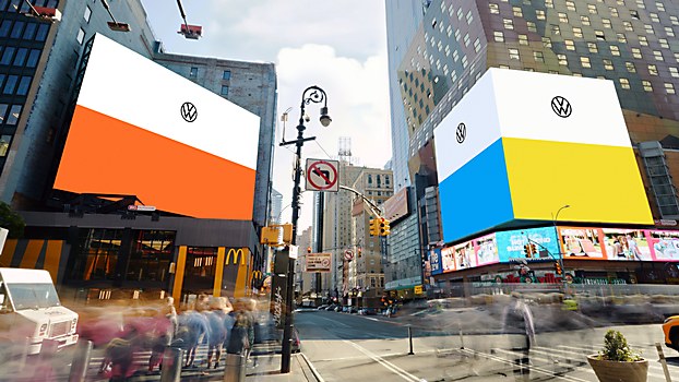
Design thinking: “The idea was simple,” says Santana. “When looking at the original Bus compared to the new one, we realized what made it unique in the ’60s was exactly what makes it unique today: its iconic two-tone paint job. So, that’s exactly what we leaned into. That, and reprising the simple, witty tone of voice and copywriting style synonymous with the brand.”
Challenges: “Keeping it restrained and simple was surprisingly the most challenging part of the project,” Santana says. “We had to constantly remind ourselves that the beauty of this campaign is in just how simple it is.”
Favorite details: “Being able to honor Volkswagen’s legendary advertising history while also adding a modern, unique twist to it,” says Santana.
Visual influences: “The classic Bernbach ads of the past were all the inspiration we required,” says Santana. “Volkswagen ads have long been a hallmark of great advertising and those classic visuals of a Volkswagen Beetle on a clean white page are undeniable.”
“During the project, our focus centered on two key elements: the dynamic movement of the car and the visual portrayal through photography,” says Robert Petrie. “We sought a style that celebrated the campaign’s simplicity and beauty with crisp, clean photography. The design team embraced the challenge of integrating multiple panels into a cohesive animation. The convergence of screens enabled us to push beyond traditional limits and create an engaging experience that commanded attention. Our objective was clear: captivating passersby with a style that seamlessly blended sophistication and playfulness.”
Time constraints: “Our production timeline was tight,” says Santana. “We had two-and-a-half months to create and deliver more than 250 deliverables. Our production partners at Preymaker and our innovative approach to this timeline—and the project as a whole—allowed us to create as much as we did in such little time. If we hadn’t approached this in the method that we had, less than half of the assets would have been achievable in this time.”


