Responses by Bud Rodecker, founder and design director, Span.
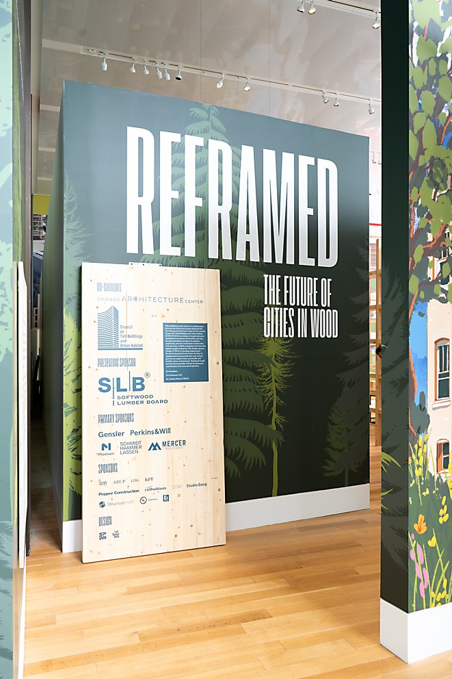
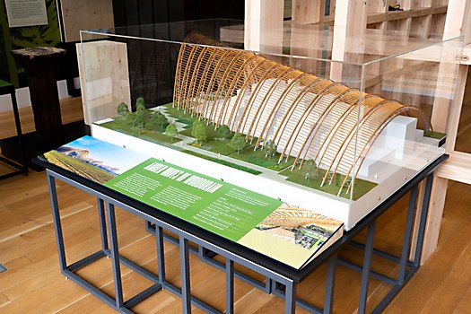
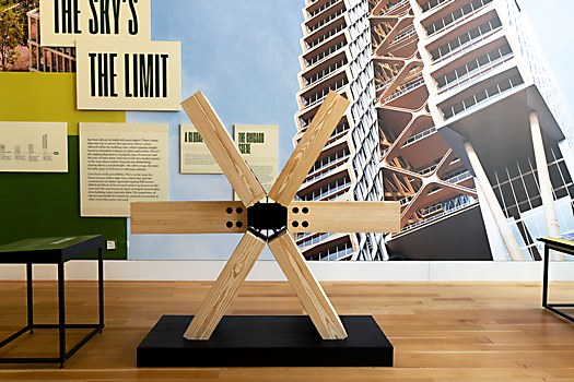
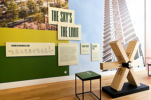
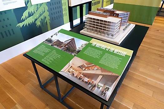
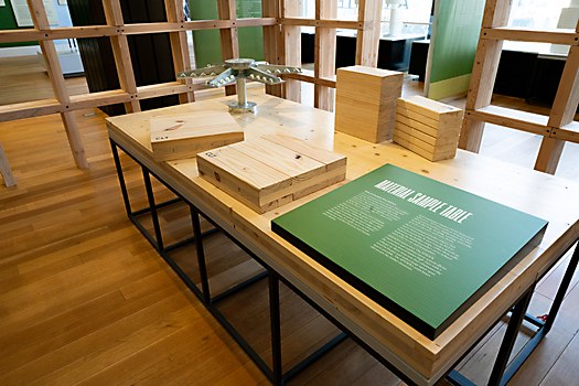
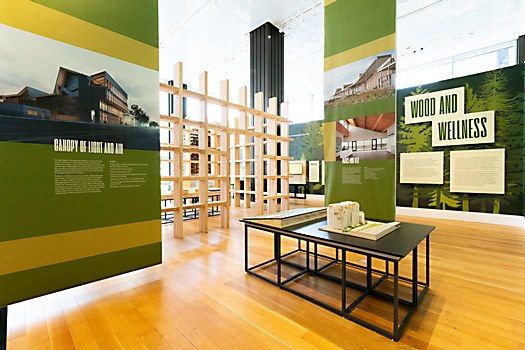
Background: The Chicago Architecture Center speaks to two audiences: the general public and architectural professionals. The ReFramed exhibition demonstrates the potential of mass timber as an environmentally friendly, visually appealing construction material. Showcasing architectural models of mass timber projects worldwide, the exhibition underscores wood’s adaptability in various contexts, from public spaces and office buildings to adaptive reuse and new construction.
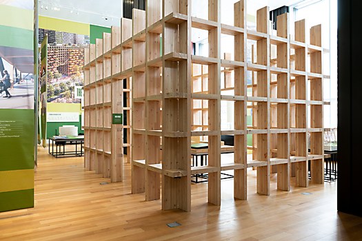
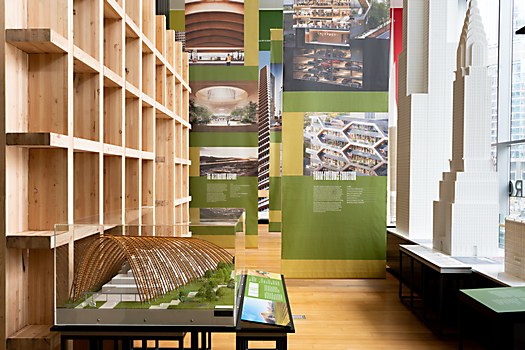
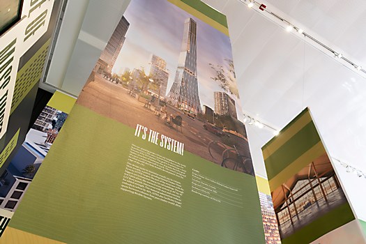
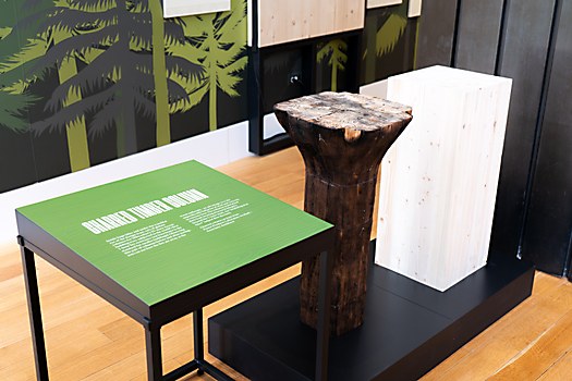
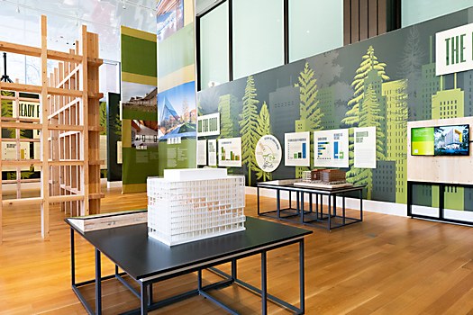
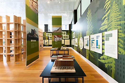
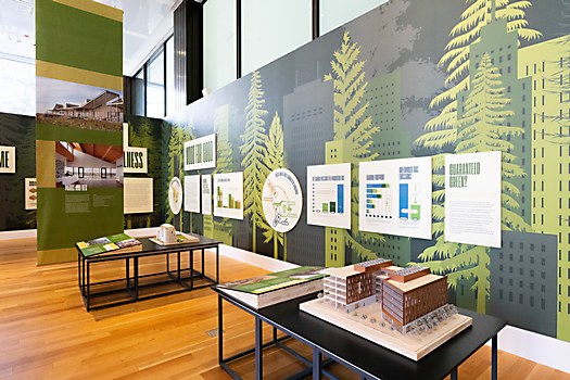
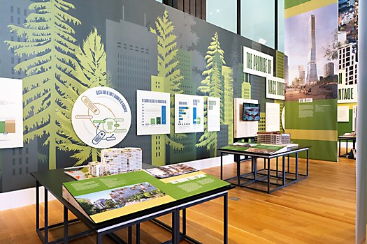
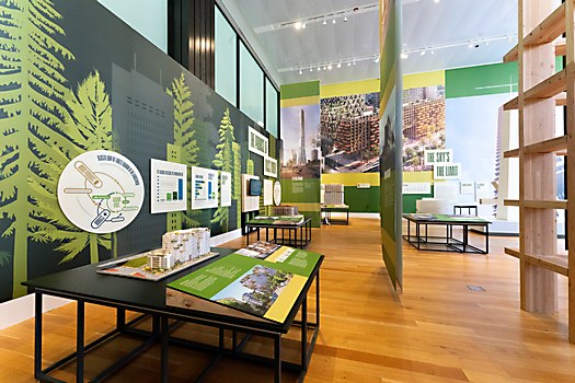
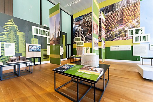
Design thinking: The exhibition design uses tall banners to mimic the density and height of a forest or urban environment. These banners accentuate the height of the space while breaking it down into smaller rooms. Our graphics on these banners build from a grid inspired by the structure of cross-laminated timber, which serves as a consistent framework throughout. The green complements the natural wood tones and reflects a lush forest.
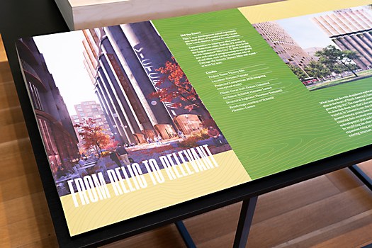
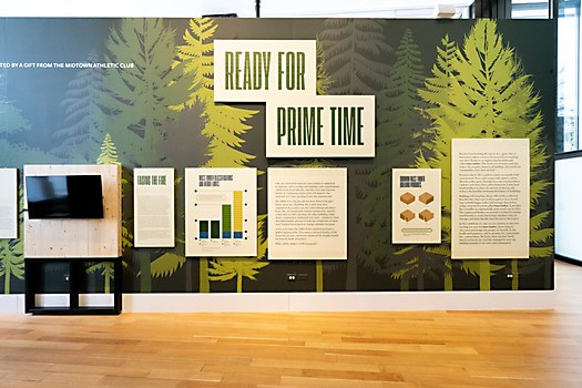
Challenges: ReFramed presents an astounding amount of information in one space. We worked very hard to design a graphic system that would not feel overwhelming while presenting all of the information. Additionally, we designed an infographic system that presented data from a variety of sources in a cohesive visual presentation.
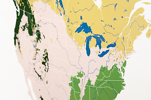
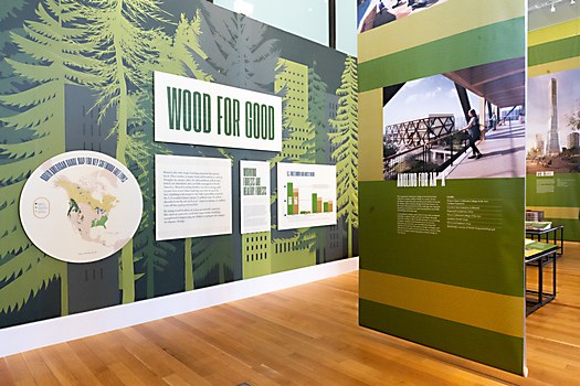
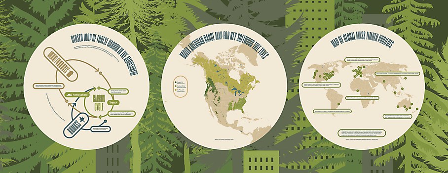
Favorite details: I’m particularly proud of the Carbon Cycle graphic and the North America Map. We designed an interesting, dynamic and informative graphic that communicates a complex amount of information in one place. And I just love the North American map; we used US Forest Service data to generate a clear picture of the scale of the tree coverage in North America. I think it turned out beautifully.
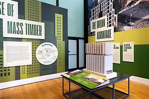
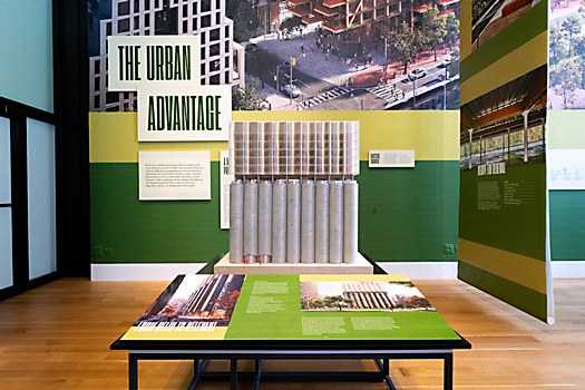
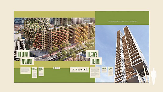
New lessons: This exhibition pushed our limits in a couple ways. First, I learned to work with geographic information system software to generate the maps in this exhibition and the neighboring exhibition ReCovered. That was a revelation of the power and potential in mapping software for creating infographics. The second challenge was in working at this scale. We’ve done a good amount of large scale graphics, but the “Urban Advantage” wall was a new level.
Time constraints: This was actually a very long project. From start to finish, we spent six months working on ReFramed. Our team was involved early on with the Chicago Architecture Center and UrbanLab Architects in defining what the visual approach for the exhibition would be. Our first task was to define a visual toolkit, starting off with little to no understanding of what the infographic content would eventually be. Once that was established, we then would implement and adjust it as new information and content were received. Eventually, we had a complete plan and implemented the design piece by piece as content was finalized. This process went right up to the end as we accounted for every graphic panel in the show and filled in any gaps before opening night.


