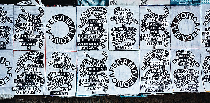
I think it still exists, that freedom and hedonism,” says Johannes Conrad, cofounder and creative director of design firm Studio Yukiko’s Berlin birthplace and home. “But we’ve developed alongside the city; our priorities have shifted from grunginess to things like having a nice meeting room and a calm space.” Particularly known for its design direction of experimental print magazines, impactful identities for cultural institutions and playful campaigns for the likes of Nike, the agency may have evolved, diversified and gone international since its inception more than a decade ago, but it nevertheless continues to manifest that elusive Berlin spirit. “It used to be a lot more present; brands would come to us specifically to tap into the Berlin mindset,” says Conrad. “We do fewer of those projects than we used to, but when we speak, we speak loudly. I think this almost overly confident approach is somehow a bit Berlin—like a middle finger to the ideas of modernism, perhaps?” While this loudness doesn’t necessarily tally to a particular style or calling card, it’s an attitude that percolates Studio Yukiko’s diverse practice.

and Johannes Conrad.
© Christian Werner
Conrad met his Studio Yukiko cofounder and fellow creative director Michelle Phillips when both were students at the University of Brighton in the United Kingdom. Conrad studied fine art with music, and Phillips was in the graphic design program. In 2012, the pair made the move to Berlin, “really to free ourselves from our day jobs at communication agencies,” as Conrad explains. On arriving in the German capital, they quickly found a studio in the iconic—and since demolished—Stadtbad Wedding: a complex of ateliers and workspaces inside a disused swimming pool in the city’s northwest. “We had some great parties there; it was a wild time,” recalls Conrad. “We collaborated with friends who were set designers, photographers and filmmakers, and we were just able to create, away from the traditional client service mentality.”
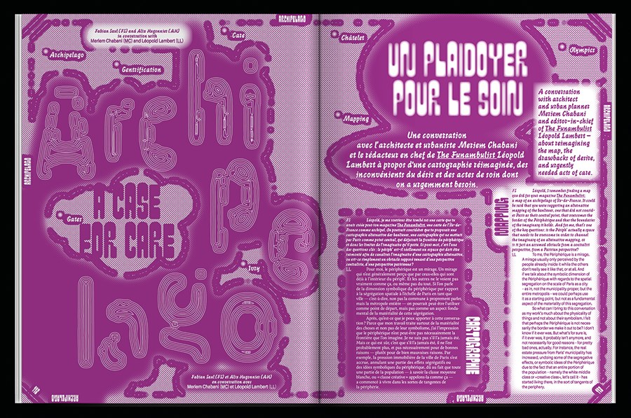
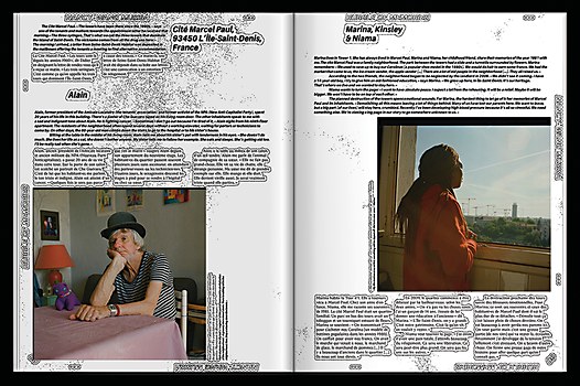
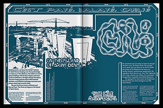
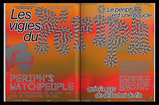
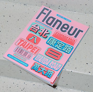
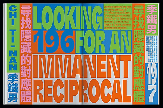
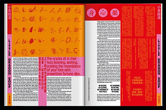
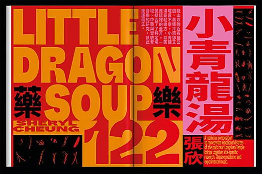
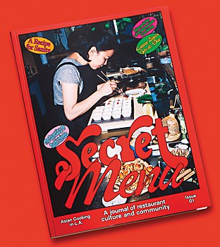
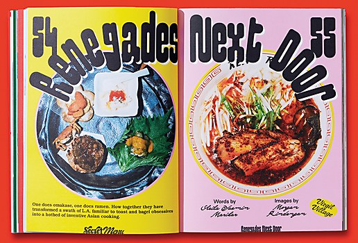
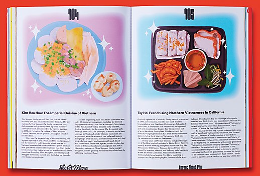
At one such party, Conrad and Phillips met magazine editors Grashina Gabelmann and Fabian Saul, who were on the lookout for designers for a new project: a nomadic, biannual publication that would uncover the stories, characters and history of a single street as a microcosm of broader social trends. After launching in 2013 with an issue focused on Berlin’s Kantstraße, the award-winning Flaneur magazine has gone on to survey streets in Rome, Montréal, São Paulo, Taipei and, most recently, Paris, collaborating with local contributors on each issue. “Flaneur is more like a group show of artists and writers in the format of a magazine,” says Conrad. “It hasn’t got a traditional content structure of reappearing formats and so forth. I think that really hit a nerve in the editorial magazine circuit and coincided with a kind of second coming for print magazines,” he says of the project’s critical reception and the recognition it brought Studio Yukiko.
Browse Projects
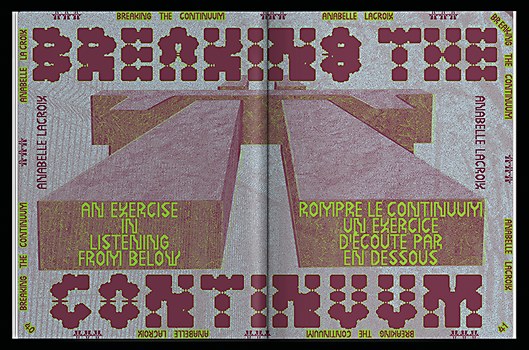
Catalyzed in part by the success of Flaneur, Studio Yukiko has grown up since its Stadtbad days: “We’re now ten people, predominantly women, and we come from all corners of the world—I think I’m the only German,” says Conrad. As they’re highly collaborative in approach, print publications remain an arena for experimentation for the studio. Take the magazine SOFA, for example, which launched in 2016 to decidedly mixed feedback: “People hated it,” says Conrad. “I remember being in a bar, and some designer came up to us and said it was the worst magazine ever and looked horrible! But that’s the thing: it wasn’t about looking nice.” Aimed at a younger Gen Z contingent, the magazine’s lowbrow, cyberspace aesthetic—printed on inexpensive newsprint—was an ahead-of-its-time playground for Studio Yukiko’s palpable interest in youth, meme and internet culture. “It started as a fun project for us to flex our design muscles and creativity,” explains Conrad. “Of course, we can do clean; we can do modernism. But that’s not what really interests us. SOFA was about questioning the status quo of design and trying things out. But remember that was seven years ago; I think we’re much more used to [this design aesthetic] now.”
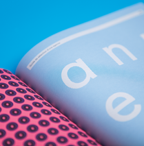
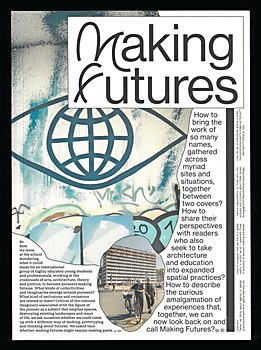
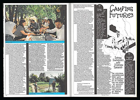
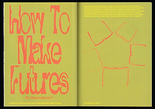
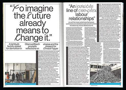
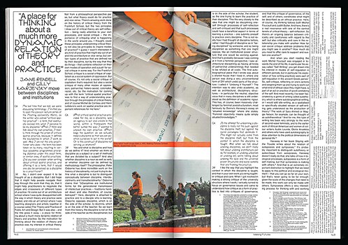
In Studio Yukiko’s printed publications, design mirrors content in bold, unexpected ways to elevate reader experience. Case in point: Making Futures, a 2022 book born from an action-based research project between architecture collective raumlabor and the Berlin University of the Arts, published by Spector Books and shortlisted for Germany’s Schönsten Deutschen Bücher (“Most beautiful German books”) award. Across essays and photography, contributors consider the role of architecture in the 21st century through the lens of diverse disciplines, collectively envisaging a more equitable, sustainable future. The book itself responds to this vision and approach by way of a printing and design process that uses minimal ink and maximizes space. For example, the front cover features an essay; inside, margins are used for horizontal annotations and footnotes. Reinforcing the nonhierarchical ideology of the collective behind the book, multiple texts run together on the same page, and they are presented in exclusively open-source fonts. “It was a very challenging [and] fun project to work on,” says Conrad. “Reading the book becomes a very visceral experience.”
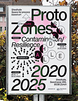
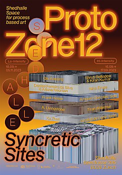
This conceptual approach particularly lends itself well to cultural institutions. “Working in culture is interesting for us because you don’t have a specific product that you’re marketing or must create a campaign for,” explains Conrad. “Commercial or cultural, we always try to think of the bigger narrative, and how we can translate a curator’s or director’s vision.” Illustrative of this process is Shedhalle, a Zürich-based exhibition space and laboratory for process-based art, or art in which the process of its creation is a visible and fundamental part of the work itself. Fittingly for a venue focused on production and experimentation, Studio Yukiko took inspiration from microbiology: in its 2022 overhaul of Shedhalle’s identity, the institution’s logo appears as a molecular chain, for example.
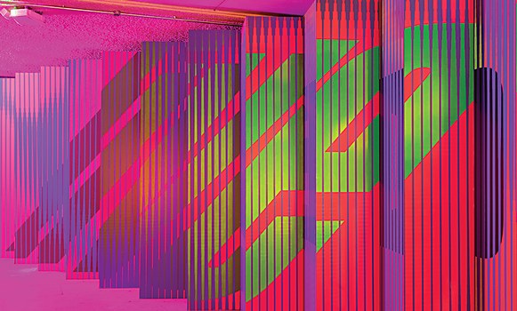
Back in Berlin, the design firm’s 2023 rebrand of Haus der Kulture der Welt (HKW) casts the multidisciplinary cultural venue as a living, breathing entity as opposed to a static institution; a pluriversity with an openness of attitude and fluid approach to hierarchical structures. At the same time, the new logo nods to what is fixed: HKW’s landmark architecture and location on the edge of Tiergarten, Berlin’s sprawling inner-city park. Bulbous and organic, the animated design recalls the venue’s iconic “winged” roof as well as the natural biodiversity of its neighboring park. Its very literal flexibility, meanwhile, speaks to the institution’s multi-genre interdisciplinarity. “This was rooted in the idea of the pluriverse: that many different voices and visions can happen at the same time,” explains Conrad. “A changing logo made sense to us. But within that flexibility, we had to build rules. It’s fun to explore those boundaries between rules and flexibility, to allow enough room to play without losing recognizability. It’s similar to how we approach Flaneur. Pushing ourselves to not get bored by our own systems keeps things exciting.”
On the balance that Studio Yukiko strikes between cultural and commercial briefs, Conrad notes: “I think what’s really interesting is what we can learn from each of these two worlds and what each can bring to the other. For example, the cultural side can be very experimental and open in terms of visual languages. That’s something we try to bring to commercial projects.”
Illustrative of this dynamic is a longstanding partnership with Nike Berlin, which began with a commission from ad agency Wieden+Kennedy for the 2018 local campaign Lauf Nicht. Renn. (“Don’t Run. Race.”) Collaborations with a slew of Berlin creatives resulted in a series of ten posters incorporating graphics and fonts that, although not typically associated with the brand, felt very Berlin.
The partnership has continued with milestone projects such as an apparel range for Nike’s sponsorship of the pandemic-canceled Berlin Marathon in 2020, complete with safety pins shaped like Nike’s iconic swoosh as a nod to the city’s punk past. Last year’s output for the sports brand included a toolkit of science-inspired graphics and typographic titles for Talking Trash, a campaign featuring marine biologist Dr. Ayana Elizabeth Johnson and filmed in conversation with singer-songwriter Billie Eilish.
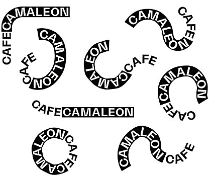
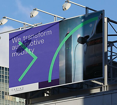
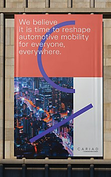
Experimental typefaces were similarly central to a wide-ranging commission from CARIAD, Volkswagen Group’s automotive software company. Studio Yukiko’s remit spanned brand and corporate identity design, brand strategy, and employer brand strategy. Uniting these various components was a system of 26 glyphs; comprising dynamic and directional lines, arrows, and curves, the code alludes to the act of computer programming itself, all the while injecting energy and movement into everything from billboards to conference architecture.
“We think about things like the current needs of the studio, as well as things like mental health and everyone’s energy levels, when assessing whether we can take on a job or not,” explains Conrad about how the team selects projects. “Ultimately, it comes down to whether the brief is interesting to us.” Happily for both the team’s current wellbeing and future engagement levels, there’s much to look forward to on Studio Yukiko’s horizon. This includes publications with Creamcake, Berlin’s interdisciplinary art and music platform focused on club nights and events; and developing the brand identity for Polyton, a new German music award. Particularly intriguing is a video game for German telecommunications company Deutsche Telekom aimed at the yet unchartered Gen Alpha demographic.
“There are some really fun and exciting things,” says Conrad of the studio’s upcoming schedule. “We want to continue merging lowbrow with highbrow.” Loud, unashamedly bold and always playful, Studio Yukiko’s visceral blend of internet culture, conceptual thinking and left-field solutions is set to keep on pushing boundaries both in Berlin and beyond. ca


