How does one describe China’s consumer market? Let me take a jab at it: The Chinese customer is young, impatient and insatiable. They’re chic and adventurous. They clamor toward the Next New Thing. Since arriving in Shanghai in 2019, I’ve witnessed the comings and goings of intense marketing strategies. This includes—and does not stop at—the frenzied hoarding of “blind box” toy collectables; a local wet market using Prada-patterned grocery bags in a surprising collaboration with said luxury brand; and a slew of coffee bars or craft beer stalls, opening one after the other on the same street and pummeling you with so many options you couldn’t bear to order another cup of coffee ever again. So yes, it doesn’t take much to capture a Chinese consumer’s attention; what’s hard is being able to hold it steady. It’s no wonder other brands rely on a fanfare of pop-up booths, gimmicky giveaways and an endless parade of marketing tricks.

project manager; Songhua Yin, founder
and art director; and Fapan Guo, design director.
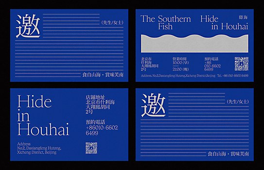
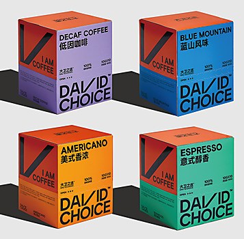
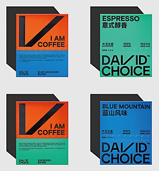
Chinese design studio Reesaw isn’t one to succumb to trends or sensationalist hype. Instead, it makes up its own rules. It is, in its own words, an “independent design institution in its rebellious period”—a description tinged with edginess, danger and defiance. Featuring large typefaces, block colors, punchy graphics and minimalist undertones, the young studio’s body of work stems from opposing ideas and concepts: tradition and modernity, order and chaos, sentiment and rebellion. Its very name is a play on cultural convergence: “ree” for reshaping and overturning, and “saw” for the aesthetics of the past. Yet behind the boldness is deference to Chinese culture and upbringing, which aligns with its goal to connect and resonate with the younger Chinese consumer.
Browse Projects
Reesaw was formed in 2015, a passion project launched by its two founders, Xin Zhou and Songhua Yin, who bonded over their similar design ethos and a growing disillusionment toward the conformist restraints of large commercial projects. Two years later, in 2017, their roles became more defined with Zhou taking on project management and Yin handling the art direction. Their first official employee and third partner Fapan Guo joined in 2019 as design director. Since then, Reesaw has welcomed a handful of like-minded designers who work across its offices in Hangzhou, Ningbo and Shanghai.
As it was during the early days when Zhou and Yin operated as a duo, Reesaw’s team members get to experience multiple roles as copywriters, designers and business managers—a multitasking feat that encourages them to proactively engage with clients, understand the inner workings of the industry and delve into the business side of their field.
Reesaw’s jumping point is a design philosophy of “forging new concepts by transforming universally recognizable elements into something unfamiliar.” For the design studio, the first step toward construction is deconstruction. Yin stresses the need to “deconstruct each project in an attempt to understand it through a fresh perspective.”
Perusing its body of work, it’s evident that food branding makes up a sizeable chunk of Reesaw’s portfolio. Food, after all, is a theme that dominates Chinese culture, making it extremely relatable to both audience and client—and an exciting challenge for the studio. “Many of our team members are real foodies, which helps us perceive and experience each brand and product more deeply,” shares Yin.
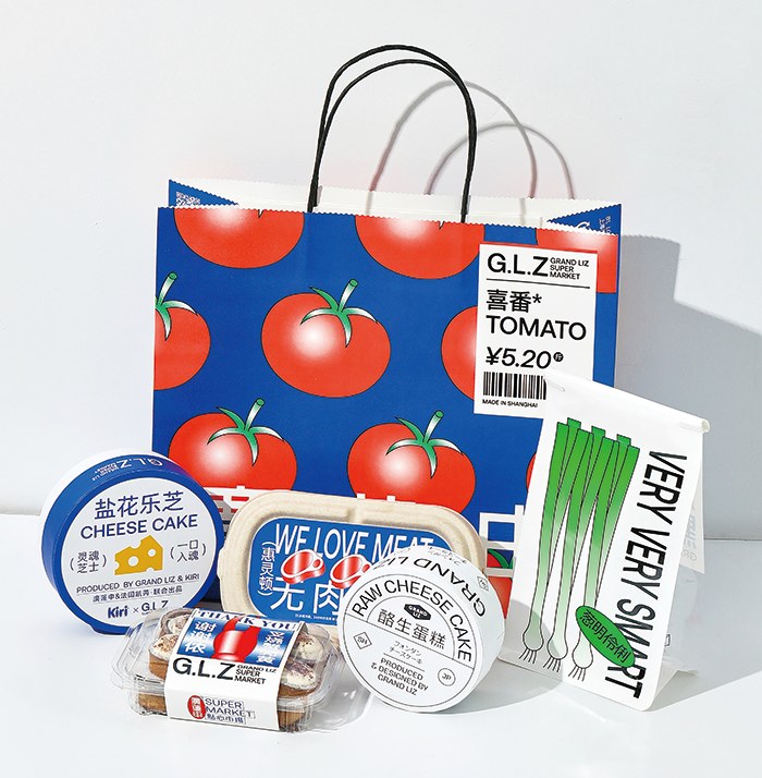
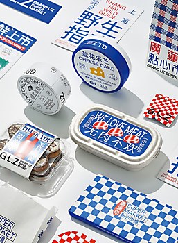
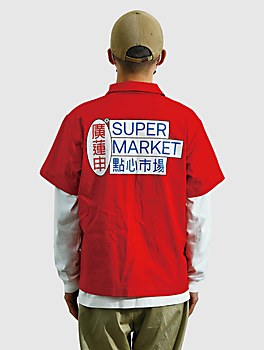
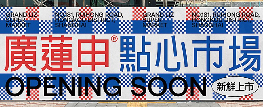
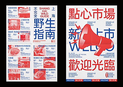
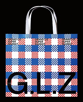
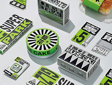
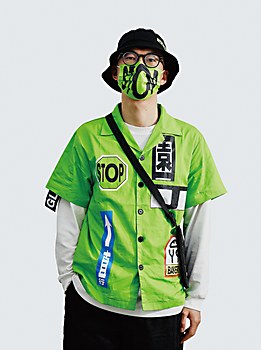
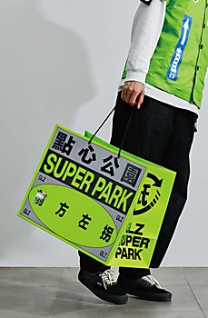
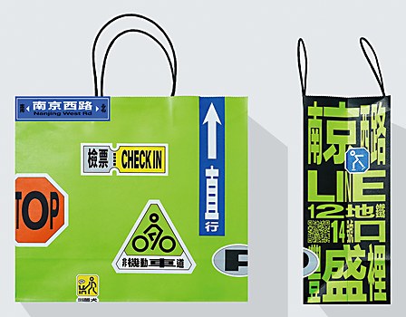
Case in point: a brand revitalization for G.L.Z, a local Shanghai-based supermarket that had lost its touch with the younger generation. The team drew inspiration from the city’s rich local marketplace culture for this project. “Our strategy was to use elements of everyday Shanghai as our starting block, making new attempts at old scenes to connect the audience to the brand’s regional products and Shanghai culture in general,” explains Yin. Cultural symbols, patterns and colors were manipulated into contemporary visuals that graced the brand’s new packaging, merchandise and food products. The campaign also included a bonus treat for hardcore foodies: the nifty Shanghai Wild Guide, a foldable leaflet listing the locations and culinary specialties of the neighborhood’s best longstanding food stalls and restaurants, ranging from pot stickers to noodles to roast duck to egg pancakes.
The campaign was a rousing success. It was current enough to connect with young consumers and carried just the right amount of nostalgia to shape G.L.Z’s own “cultural content” in the process. Sure enough, iterations of its successful visual branding were applied to other G.L.Z pursuits, such as its exclusive line of bakery products and convenience store snacks. The studio also produced a limited edition of G.L.Z food boxes that went into distribution during the height of the pandemic.
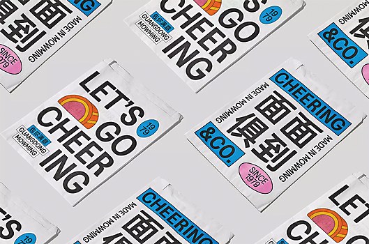
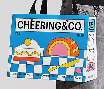
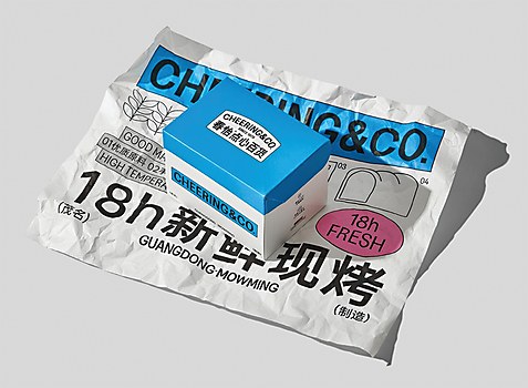
G.L.Z is not the only long-established brand that sought Reesaw out for reinvention. Cheering & Co, a baked goods store based in the coastal province of Guangdong in southern China, has been around since 1979. Ready for a new look, it approached the studio with a brief to refresh its aging visuals in a manner that wouldn’t isolate longtime patrons. Reesaw conceptualized a brick-and-mortar store that channeled the aesthetics of a warehouse, where raw concrete walls and exposed-beam ceilings mingled with bright pink self-serve pastry shelves and casework. The rest of the merchandising, from flyers to shopping bags to food packets, features charming 2-D food illustrations accompanied by bold fonts. The result was a campaign confident in its simplicity, striking enough to be remembered, and playfully appealing to both old and new customers.
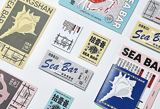
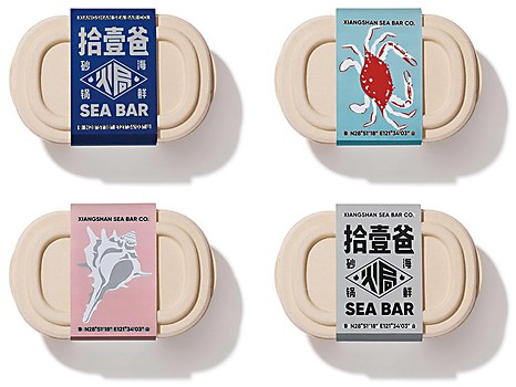
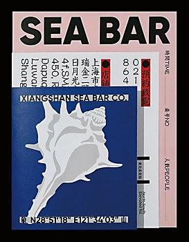
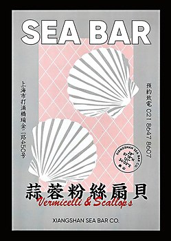
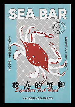
Meanwhile, for the Shanghai-based stewed seafood restaurant Sea Bar, Reesaw built a visual identity around its owner’s childhood experience of growing up in a small fishing village in the ’80s. The studio centered the campaign on charming seafood illustrations, complementing them with retro-style typefaces and a soothing pastel palette.
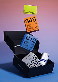
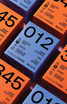
And what better testament is there to one’s effectiveness than a returning client? Colin Coffee, for example, has been a staunch Reesaw client since its beginning. Given the studio’s penchant for reinvention, the brand has undergone a Bowie-esque number of new and exciting identities. (And if you were wondering, yes—that’s a good thing!) Despite the wild costume changes, the Reesaw roots hold firm: Colin Coffee’s campaigns, ranging from coffee cups to specially designed Mid-Autumn Festival gift boxes, bear the studio’s signature use of large lettering and strong graphics, patterns and illustrations.
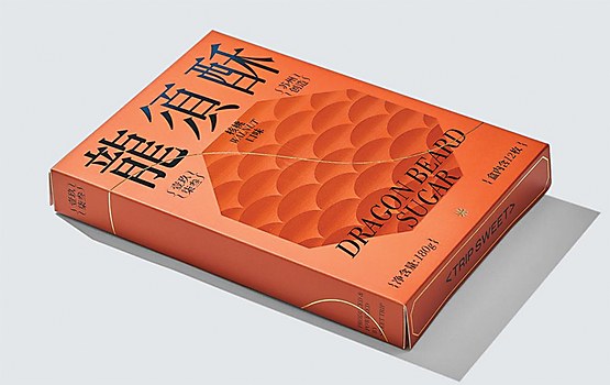
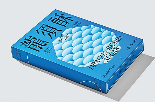
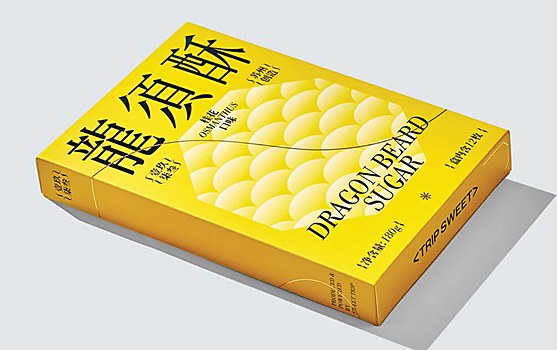
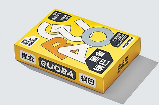
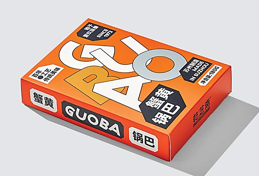
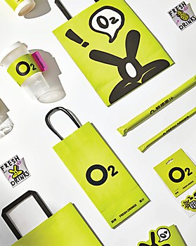
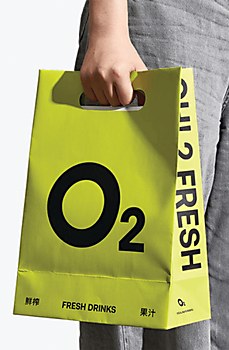
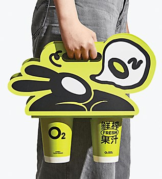
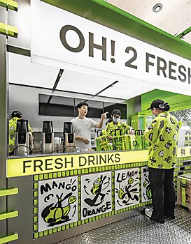
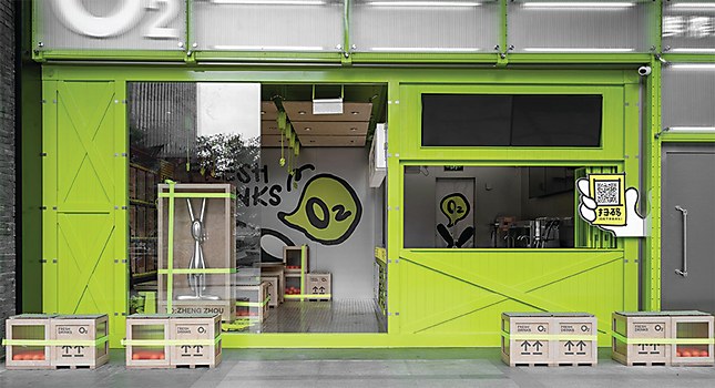
The team are also behind the revitalized packaging of Gan Zhi Zhai, a Suzhou-based company selling souvenir tea cakes and snacks; the freshly-squeezed juice brand O2; and the limited edition mooncake gift boxes of Sixiang, a large domestic packaging company.
Hitting the sweet spot between an established brand’s identity and a total design rehaul can be a designer’s Mount Everest. “The visual update of old brands has its pros and cons. Taking too big a step can lead to customer-acceptance issues, and too small a step may just not make much of an impact,” the studio explains. “If a client’s products or management operations are excellent, then rebranding can truly be empowering. On the contrary, it could end up being a temporary solution. In such projects, one needs a sufficient understanding of the industry and the client’s competitors, as well as a comprehensive judgment of the target audience.”
So what makes up a Reesaw campaign? “The basic process for each of our projects is generally the same: initial contact with the client, brainstorming for concepts, clarification of visual directions, core visual output and, finally, producing the final materials,” says the studio. The client’s trust in the Reesaw team’s abilities is crucial—this gives them enough space to express their creativity, both conceptually and visually. They also stress the importance of choosing the best domestic suppliers, printers and partners for the final production stage of their projects. Beyond creativity, client relationships, mutual understanding and professionalism are significant factors that contribute to their success.
That said, the studio isn’t just about work. A new week at Reesaw starts with a Monday meeting that maps out the studio’s workload, after which the designers carry on with their tasks at their own pace. To keep the creative juices flowing and their instincts sharp, the team indulges in a weekly tradition dubbed Reeshare: informal get-together sessions where they shoot the breeze about art, movies, design, music, exhibitions and anything else that has inspired them recently. Occasionally, team members get together for a weekend frisbee or badminton game. “The work atmosphere is relatively relaxed,” says Yin. “We’re a bunch of young people who get along well, so there’s basically no topic we can’t chat about.” Concerning creative influences, the Reesaw team expresses their admiration for the South Korean independent studio ORKR, which they describe as: “Free and unique. Avant-garde, yet organized.”
When asked how they perceive Shanghai’s creative scene, without hesitation, the team answers: “inclusive, open, and diverse.” Compared to a few years ago, independent design studios in China are gaining popularity and acceptance. “There’s a noticeable change in the industry and its way of thinking: it’s becoming younger,” observes Yin. The fact that the design field is ever evolving is a good thing; it keeps Reesaw on its toes. The design studio’s team believes that staying true to their aesthetic, exploring potential collaborations, continuously nurturing valuable relationships, and using unique visual languages and expressions are the keys to having a lasting presence in the field—that, and the friendships forged by a shared passion for what they do. “Having worked together for nearly seven years, sharing and supporting each other has brought a stronger driving force and sustainability to our studio,” says Yin. When it comes to reinvention, Reesaw is in it for the long run. ca


