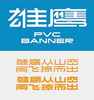
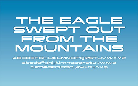
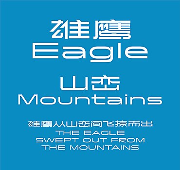
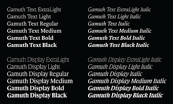
To date, the Paris-based type designer Jean-Baptiste Levée has more than 100 typefaces to his name. Levée has worked in the type design industry for 20 years, from freelancing to establishing the foundry Production Type, and each lesson he has learned along the way shaped his design and leadership philosophy. After meeting Levée, who confessed how he’s adamantly against patrimonialism in type design, it’s clear that the story of Production Type’s success goes beyond his own name. Levée describes his team, based in Paris and Shanghai, as a group of people who are “better than him at what he does.” And they must have been doing something right, as the foundry celebrated its ten-year anniversary this year.
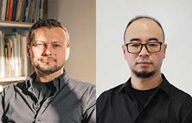
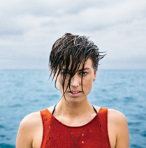
Levée and Tao Chen.
© Julien Lelièvre/Shijun Xia
While new type design programs and alternative schools have emerged in the last decade, there were few and far between in the early 2000s when Levée was a student. After graduating from art school École Estienne in Paris, he worked as a freelance designer. In 2009, he cofounded the foundry Le Bureau des Affaires Typographiques (BAT) with three other partners. “We all wanted to make something together that would foster French type and thrive in a local market that was stiff and underwhelming at the time,” Levée says.
A few years later, Levée left BAT after having an epiphany looking at the state of the type design market at large and in France. “I wanted to put my money where my mouth was,” he says. “And my mouth was advocating for a consistent stream of design in France and abroad that would materialize in gathering people whose work I like and skills I admire, who did not have a channel for their own designs.”
Browse Projects
Levée acknowledges that his freelance experience helped make a name for himself, but being on his own had its limits. As the years went by, he realized he was sitting on his own pile of gold—unused and unpublished font designs and drawings that had been shelved away in drawers. There was only so much one could do solo, and his individual name would only take him so far. “There was a glass ceiling of self-branding, and I could never properly build this output channel using only my own name,” he explains. So, in 2013, Levée traded in his name for a new one: Production Type.
The foundry took two years to build and launched as a two-person operation, with Levée and one part-time assistant. One year later in 2014, Levée met Tao Chen, a designer from Shanghai. Bonding over on-and-off-hours interests from letterforms to Burgundy wine, the two planted the seeds for collaboration and the foundry’s later global expansion.
Tao had lived and worked in Paris for eight years, citing an appreciation for Sino-French culture. “The elegance, freedom and bravery of French culture have always influenced my design theories and practices,” he says. “Meanwhile, I am also deeply rooted in my motherland in China, which has vast territory and a long history. I wanted to bring together these inspirations in my practice to innovate in the Sino-French cultural space.”
Before joining Production Type, Tao had founded his own agency in Shanghai that specialized in branding and custom type. His professional and cultural experiences in both French and Chinese design environments presented a unique opportunity. In 2019, Production Type opened its Shanghai office, with Tao leading as associate creative director.
To be anchored in Paris and Shanghai “is a story of opportunities,” Levée says. “Most of our clients are in the field of luxury, fashion and industry. I noticed there was an opportunity to build a stronger offering that is Western-facing but Eastern-focused.”
This orientation means the foundry can not only work with clients across time zones, but also cover a variety of scripts—Arabic, Cyrillic, Greek and Latin on one end, and Chinese, Japanese and Korean on the other. “If you connect the dots, we have the firepower to cover challenging client requests at many levels,” Levée says. Even down to licensing, this setup lets the foundry offer support for Western clients who have to navigate a completely different font-licensing landscape in Asia.
“With growing aesthetic and cultural demands, many brands need a reliable, strong voice to help them communicate their brand concepts and ideas,” Tao says. “I believe the most important voice of all can be a custom brand font or a retail font that is visible, beautiful, audible and durable.”
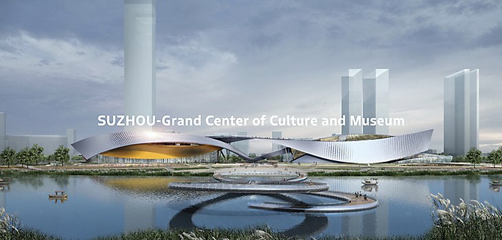
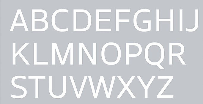
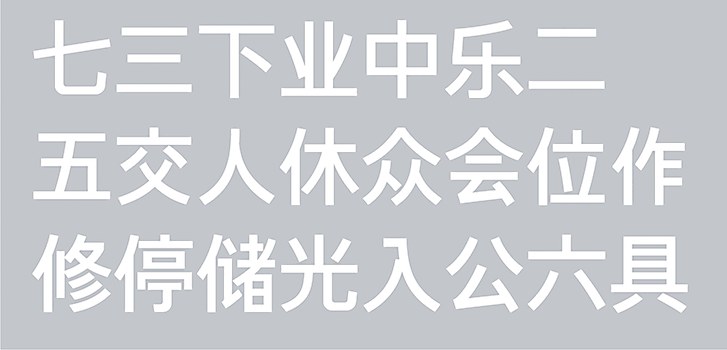
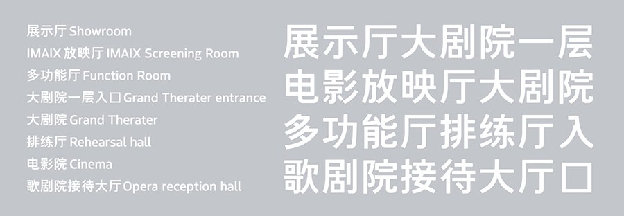
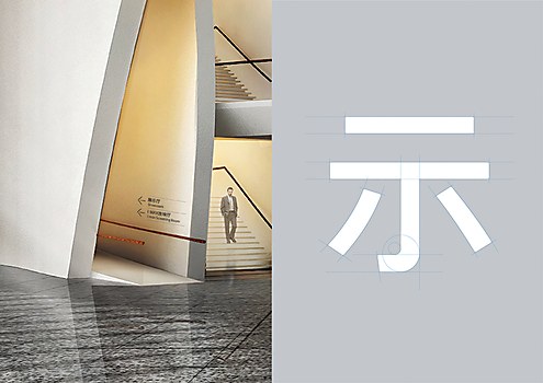
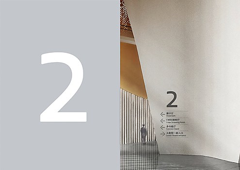
One of the foundry’s first global-scripts projects was designing custom Latin and Chinese typefaces for Suzhou Bay Cultural Centre. The project also complements the foundry’s own ties across China and France, as the Centre is located in Suzhou, China, and was designed by French architect Christian de Portzamparc.
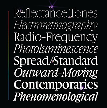
Type foundries all over the world often find themselves navigating the delicate balance between usefulness and uniqueness. “How can you make work that feels fashionable, contemporary, relevant and, at the same time, not shallow—but also not completely antiquated?” Levée poses. He describes Production Type typefaces as a mix of depth, substance and freshness. When looking at the design spaces in its library, many typefaces hit the mark on all three of these qualities.
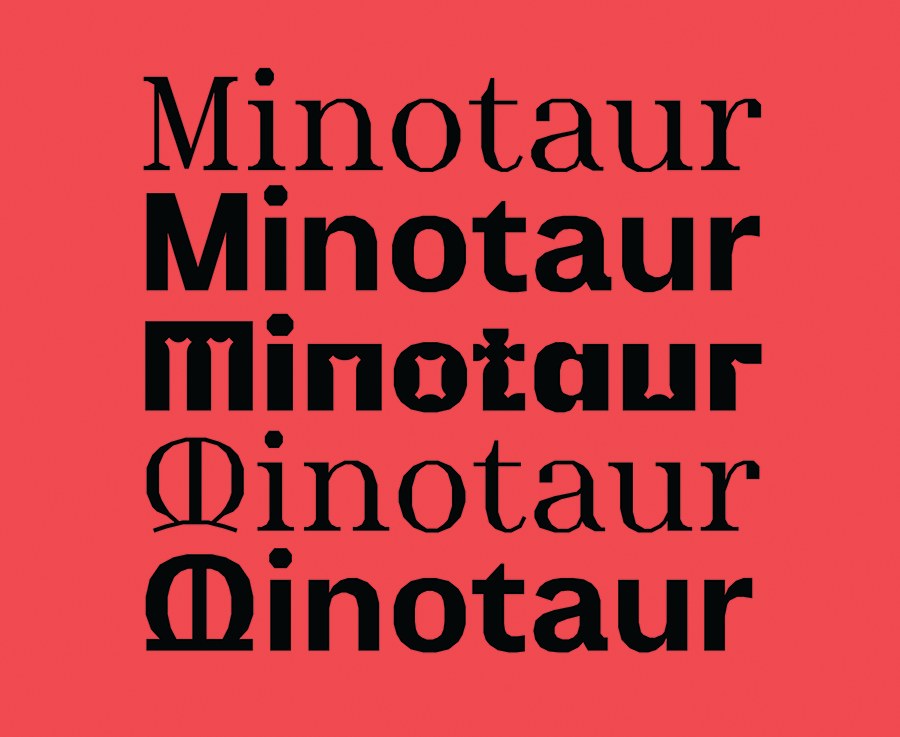
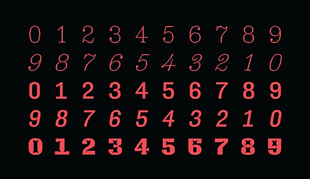
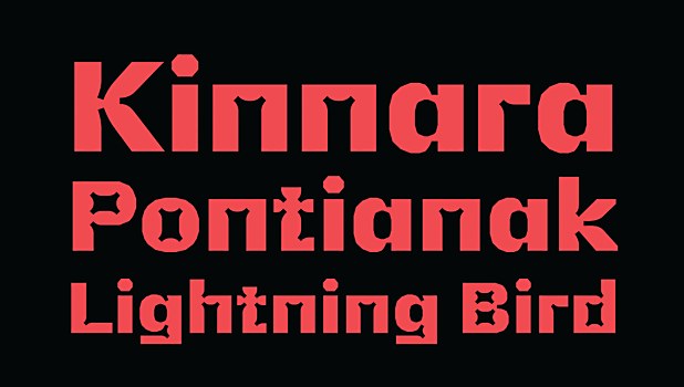
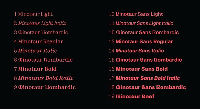
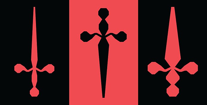
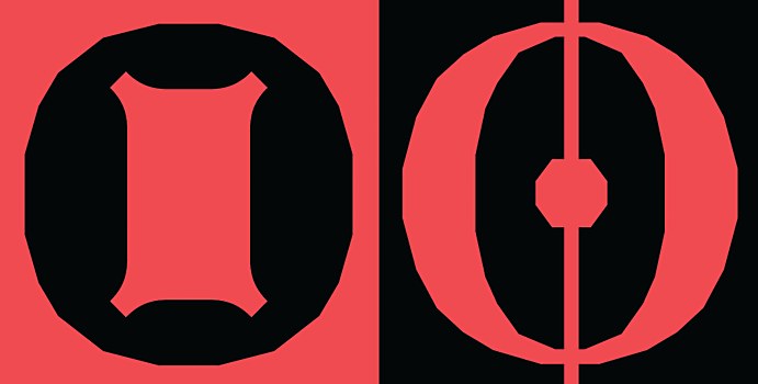
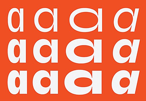
While we usually expect all members of a type family to look similar, sharing visual genes to prove their kinship, Production Type font families are strongly related by concept and attitude. The Minotaur Collection, for example, references cubism from multiple perspectives. They forgo the obvious answer, which would be to disassemble and abstract each letter—a solution that would be visually interesting, but not usable. Instead, each character is razored off, leaving no curves, but ragged edges consisting entirely of straight lines. The serif and sans serif families were created for a Paris art museum, and the collection also includes curious beasts like Minotaur Beef and Minotaur Lombardic.
Minotaur, one of the foundry’s first releases in 2014, still feels incredibly thoughtful and contemporary a decade later. In this one collection, visual threads are pulled from stretches of time: 15th-century Lombardic initials, 19th-century Scotch Rouniqman serifs, an early 20th century grotesque—all the way to A. V. Hershey’s jagged computer vector fonts from the 1960s. Frankly, Minotaur Beef, which lacks any explanation
or visual reference, looks as though it came from the future, beamed from another universe.
As a student, Levée was instilled with the idea that type design was a specialty skill emerging from graphic design. The two disciplines are often spoken about together, but based on the workflow, to the size and scale of impact, Levée believes the field is actually much closer to industrial design. “We manufacture, design and package shapes that are going to be reproduced hundreds and thousands of times, and that one shape will not change while being reproduced,” he explains.
This process is even more apparent when designing typefaces for writing systems that are much more complex, with even larger character sets than Latin. For example, the baseline for a workable Chinese font can be from tens to thousands of characters. Southeast Asian scripts require shapes that change and shift based on context. In other words, there are many more parts needed for the final, working product.
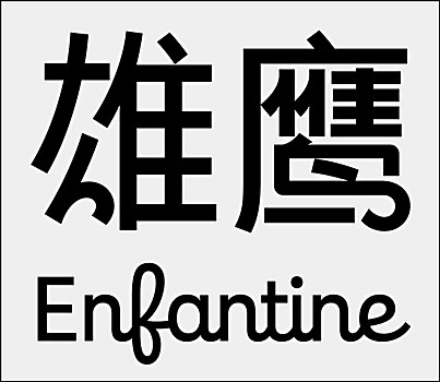
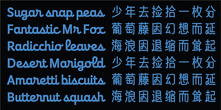
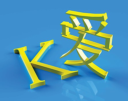
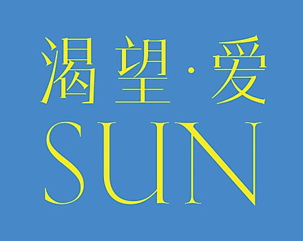
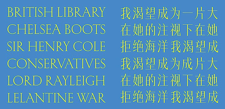
The foundry has teased the Chinese expansion of three typefaces, and Levée hints that there’s even more on the horizon. As the first set of expansions, one might have assumed Production Type would tackle the typefaces that have been the most commercially successful. Instead, the foundry decided to undertake some of the fonts that pose a great challenge when applied to the Chinese script: Arc, a stencil typeface; Enfantine, an upright script; and Kessler, a contemporary take on inscriptional serifs.
“We don’t just release designs because we believe they will sell well,” Levée says. Instead, it seems that designs are released because the foundry believes in them. From LAB fonts that are working experiments to typefaces published with independent designers, each and every one makes a statement.
Levée has expressed before that typefaces are not tools, but design for designers—and this belief still holds true in our conversation. “Type design is a craft where it’s easy to forget that you are not designing for yourself,” he says. “Of course, the design you do has to be rewarding, you have to be proud of what you do.”
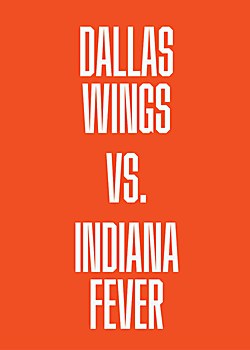
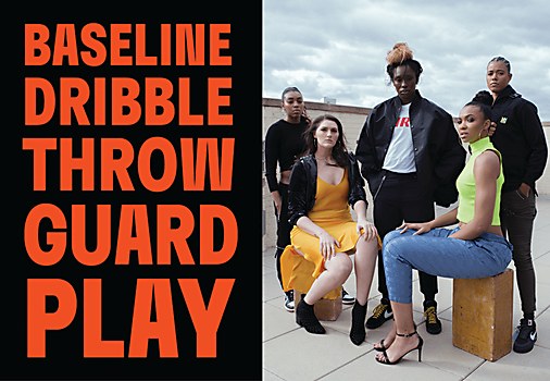
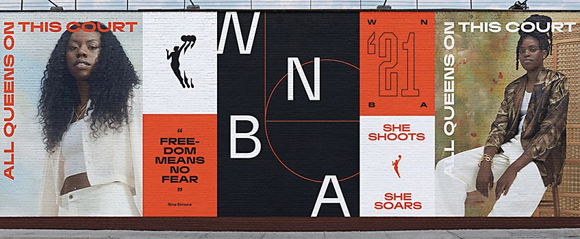
While this outlook may not directly affect the end user, it makes a difference for how the foundry relates to and releases its fonts to the world. Instead of creating mock-up in-use cases, which some believe prescribes and limits the typeface’s potential, Production Type debuts them with what Levée describes as “type allegories.” An allegory can be defined as a symbolic expression of truths about human existence, morality, religion or politics. A typeface as design should then impart these truths through visual means. Typefaces become characters with stories and morals of their own, arriving in the world to teach us something. “What you see is simply what the type is, what it should do and what it’s good for,” says Levée.
To show instead of tell, each typeface has its own art directed story situated in a certain place, however abstract or concrete, that tells us who it is and what it came here to do. Designed letters enter the visual and material world, generating meaning and cultural value by wrapping themselves around text, words, brands and more.
Our digital era expects that once something is online, it will last forever. But for Levée, nothing should last forever—not even fonts. From time to time, fonts go through a quiet retirement from the library. He makes the analogy to that of a controlled burn, when fires are planned to maintain the health of the entire forest. In nature, burning dead leaves and debris returns nutrients to the soil faster than natural decomposition. The open space allows for new young trees to grow. In a type catalog, this means that designs more relevant to the current time can be given the space to shine. But a responsible leader knows the extent to which this power can be exercised, and the fonts that get shelved away are usually Levée’s own.
“I don’t think that all my designs will be relevant for eternity,” he confesses. “So as much as Production Type’s mission is to build a consistent, solid stream of high quality design, we are also in the business of the renewing of images.”
In 2023, the foundry received exclusive rights to the type design legacy of A. M. Cassandre, a 20th-century French poster artist and graphic designer. It will take on renewing his images for the 21st century, including groundbreaking typefaces like Acier, Bifur and Peignot, as well as his lesser-known works like Graphika 81, a typewriter typeface, and Cassandre, the late designer’s take on epigraphic research.
Looking ahead, the foundry’s goals are quite simple. In the short term, Levée and Tao want to strengthen the bridge between France and China, between Western and Eastern cultures. This exchange is not only external-facing, but also within the foundry itself. Production Type designers participate in design exchanges and can have extended stays in both Paris and Shanghai offices. “We continue empowering our teams with a bicultural approach to sharing knowledge,” Levee says. “There’s no such thing as individual type design. Type design is a collective act.”
With Levée leading Paris and Tao leading Shanghai, the full team is a little less than 30 people. “The core of our partnership is built on trust; after nearly a decade of getting to know each other, we trust each other,” Tao says. Their partnership’s strength was also evident when the pandemic closed global borders soon after opening the Shanghai office. The two built and ran teams that collaborated closely without seeing each other over the course of three years. These teams only reunited in-person for the first time in the fall of 2023, which Tao describes as an “instant connection.”
“The trust provides flexibility, and the Paris-Shanghai twin city model allows both of us to retain a high degree of mobility in dealing with clients and the market, but with a relatively unified philosophy and mindset,” Tao adds.
In the long term, Levée will be satisfied if the foundry can continue what they currently do, which is to produce the best of today’s and tomorrow’s designs. Its work is in the name, and its name is in the work. “The fonts we do are here to help designers produce,” Levée says. “Production Type is type that enables the production of shapes, of pages, of screens, of interfaces. It’s not decoration type, not light-hearted type, not anecdotal type—it’s production type.” ca


