Responses by Quintin Lodge, designer and cofounder, and Mario Sanchez Maselli, developer and cofounder, Non-Linear Studio.
Background: “The purpose of our site is to showcase our work, process and capabilities,” says Quintin Lodge. “The target audience for our site is any company out there that wants to do something unique and innovative in the digital space.”
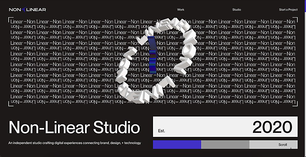
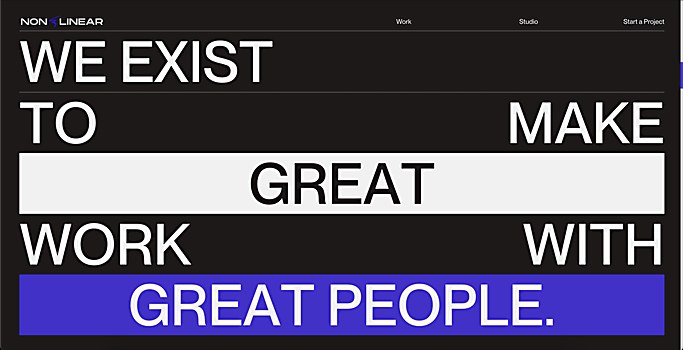
Design core: “I would say the core design style could be summed up as branded brutalism with brains,” Lodge says. “In terms of unique features, I would say it would be the site’s aesthetic paired with the subtle and thoughtful execution of those design elements.”
Challenges: “Designing for yourself tends to always be one of the toughest things,” Lodge says. “We probably went through fifteen or so iterations of our site before finally landing on an aesthetic. The other challenging aspect was finding time between client work to get the site built.”
Time constraints: “It ended up taking more than a year to get the site live as we ended up prioritizing client work a number of times during the course of the project,” recalls Lodge. “As such, we launched a WIP version of the site about six months ago but waited to announce the launch until we could add some polish.”
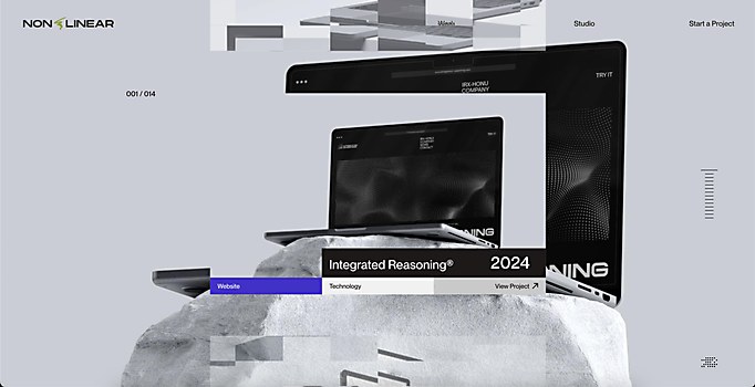
Special navigational features: “The work section was probably the only special navigation feature—as we wanted something non-linear,” Lodge says. “So, we came up with an infinite vertical carousel.”
Technology: “The site was built using the Sanity CMS and 11ty and deployed on Netlify,” explains Mario Sanchez Maselli. “This setup lets us create a static, super-fast site while keeping the headless CMS functionality. Sanity v2 powers the back end, giving us full control over the content.
“The front end runs on 11ty, GSAP, Taxi.js and three.js,” Sanchez Maselli continues. “Developing the front end was a bit more complex as we went through several designs before landing on the final version. I played around with various layouts for the projects, the hero section and the overall aesthetics, even if some didn’t make it to the final site.
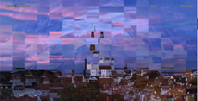
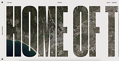
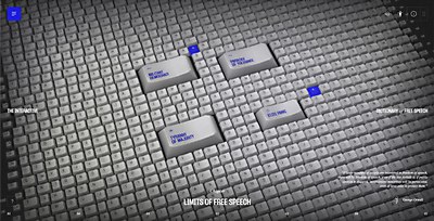
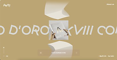
“One of the coolest sections is the hero,” adds Sanchez Maselli. “We used canvas as a texture for the hero text animation and GSAP for the flipping text. The project sections on both the homepage and the work pages use WebGL—and are also some of my favorites. We tried several tests on them. At first, we weren’t sure how to achieve a unique pixelated effect, but Quintin came up with a concept in After Effects using a displacement map. From there, I was able to re-create it in three.js, resulting in a smooth final effect.”
Special technical features: “Given that it’s our own portfolio, we experimented more than usual and tried different ways to create pixelated effects,” Sanchez Maselli says. “We used shaders and pixelated the image by creating a grid on the texture, but when we tried to revert the image to its original state, the effect didn’t feel very smooth. So, we kept experimenting until we found a nice solution with a displacement map. The displacement map is a texture made from randomized rectangles that we import and then use noise and random positioning to distort. This way, we get rectangles displaced from the texture in a different way for every project.”


