Responses by Adrián Gubrica, author, designer and developer.
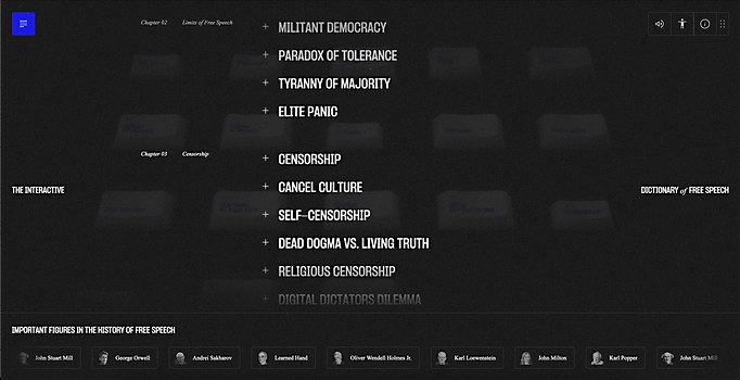
Background: The site, maybe a little surprisingly, is a result of my master thesis made at digital design department at Universita Tomáše Bati ve Zlíně in Zlín, Czech Republic. Its content focuses on popularizing the topic of free speech, which is very commonly discussed lately. However, people don’t know too much about it and its history.
My true goal with this site, as a student of digital design, was to research and prove that creative web development is a true design discipline while trying to showcase the potential of cutting-edge web technologies and immersive experiences.
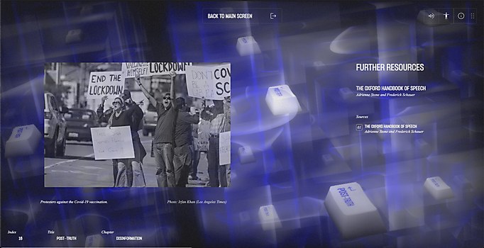
Favorite details: I’m really proud of most of the transitions in the site. With a little math knowledge and multiple render targets, I was able to switch smoothly between chapters and scenes. I even displayed one 3-D scene within another, making really unexpected and cool effects.
Challenges: Definitely the complexity of the project. On the site, I was the designer, developer and content creator in one person, which was often quite overwhelming—especially because I wanted to deliver a great result in every aspect of the project.
Time constraints: As this is a result of a master thesis, I had several months to work towards the result. This gave me a lot of freedom to experiment and try a lot of iterations before I had to deliver the final project.
Divergent paths: I would definitely reconsider how I structure my code and make more conscious decisions about it. During the development, I often got into situations where I became trapped by bad decisions I had made earlier.
New lessons: I vastly expanded my knowledge in the field of 3-D graphics programming and discovered that creative web development is something I truly enjoy doing. By education, I’m a designer; however, I really see my value on the creative side of development.
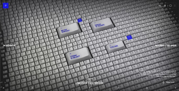
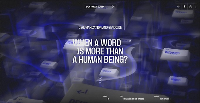
Special navigational features: The site strongly encourages the user to directly interact and have fun with the 3-D elements, which is reflected in the navigation as well. Right from the site’s introduction, the user has to interact with it in various ways to move further, such as pushing the pointer hard or to start holding and dragging to delete keys on the animated keyboard. This also applies to the main content, where the user has to click on the interactive keys to read their content or to move to another chapter by clicking onto the small keys.
During the user-testing phase, people seemed to really enjoy the audiovisual feedback from clicking and hovering the 3-D keys in the scene; they even had a relaxing effect on some users, making them more curious about exploring the content.
Technology: The front end was made mainly by using GSAP, React and three.js, and it was bundled in Vite. For the back end, I used Strapi CMS.
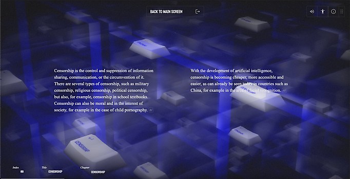
Special technical features: The site is basically derived from a single low-poly keycap model that I combined with a number of custom shaders and advanced techniques. such as instancing and multiple render targets. This resulted in especially dynamic visuals while the site still kept a smooth performance.


