Responses by Nicolas Bouvet, developer; Luca Franceschetti, digital and web designer; and Giulia Peretti and Silvia Recalcati, cofounders and designers, Paffi.
Background: “We are communication designers from Verona, Italy, and this year we celebrate our tenth anniversary as a team at Paffi,” say Giulia Peretti and Silvia Recalcati. “This portfolio website is the perfect way to celebrate ten years of great projects we are very proud of in branding, editorial design, visual identities and icon design, among other media. We wanted to feature them all in a fun and interactive way, which Luca and Nicolas made possible with their magic.”
“We helped redesign the website to celebrate the ten-year anniversary of Paffi Studio,” says Luca Franceschetti. “We naturally joined together because our previous collaborations have been great—and because we have been friends for a long time!”
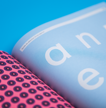
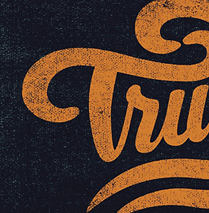
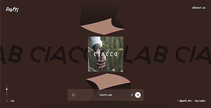
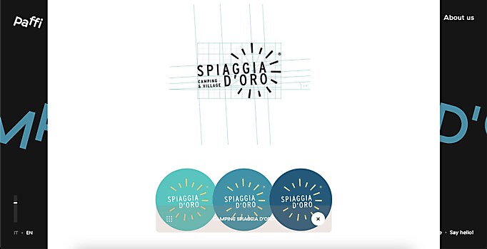
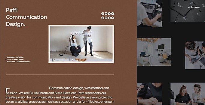
Design core: “I designed this website with two goals in mind: to make an easy, enjoyable navigation experience and reflect Paffi’s lively, playful approach through design,” Franceschetti explains. “So, we played with the color palettes of brand case studies and with GT Haptik Rotalic, the eclectic Paffi logo font. We wanted to stress its italic peculiarity, which you can see in the hover link effects. The background colors and textures in the About page are inspired by the Fedrigoni Materica collection palette, a set of papers which Giulia and Silvia are really devoted to.”
Challenges: “Displaying all our very different and very custom projects in a coherent way without making the site boring nor difficult for us to update,” say Peretti and Recalcati. “We wanted to upload a lot of designs in order to celebrate them and to give a voice to all of them, not just the biggest ones. Luca and Nicolas designed the website in a way that allowed us to easily and quickly fill the website with all the content we already had, using social materials, sketches and GIFs. The site also lets us control the color and gradient light for every project.”
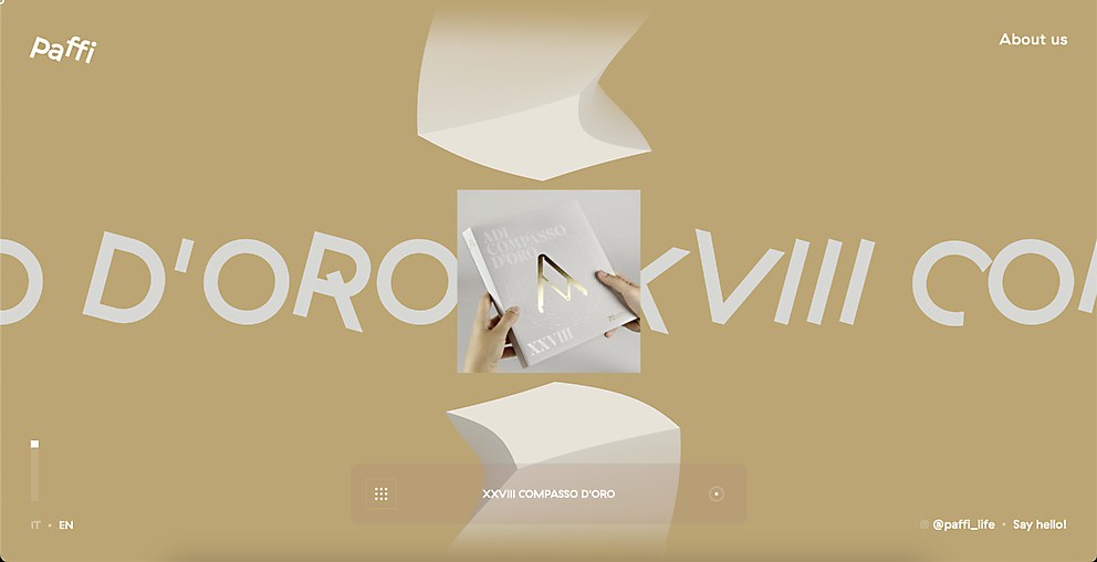
“For the home slider, I wanted to create something dynamic and playful enough but that still focused on the project cases assets,” says Franceschetti. “I eventually came up with the idea of a rotating modular slider, displaying logotypes and brand colors of each featured project. I called it the ‘totem slider.’ It’s probably reminiscent of some video games I played, such as Monument Valley. Nicolas developed it flawlessly: it’s scrollable, draggable and even more enjoyable on mobile.”
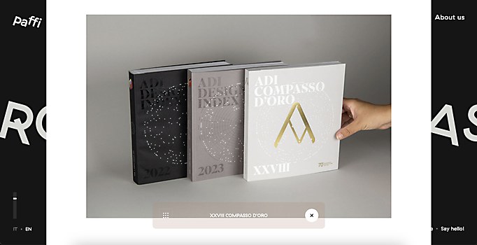
Navigation structure: “The site has two distinctive sections,” Franceschetti says. “First is the Projects section. You have a glimpse of the featured projects from the home slider and then you can navigate seamlessly through all the cases, or you can have an overview of all of them through the left button on the horizontal bottom bar. Second is the About section, which displays all the info about the studio, the associations in which they are involved, the awards earned and their social links.”
Technology: “For the front end, classic web technologies: HTML, CSS and a bunch of JavaScript for animations,” says Nicolas Bouvet. “For the Home page, WebGL with custom shaders bend the cubes at will and create the custom gradient lighting system. For the back end, there’s Cockpit, a headless PHP CMS. As a headless CMS, it’s easy to customize and acts as a database for the website. The key word is custom, as everything has been finely crafted with everyone on the team to bring together design, beauty and technology.”


