Responses by Harry Pearce, partner, Pentagram.
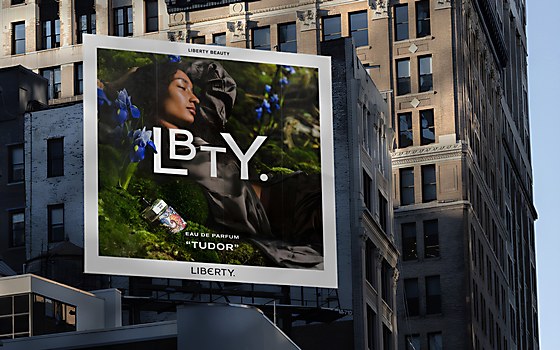
Background: The project began in September 2022 when the team at beauty brand Liberty asked us to assist them in the brand’s extension into the luxury beauty market. We were approached as we had created the visual identity for Liberty back in 2020 and most recently had extended that identity into a series of typographic fabric patterns. These fragrances mark the first release from the new LBTY Beauty range and are gender neutral, targeting anyone who appreciates Liberty as a thought leader in art and design.
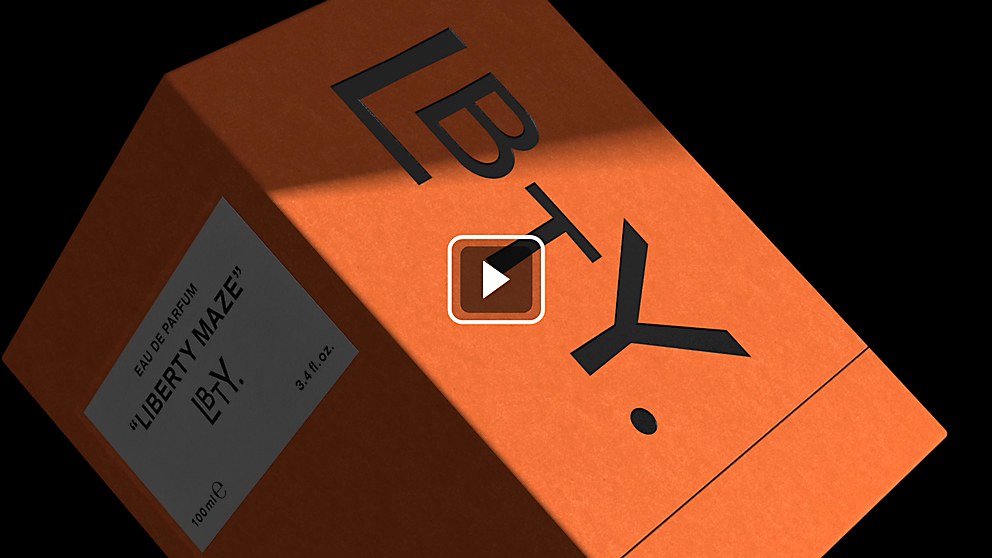
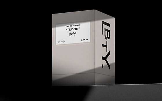
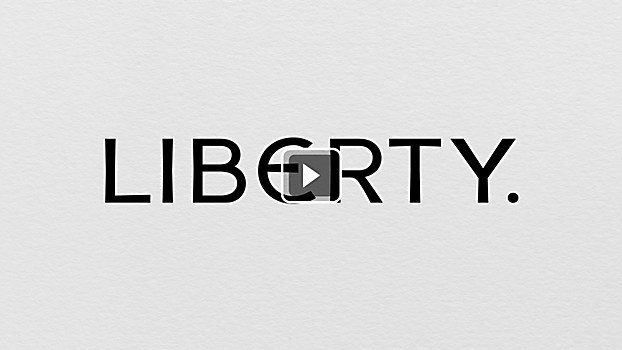
Design core: The naming process began with archival research during which we discovered that Liberty had been shortened for use on hallmarks. LBTY is born from the brand name, and the LBTY logotype is derived from the Liberty masterbrand logotype, itself derived from the lettering of the original sign above its Great Marlborough Street storefront.
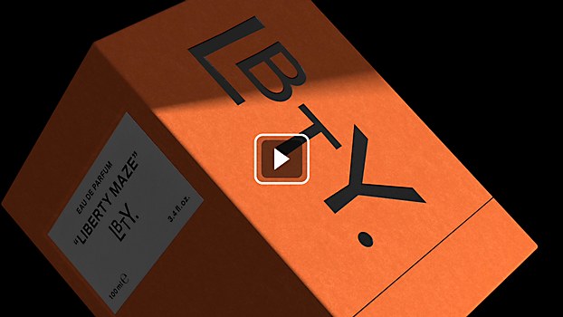
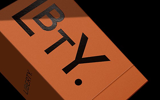
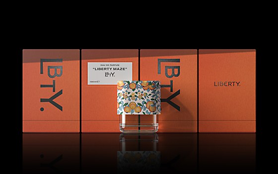
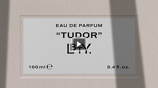
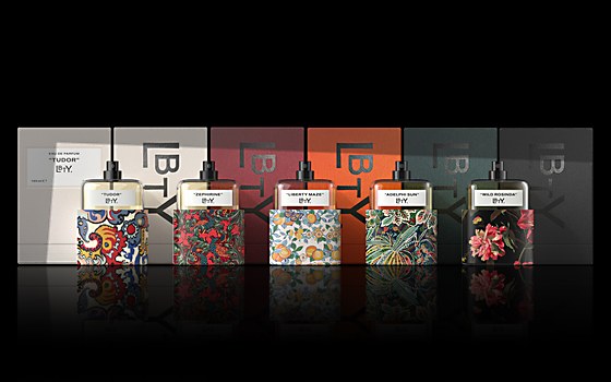
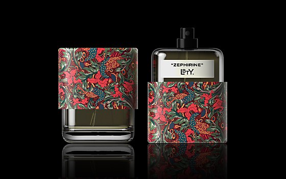
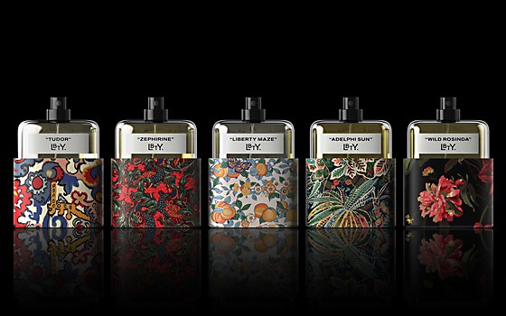
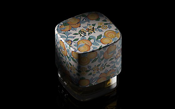
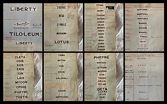
Archival discoveries are the springboard for the design of both the logotype and the fragrances themselves. The Liberty team selected prints from their extensive collection and sent them to a hand-picked selection of the world’s most renowned perfumers to be used as inspiration for the fragrances. The oversized lid showcases each Liberty print and features a gold debossed LBTY logo. Reflecting Liberty’s ethos of blending heritage and modernity, the fragrances are contained in an elegant clear glass bottle with an understated black-and-white label on the front. The pared-back label designs set in Akzidenz-Grotesk Extended are a nod to indexes of trademarked fabric names found in the Liberty archive.
Challenges: Building a consistent visual language across so many substrates and maintaining such a high standard across the many finishes used on bottles, caps, cartons and wraps. One challenge with the perfume bottle design was the requirement of developing a recognizable branded design without custom tooling for the glass bottle. The design team opted for a custom oversized cap that covers most of the bottle—including the label—maximizing the area available for the Liberty print. This approach provides a unique identity for this line of high-end fragrances and hints at an overall design language for future LBTY product categories.
Favorite details: We are particularly proud of the high standard of finish, particularly in relation to the application of the fabric pattern to the lid.
Visual influences: Throughout the project, we were influenced by Liberty’s rich history of innovation in art and design along with its unapologetic eccentricity.
Specific project demands: The fact that we were unable to create a bespoke bottle meant that the team needed to create alternative solutions to ensure standout.


