Responses by Design Bridge and Partners.
Background: The purpose of the project was to articulate the value of the Archer School for Girls’s unique educational approach and perspective more effectively and distinctively in a crowded private school landscape. Archer wants to resonate with parents of girls in Los Angeles looking for a place to learn that nurtures both ambition and joy in the pursuit of excellence. More specifically, Archer wants to appeal to parents who are open-minded and invested in the idea that an emerging, iterative, research-based educational approach is likelier to offer their daughters a lifelong experience of joyful ambition and success.
Design thinking: Throughout this project, we heard about the warmth and glow you feel when you walk the halls of Archer. When we explored the campus and had conversations with groups of students, teachers and parents, we felt exactly. These conversations with Archer made clear that it is not a typical private all-girls school—it has deliberately designed an educational experience for girls that balances traditional schooling with emerging research-based approaches, using iterative leadership and curriculum practices to keep its approach continually current.
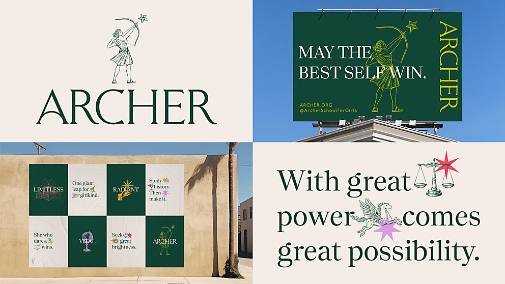
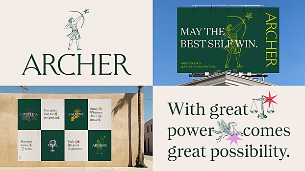
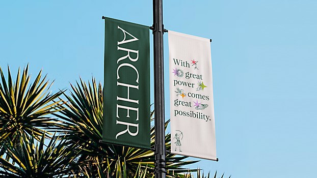
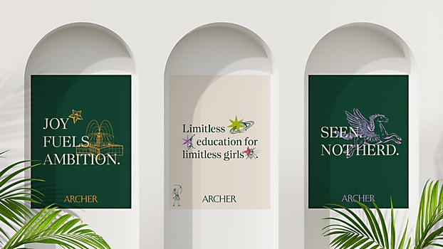
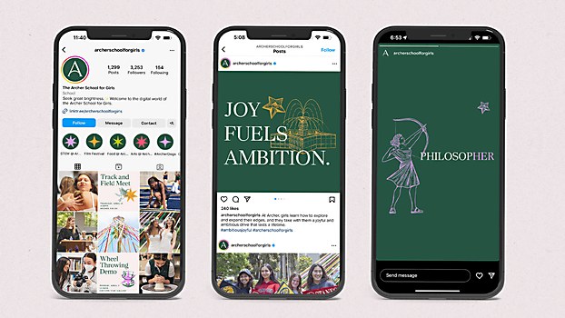
Archer had been walking the walk for years as this category of one—the incredibly thoughtful, intentional nature of its approach to education permeated every inch of campus and every conversation we had about its organization. So, our idea was to take this loud and clear by blending Archer’s modern capacity for iteration with a classical piece of its founding legacy: the story of Artemis from Greek mythology. This resulted in the idea of Archer as an “aegis” for girls pursuing their striking brilliance, with Artemis herself taking the helm of the visual identity aiming at a star—just as every girl at Archer has her own star. Modern secondary colors beautifully complement the classical primary palette of evergreen and stone. Modern turns of phrase and spacious layouts paired with iterative icons and star symbols give the identity potential to adapt in the hands of every individual girl at Archer.
Challenges: Finding the right color palette at the sweet spot of classical education and modern Southern California, ensuring it would always feel youthfully energetic and timeless.
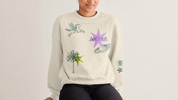
Favorite details: We take pride in the fact that the “striking brilliance” we saw in the girls and leaders at Archer came through in the rebrand in a fresh yet familiar way that honors the school’s history, heritage, culture and future orientation. We are also proud of the ever-changing school icon specifically; there are so many ways to be a successful student at Archer and a successful woman afterward, and the variety within the icon shows that breadth of possibility. In combination, all the strategy and design elements enable Archer’s glow to extend way beyond its gates because you can feel it when looking at any of the designed materials or reading any of the strategic canon we built into its brand mission, purpose and values, among others.
This is all thanks to our deep immersion in the school, learning what made Archer such a special place all these years, everything from the lore and quirks of the building and prevalence of student-run organizations to the guiding philosophies of leadership and teachers’ approach to mentorship. Understanding what has powered Archer’s impact for more than 25 years helped us capture that magic and embed it into the brand in a way that’s as modern as it is timeless. Through the brand’s new positioning and visual identity, we preserve what’s always made Archer a school in a category all its own and translate that unique value into an opportunity for girls and their families, setting Archer up to continue its legacy as it prepares for its next 25 years.
New lessons: When we investigated what’s happening culturally, we saw immense and increasing opportunity for women, while at the same time, the data shows that girls are really struggling with mental health and wellbeing. Working with Archer promised us the opportunity and responsibility to make even the tiniest ripple effect for impacting girl culture and, by default, women’s futures.
We also learned about the nuanced mindsets of parents when exploring private schools. While many elite traditional schools attract parents who believe the way they found their success will be the same way their children finds theirs, there is an emerging subset of parents who are open-minded about modern approaches that are tailored to the demands of modern contexts and culture, especially for girls.
Visual influences: We had three primary sources of visual influence. One, Archer’s campus, which is represented clearly and distinctly with the core icon set of “The Fountain,” “The Palm,” “The Maypole” and “Alfie” the dog, the school’s unofficial mascot. Each represents facets of Archer’s identity and the community it serves.
Two, Greek mythology and traditional private and boarding school vibes, visible in the stone-carved logo letters, the Archer hero mark, the icon illustration style and the complementary “constellation” stars for mix and matching as the girls see fit, and the primary colors stone and evergreen that symbolizes foundational support and growth.
Three, Southern California and Los Angeles, which are visible in the secondary colors palm, pink, sunset and sunrise; representing new growth; the divine feminine; Los Angeles sunsets; and the limitless potential of Archer.


