Responses by Rob Duncan, creative director and partner, Mucho.
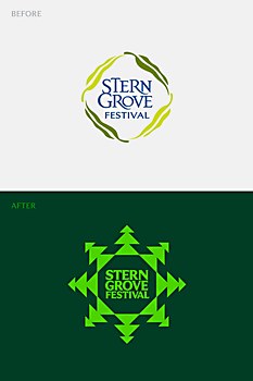
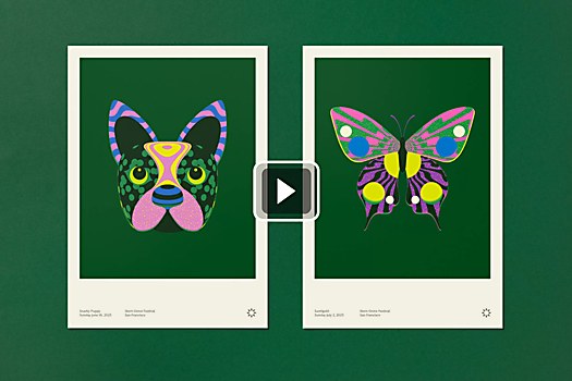
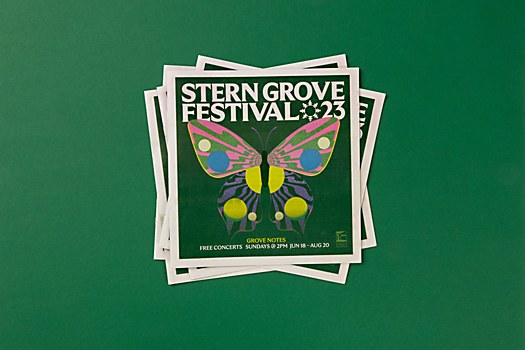
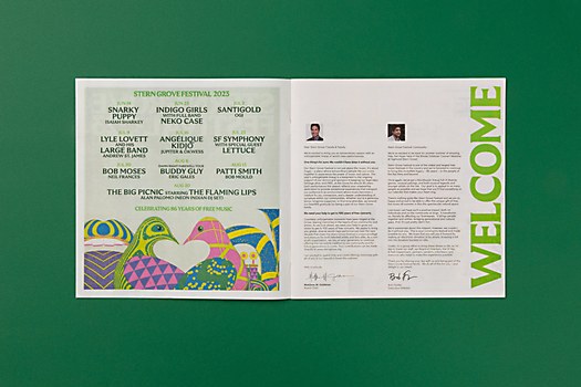
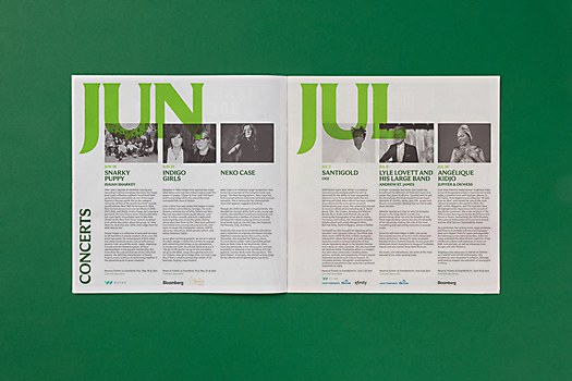
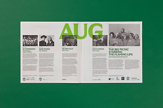
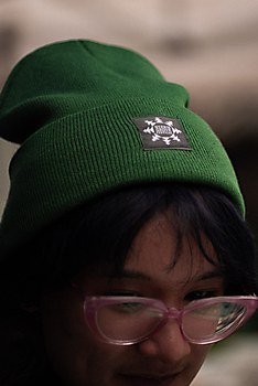
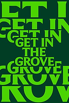
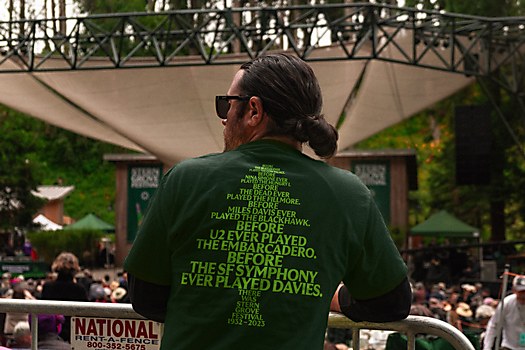
Background: The purpose of this project was to refresh the brand identity of the Stern Grove Festival, a live music festival in San Francisco. The last rebrand, made in 2005, wasn’t bad but didn’t lend itself to a more modern interpretation of music or motion graphics. Along with the logo, the previous identity just consisted of a graphic poster, and many of these graphics relied on an interpretation of a tree and referenced the hippie culture of San Francisco. In creating a new brand identity, we wanted to give Stern Grove a suite of “evergreen” design elements, such as a consistent logo, new typeface, color palettes and layouts. All of these, when applied correctly, create a holistic brand experience across signage, printed and digital collateral—something that Stern Grove has never had before.
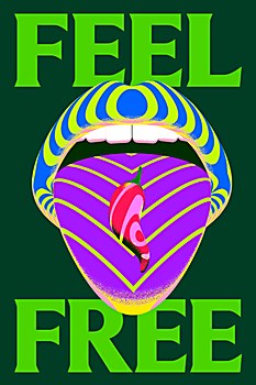
The new identity moves away from the traditional hippie representation of San Francisco and works with any genre of music. It’s also a more modern interpretation of the “grove,” appealing to a younger audience and lending itself better to motion graphics and interactive experiences. In this way, Stern Grove Festival appeals to different musicians and younger audiences and can also move into different event experiences.
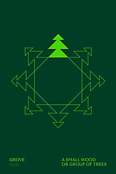
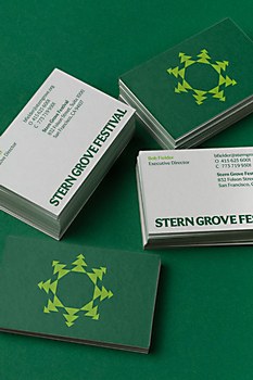
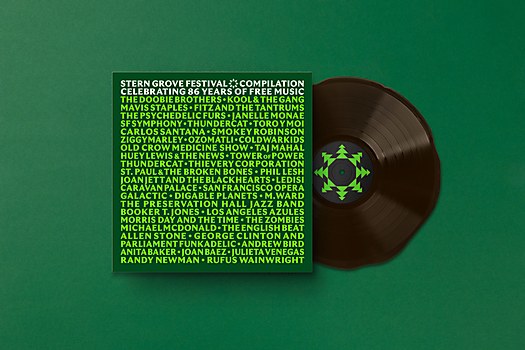
Design thinking: We wanted to create a clean, modern interpretation of the grove. By rotating a simple icon of a tree, we created a group of trees in a circle, representing a grove as well as a community. However, we also wanted to create something that had movement even when stationary: something that could easily be embossed, foil stamped, reduce down in size, and, importantly, animate and come to life with music.
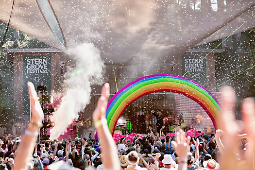
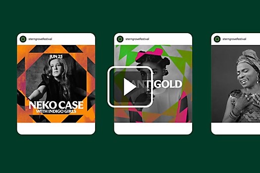
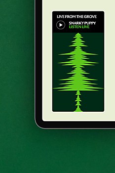
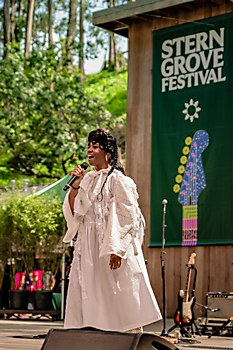
Music is all about movement and feeling: It makes you happy. It makes you want to dance. It was important that the logo could come to life in the same way. The logo can be used on the website and Instagram in this way. In the future, we envision the material banners on stage becoming digital screens. Here, we can bring the identity to life and have it react in real time with the artists and music being performed.
Challenges: It was important that we create something new for Stern Grove that would appeal to younger audiences without alienating those who have been coming for decades. The previous logo had been around since 2005 and was loved by some older members of the Stern Grove family. It was hard to let go of something that they felt very close to. However, in seeing that the new logo and brand system spoke toward the new brand values and strategy we developed with Stern Grove, they could see it was changing for very strategic reasons, not just for the sake of change.
Favorite details: We are proud of the whole identity as a system, from the symbol to the typeface, color palette, illustration style and being able to give Stern Grove Festival a suite of elements to carry on promoting this festival as a very San Francisco world-class event. In working with motion design agency Thru, we also developed a way that the symbol could interact to sound and music. We hope that future events could take on a more immersive, digital, real-time experience.
Visual influences: The best design solutions don’t rely on visual trends or influences; they should speak to the unique challenge that the client has and answer questions that are uncovered in the discovery and strategy process. A great identity is something that each client can truly own. It should only work for that particular client.


