Responses by Petter Skogheim, founding partner, Studio Oker.
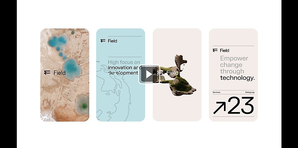
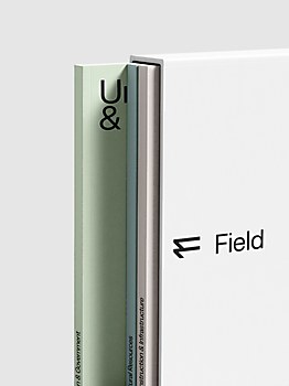
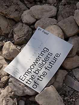
Background: In 2022, technology company Field was formed by the merger of multiple tech entities to become Europe’s leading geodata, data collection and analysis company. Our role was to develop the new brand strategy, name and visual identity to encapsulate its position as an unique supplier of greener, safer and smarter solutions to a broad range of customers within the infrastructure, construction, environment and public sectors.
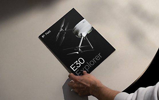
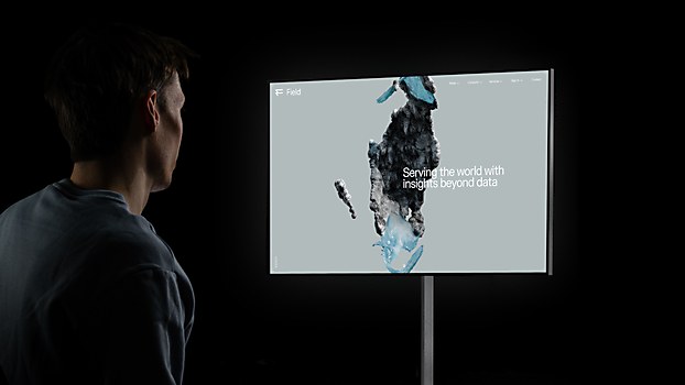
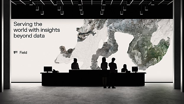
Design thinking: Given Field’s extensive reach, we aspired to develop a brand identity that not only captured its core business concept but also its global vision of offering insights beyond data. Our aim was to create a refined, universally resonant expression by seamlessly integrating nature and technology, resulting in a versatile identity system that informs and inspires.
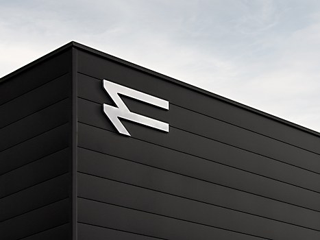
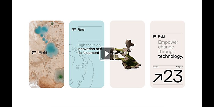
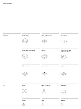
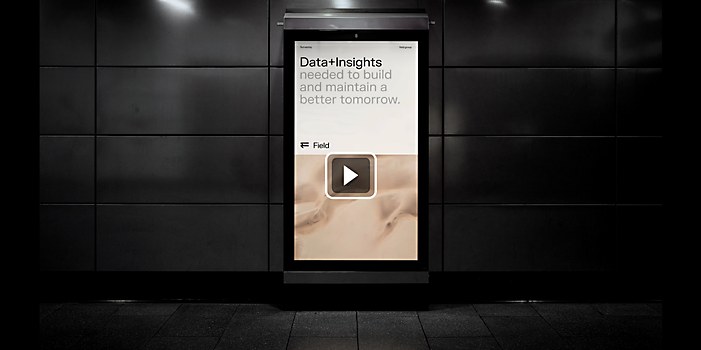
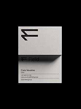
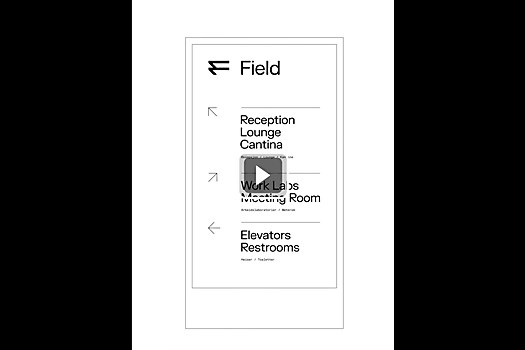
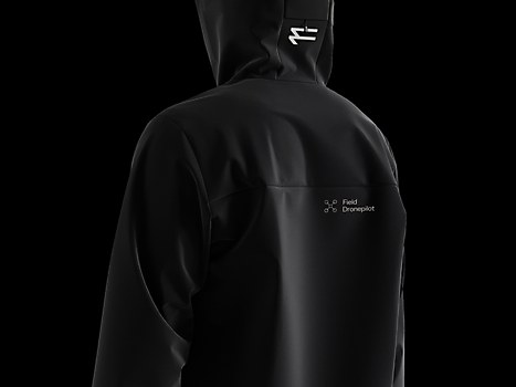
Our approach involved delving into the geospatial realm, including geospatial layers, geographic mapping and topography. We brought these aspects to the forefront to craft a relevant, meaningful experience. These key elements are reflected in the logo symbol, color palette, iconography and animations.
Challenges: To align multiple companies, sharpen the brand within a diverse array of services and target groups, and establish a cohesive direction grounded in a shared understanding of the new core business for the company.
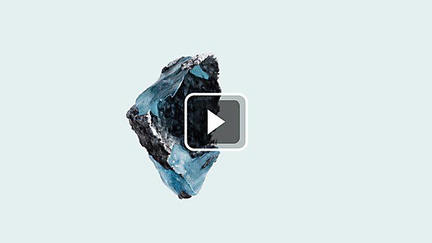
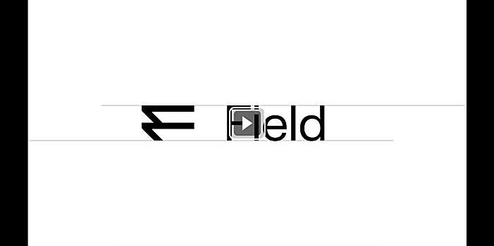
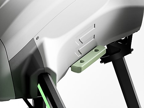
Favorite details: The logo symbol, inspired by the concept of geospatial data layers, and the expressive animations that echo “geographic mapping.” Both convey a sense of progressiveness.
Visual influences: During a trip to Berlin last year, we were fortunate to encounter an exhibition featuring the work of the late sculptor Anthony Caro, renowned for crafting exquisite abstract sculptures from metal. The juxtaposition of the constructed and the organic in his art ignited the inspiration for our animations.
Specific project demands: We were entrusted with the responsibility to lead the brand strategy and naming process for the new company, enabling us to craft the brand from its very beginnings. While this didn’t necessarily simplify the project, it let us take a holistic approach that benefited the result.
As we delved into the naming process, we gained an in-depth understanding of the company, making it easier to envision the aesthetic and essence of the new brand. When we ultimately agreed on the name Field, it provided us with a clear direction in terms of the visual work moving forward.


