Responses by Jon Hartman, partner, Wunder Werkz.
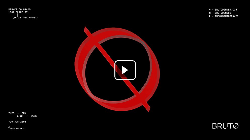
Background: The client gave us the lofty task of reimagining the spatial, collateral and digital experience of Denver-based, brutalist-inspired, Michelin Star restaurant Brutø. We wanted to bring in the raw tactility and deep connection of the Brutø experience to its design systems through touchpoints that reflect the ethos of the restaurant over pushing items on the menu.
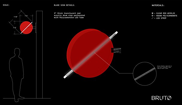
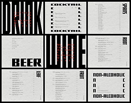
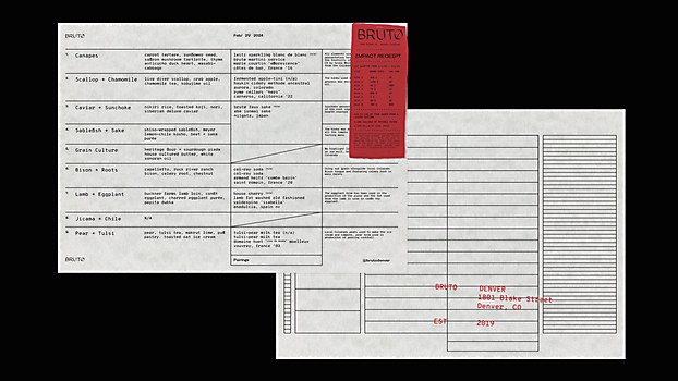
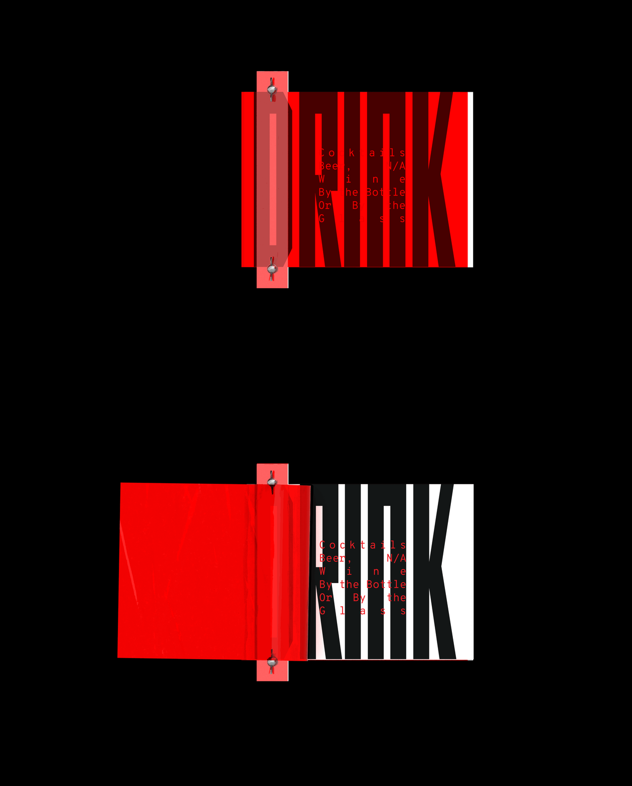
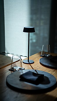
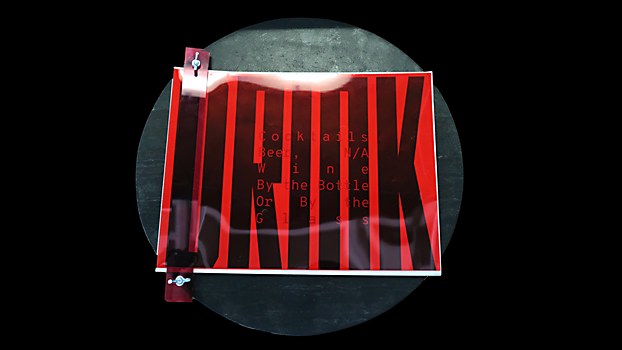
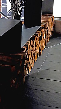
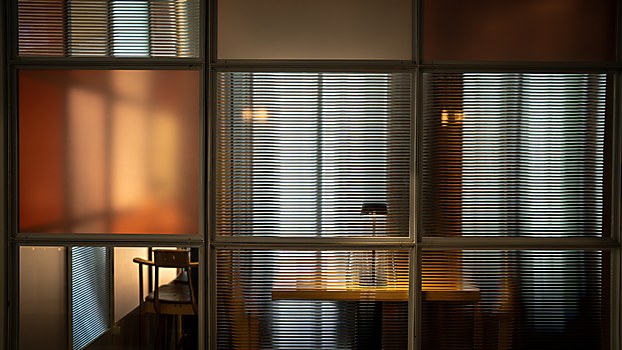
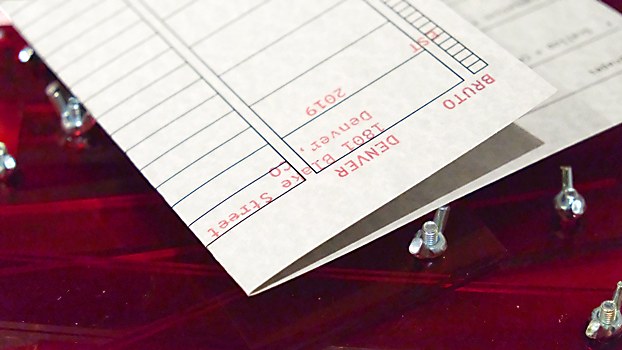
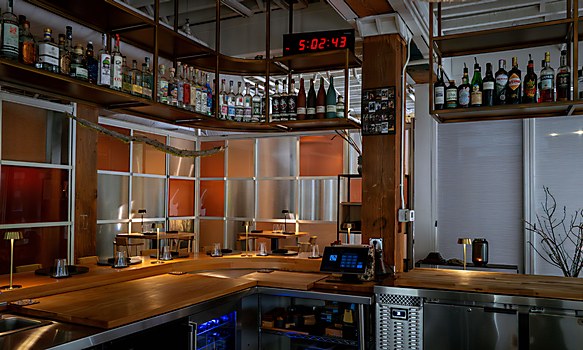
Design core: Brutalism comes in a lot of forms, but in our mind, it’s a celebration of materiality and artistry—creating deeply moving dishes, spaces and experiences with simple raw materials that are transformed through our work with them. We wanted to give the guest a deep understanding of the spirit of the Brutø brand. To that end, we tried to play with ideas of light and transparency and utilize simple, noble materials that would acquire a patina over time. On collateral, we left the technical act as a design element, enabling the layout grid to become a design-elemental menu and using a receipt as a moment of reflection. Liz Henderson, our head of web development, gave us great guidance as to trends in brutalist web design and letting function guide the form of the site. A focus on honesty and function guided our whole process.
Challenges: When you have a restaurant like Brutø that has been so successful for so long and is only getting better, we always have to be mindful that what we are bringing is additive and enhances an already amazing experience. Understanding restraint—whether in material, collateral or digital experience—as always the challenge, knowing when to edit ourselves and when to go big to enhance the story.
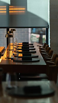
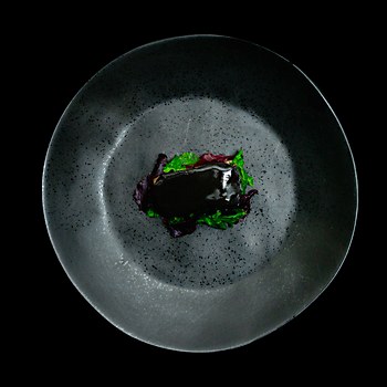
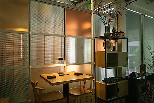
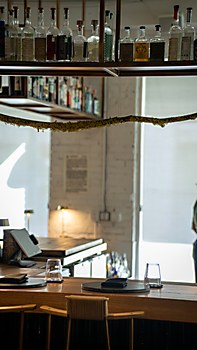
Favorite details: We really tried to bring materiality to the forefront of this project and do more with less. Brutø’s space is small and unadorned, which forces the food and hospitality to take center stage. For us it was always a game of restraint to introduce design that was thoughtful, utilitarian, material driven and stylish without seeming overly embellished or frivolous.
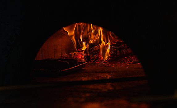
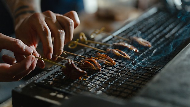
Visual influences: In the middle of the space, there is an amazing wood-burning hearth made of concrete that stands in full view of the diner throughout the meal. Generally, these ovens are tiled over, but this was just raw and so interesting. There is really nothing hidden in Brutø’s experience, and we wanted to channel that in the design systems. We looked at a lot of brutalist movements to help further those ideas, looking at interesting projects across the globe from Central and South America to Eastern Europe. We really tried to understand how brutalist techniques and use of material can create these very human and moving designs.
Specific project demands: The client was amazing to work with; they wanted a project that spoke to a deeper ethos and had very few specific parameters. They were great collaborators when it came to ideas like the impact receipt, which helps diners visualize their impact to the environment against the price of the meal. It is really unique when a client can collaborate with you in that way and made the project a real joy to work on.


