Responses by Tristan Roques, art director, KesselsKramer.
Background: Holland Festival, an annual festival for international performing arts in Amsterdam running for 77 years, is well-known for selecting the most innovative performing artists from all over the world. For its dedicated fanbase, Holland Festival is an established name, but to a larger, more diverse audience, it’s less familiar. This year’s campaign aims to show what Holland Festival is all about to a new audience.
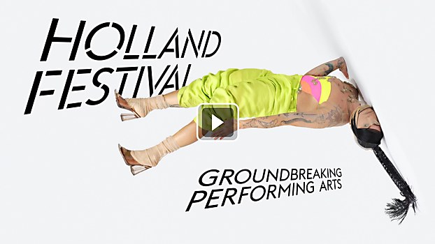
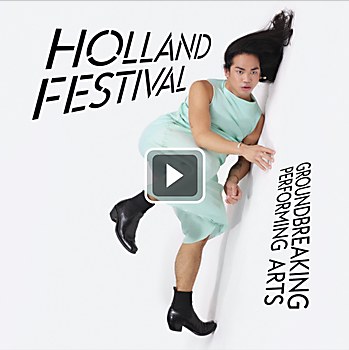
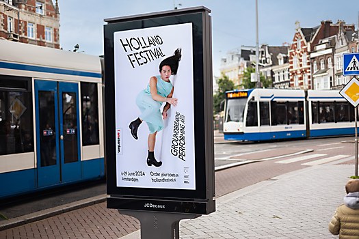
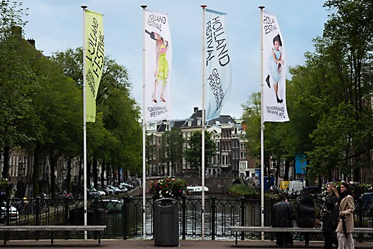
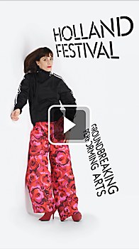
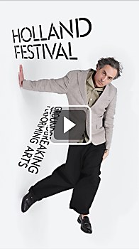
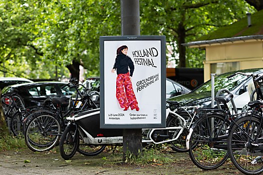
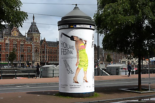
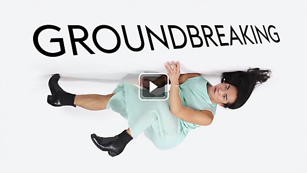
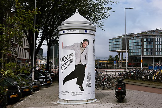
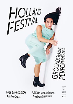
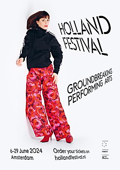
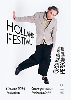
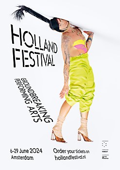
Design thinking: We introduced a new tagline—“groundbreaking performing arts”—to show a new audience that Holland Festival is the place for them to see something that they have never seen before. Artists became the face of the campaign because, after all, they are the ones that make the festival groundbreaking. They are the ones that show us different perspectives, break rules and shatter conventions. Everything in the campaign was designed to show this: artists were depicted in different, sometimes confusing perspectives; typographic rules were abandoned; and everything was shown on unconventional mediums.
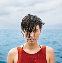
Challenges: For photography, we worked together with the duo Anuschka Blommers and Niels Schumm of Blommers/Schumm. Their work, which often plays with perspective tricks, was a perfect match for the campaign. However, getting artists from all over the world together in their studio in Amsterdam was a bit of a challenge. Luckily, Holland Festival found four international artists from Brazil to the Philippines that live and work close by, making Yannis Kyriakides, Flavia Pinheiro, Joshua Serafin and Naomi Velissariou the faces of this year’s campaign.
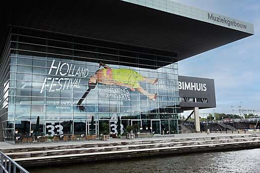
Time constraints: The project started three months before the festival, so we had to work on a tight schedule. Since photography was part of nearly all campaign assets, that became the primary focus. We began casting and shoot preparations in the first weeks of the project. After the images turned out to be so striking, our confidence increased in the rest of the campaign, and it was only a matter of placing the images onto all the different media. This list of campaign assets was extensive—from flags to cargo-bikes to enormous window stickers. We are very thankful to the internal design and production team at Holland Festival for their help with getting it realized. Without them, this campaign would have never been this visible.
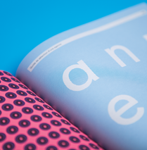
Visual influences: For its last few editions, Holland Festival communicated graphically, which inspired us to do something different. In terms of graphic design, we did this by abandoning rules. Typography was warped into three-dimensional perspectives and placed into a layout that did not follow a strict grid. In terms of photography, we chose to not show performers in a theater. Instead, we showed them in a decontextualized white space, wearing mostly their own clothes. Letting go of these rules and creating some kind of in-betweenness felt more unique and in line with the spirit of the festival.
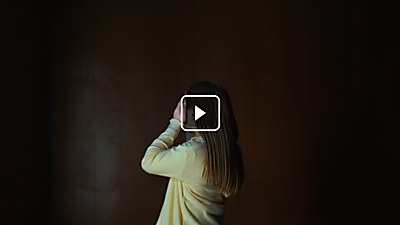
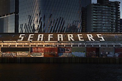
Favorite details: Blommers/Schumm shot the campaign on a camera with an ultra-high resolution. This resulted in incredibly detailed photographs that gave us a lot of freedom. For instance, they were animated for the festival trailer, shorts and bumpers, bringing the performers to life on screen. But the images were also perfect for some of the larger-than-life print assets, one of them being printed onto a 40-meter (~430 sq. ft.) facade. Seeing that photo you’ve spent hours looking at on your little computer screen suddenly on a building 100 times your size, you can’t help but feel proud.


