Responses by Filmograph.
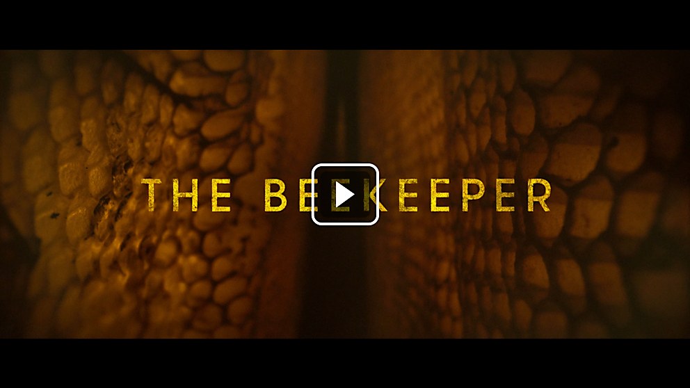
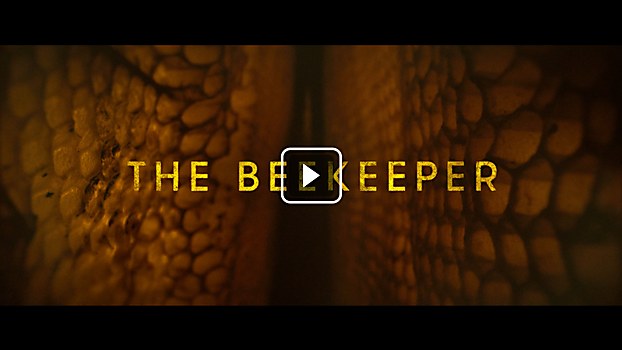
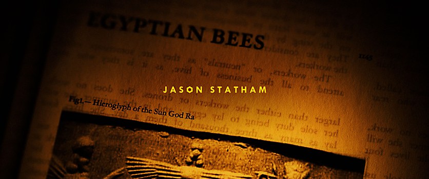
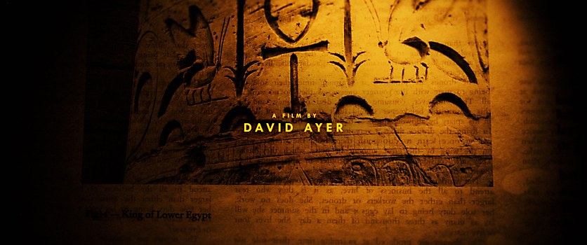
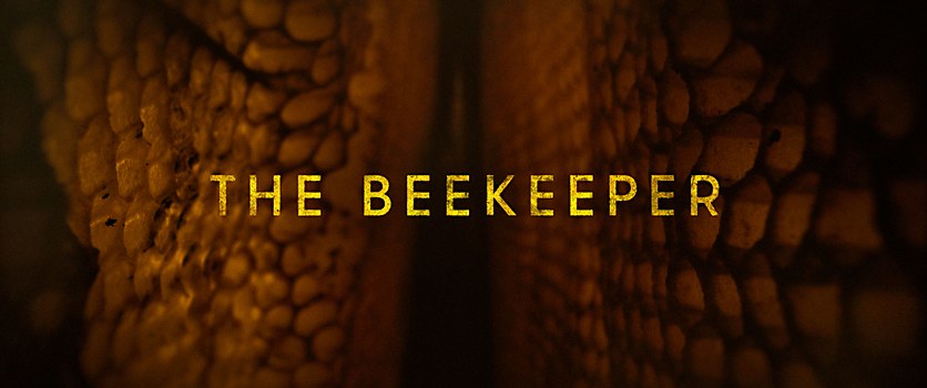
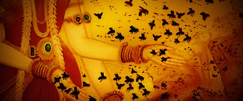
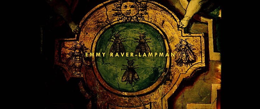
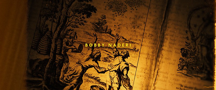
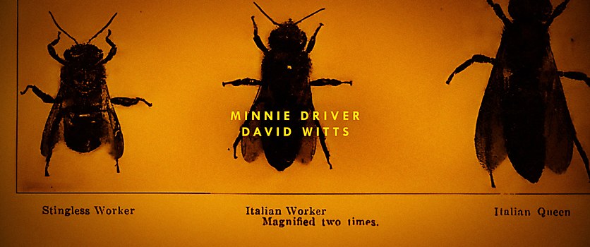
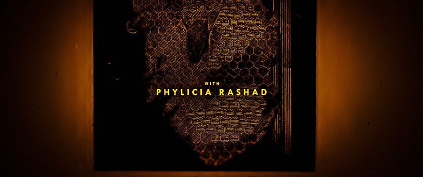
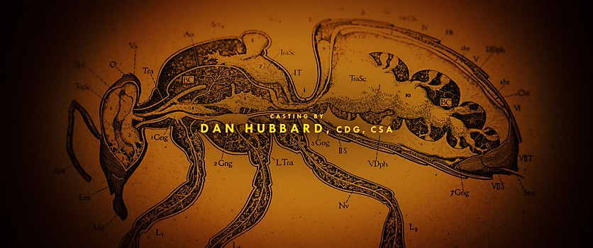
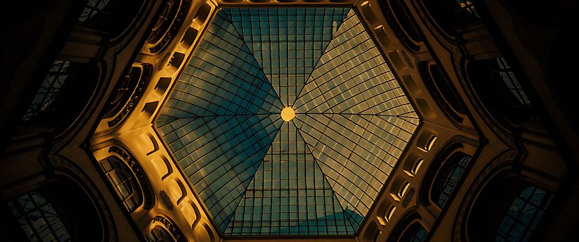
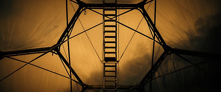
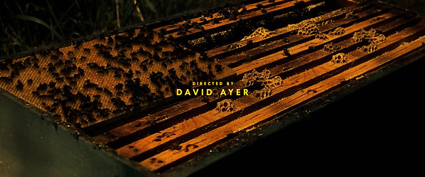
Background: We were tasked to create a compelling prologue for the film The Beekeeper that establishes a history of bees and their impact on society’s development over time. The sequence then advances to the film’s present scenario, leading the audience into the film’s storyline. Employing a mix of custom and found imagery, as well as subtle typographic animation, we developed an emotive montage designed to initiate the audience into the film’s world and provide a sense of backstory.
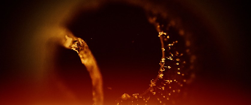
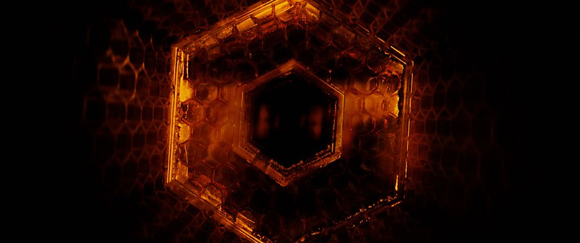
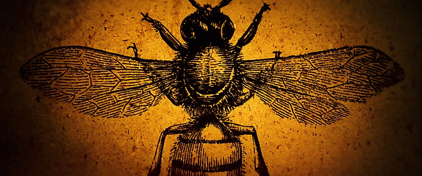
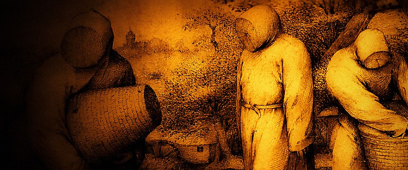
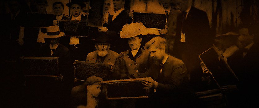
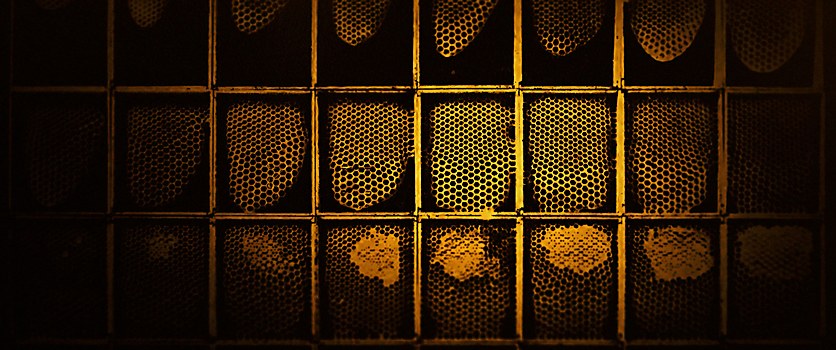
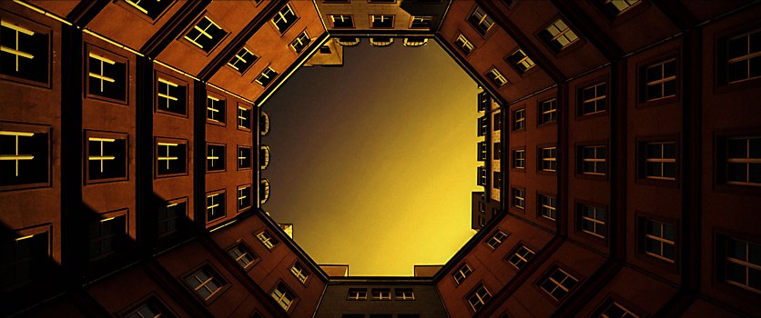
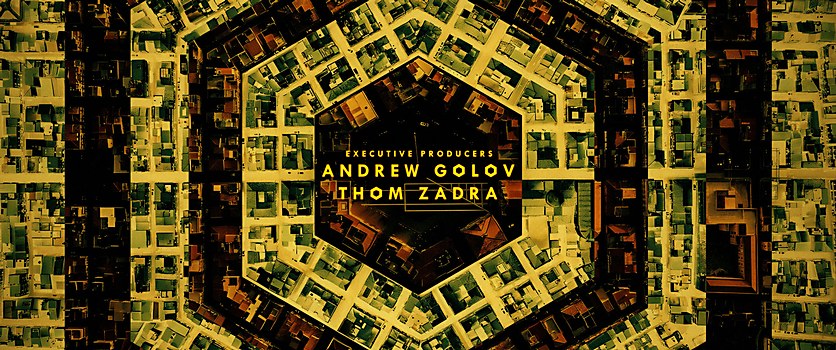
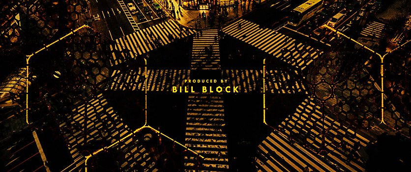
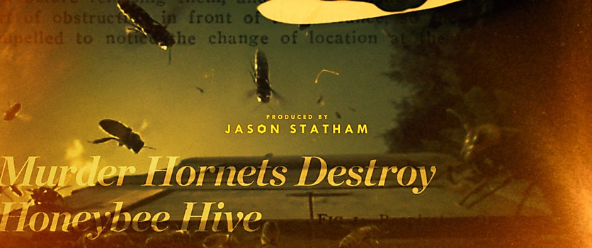
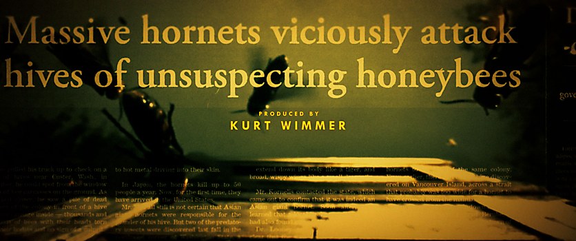
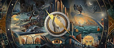
Design thinking: We took a bit of a different approach and allowed form to help us find our story. We knew we wanted to explore the idea of how bees have helped organize our societal structures. We looked for images where we could find manmade structures and patterns of movement that corresponded to the way bees create their hives and move through their environment. Once we developed that visual relationship, we kept researching back in time and around the world for imagery from societies that had venerated bees and acknowledged their impact. Having all those elements as a backstory, we focused on setting the stage for the predicament that The Beekeeper presents. We did that by creating media headlines that hint at the film’s plot. Finally, all those pieces were re-ordered and edited to bring the final sequence together.
Challenges: This being a contemporary story, we wanted to carefully communicate the vast legacy of bees throughout history without undermining the current feel of the film. Given the limited runtime of any title sequence, making the best use of time and striking the right balance editorially were crucial in achieving a far-reaching feeling of travel through space and time.
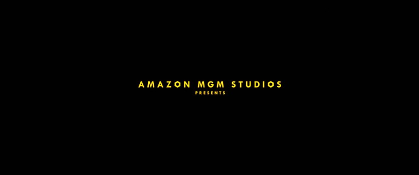
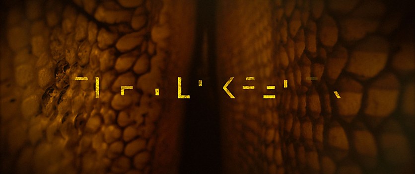
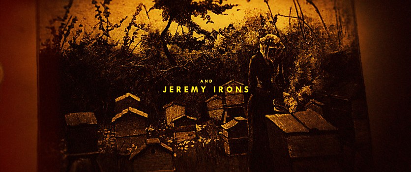
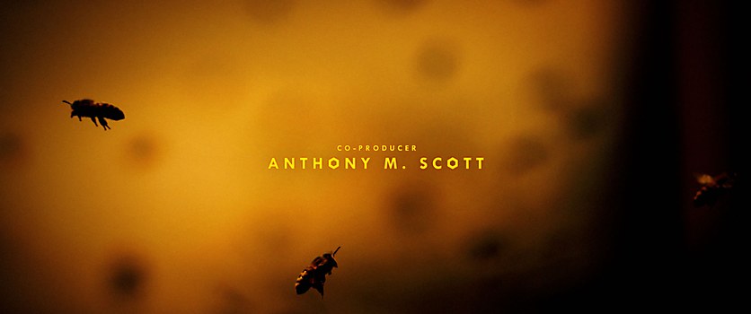
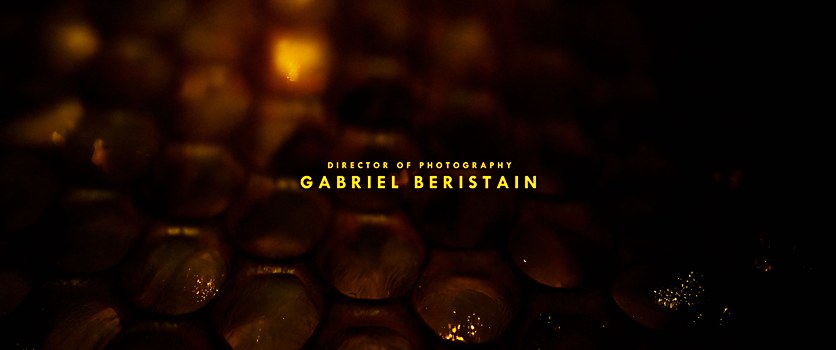
Favorite details: These are several elements throughout that were painstakingly created using different techniques. We are proud of all of them, but we would perhaps most hope that audiences who see the film on the big screen will pick up the subtle, twitching typographic elements on the various credits. The understated motion of the letterforms almost feels like an Easter egg that aids in creating a feeling of agitation, lending itself to the plot line that follows.
New lessons: I wouldn’t say we learned anything entirely new, but with each project comes a cumulative impact on how we might approach the next creative challenge we face. One of these lessons is to continue embracing your visual instinct or design style. Don’t be afraid of making very quick decisions. Sometimes not obsessing is the key to dynamism, so doing a layout, tweaking it quickly and moving on can produce exciting results you wouldn’t otherwise arrive at if you spend hours manipulating a single image.
Visual influences: We spent a great deal of time looking through thousands of archival references, from Greek antiquity ceramics to medieval etchings to Gothic architecture and all the way to the present-day hexagons in Tokyo’s Shibuya crossing. We didn’t rely on a particular visual style to guide us, but rather the forms that are found among the life of bees.
Specific project demands: The only issue we felt was a slight lull in the middle of production, which may have been the result of the ongoing strikes. We were able to fight the impulse to be fully pencils down and find ways to create nonetheless.
Alternate paths: We would probably try to have a single day of additional photography to see what kind of supplemental macrophotography of bees we may have been able to capture, but all in all, we’re very pleased with the result.


