Responses by Jairo Guerrero, chief executive officer, SoyJairoGuerrero.
Background: Days Without End is an independent record label for music that takes a conceptual approach and is conceived as sound art rather than conventional songs. The catalog includes genres that range from ambient music and new age to experimental electronica and tape looping.
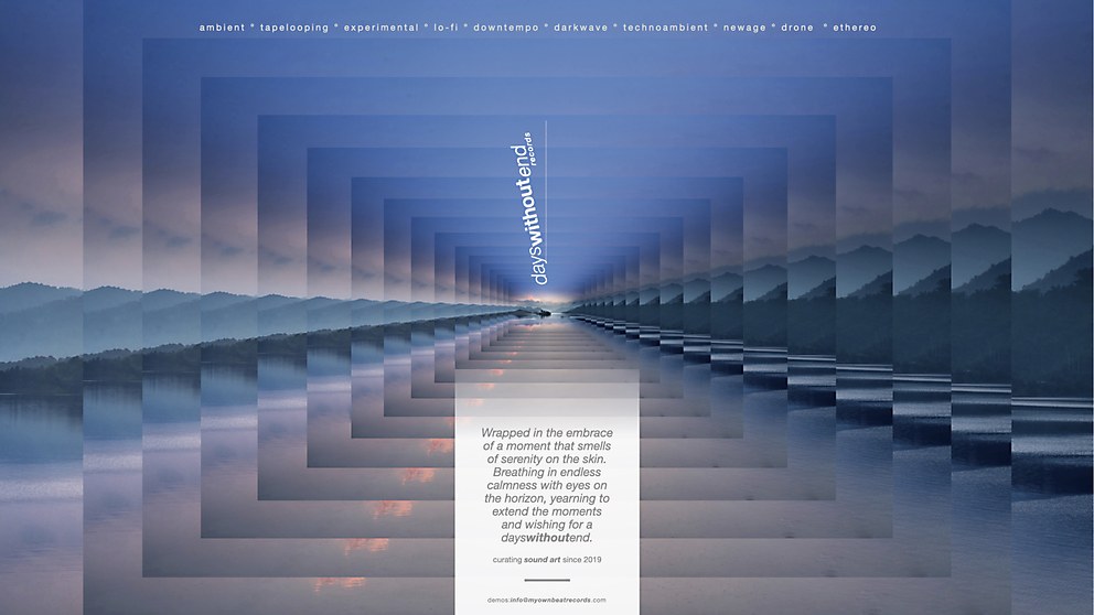
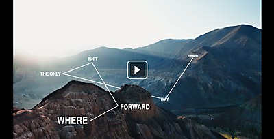
This campaign communicates and connects the label to its visual DNA. It speaks in a conceptual, poetic language, similar to how a sound artist perceives music. It also encourages submissions to a label that treats music not only as songs, but as pieces of sound art.
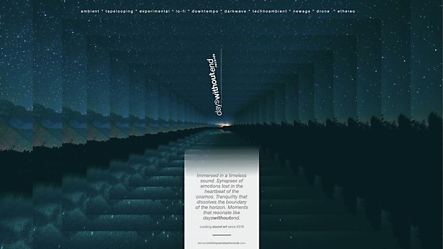
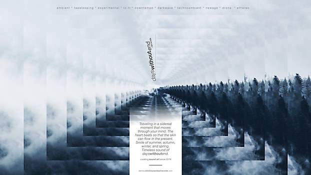
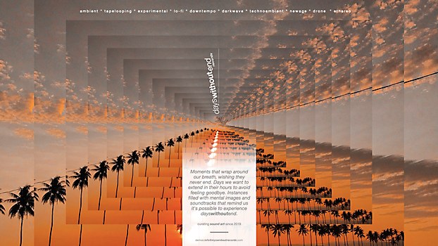
Design thinking: The focus is on making all the music selected for a label feel timeless. These sounds invite repeated listening, creating an endless experience that transforms moments and days into what we call “timeless”—space and time without end. With that in mind, we sought to create a series of graphics that, through the use of collage and geometric repetition, convey the notion of an idyllic moment that stretches into eternally. This generates a type of visual timelessness that encompasses that past, present and future.
Favorite details: First, it was thrilling that the project and the brand’s DNA let us transcend the boundaries of advertising texts, delving into a more poetic and literary realm.
Second, being able to work with a product whose DNA is closer to a conceptual, artistic world rather than making products for mass consumption. This compelled us to move in a completely artistic direction in terms of text, concept and visuals.
Last, we sought not only to communicate the timelessness behind the label’s sonic concept, but also ensure each print was a kind of artwork, akin to the music curated by Days Without End.
Specific project demands: The demand was primarily aesthetic and conceptual. Departing from conventional patterns in advertising communication to develop design is venturing into uncharted territories. The designs don’t adhere to conventions: there’s no title, reason why or hero image. The entirety is itself an artistic piece, and achieving that from an advertising perspective always presents a challenge. Additionally, composing the texts proved complex; in the end, I felt like I was writing poetry that, one way or another, spoke about myself and my perception of the music released by the label.
Visual influences: I love the simplicity in which we managed to communicate something as profound as the soul and DNA of a record label. The premise was: “music to time travel within an instant.” A simple yet complex moment. After extensive exploration, we arrived at the solution known as the pattern effect—the repetition of graphic elements through a play of volumes. No elaborate digital effects or complex, expensive photo montages were used.


