Responses by PORTO ROCHA.
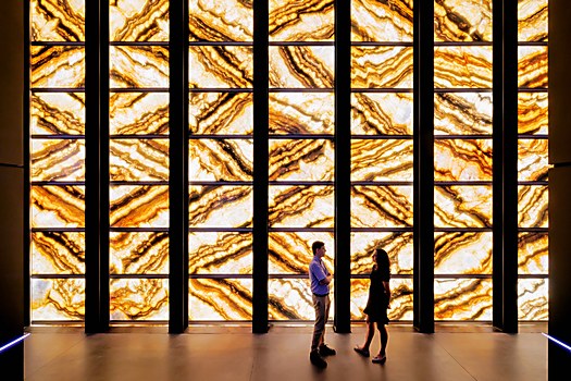
Background: The purpose of this project was to establish PAC NYC as a cultural beacon at the historic World Trade Center site and reimagine the role a performing arts center could play in bringing people together. The target audience ranges from New Yorkers in all five boroughs to visitors from around the world, encompassing diverse demographics and cultural backgrounds from plumbers to politicians.
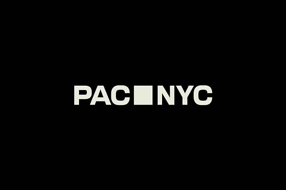
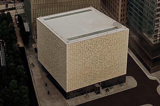
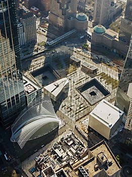
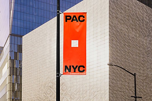
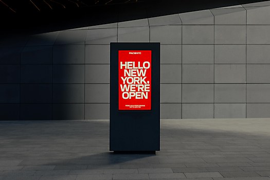
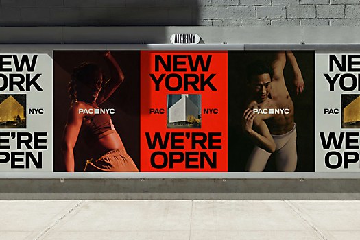
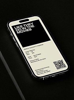
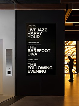
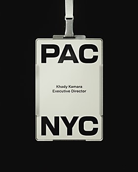
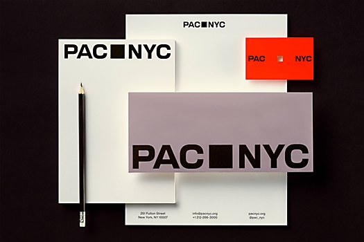
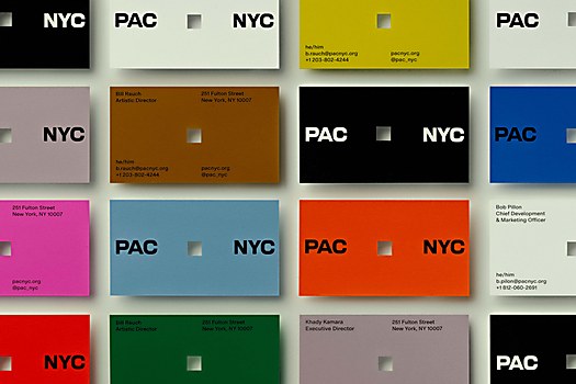
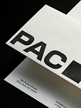
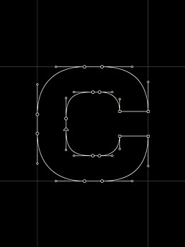
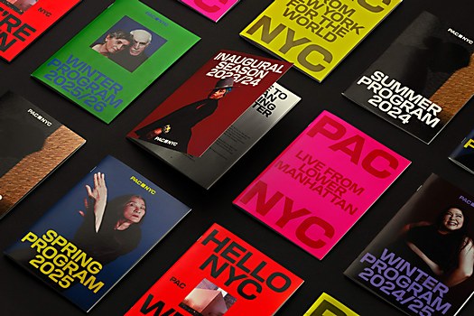
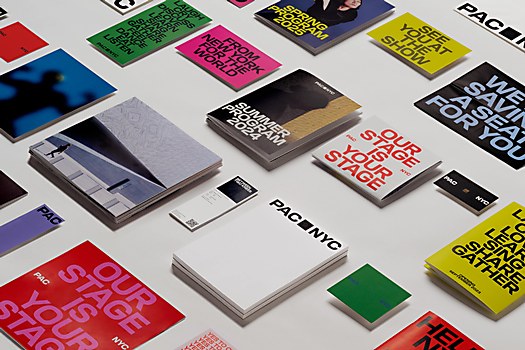
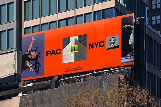
Design thinking: Our solution aimed to create a welcoming and inclusive brand identity that invited the world in. To honor the building’s form, we used the building's shape—a perfect square when viewed from above—as the core component of our wordmark and type forms. The square was something only PAC NYC could own, and we made it the hero in our identity.
Challenges: Overcoming the historical elitism associated with performing arts institutions while simultaneously honoring the significance of the World Trade Center site. Balancing accessibility with prestige required careful navigation to ensure the brand resonated with seasoned performing arts enthusiasts while remaining inviting to those historically excluded from it.
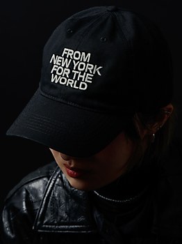
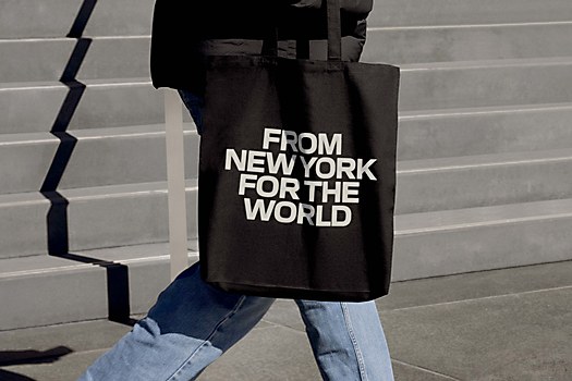
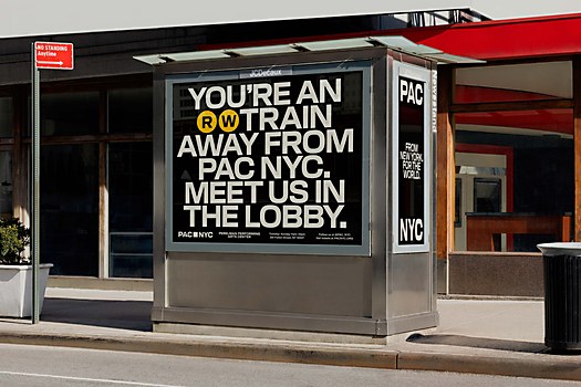
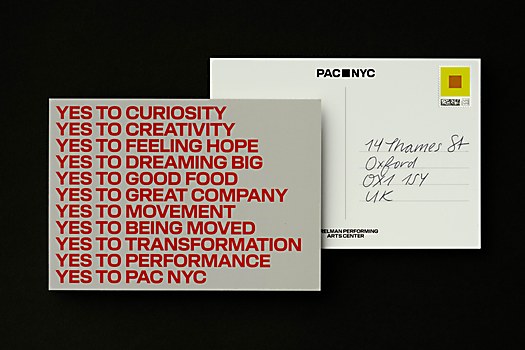
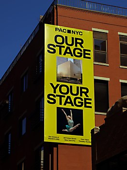
Favorite details: Each brand element has its own role to play, so we can’t single one out! We’re proud of how each aspect of the brand identity works together. From strategy to naming to design and tone, everything works in harmony to create a warm, welcoming brand that lets all different types of people see a place for themselves within it. The significance of working on a project at this scale with such cultural significance for New York City and beyond is a source of pride for us, especially as an international team.
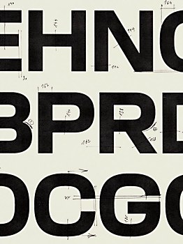
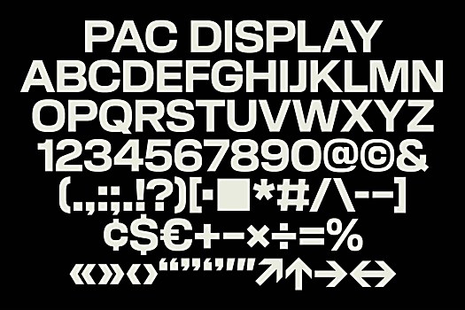
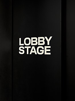
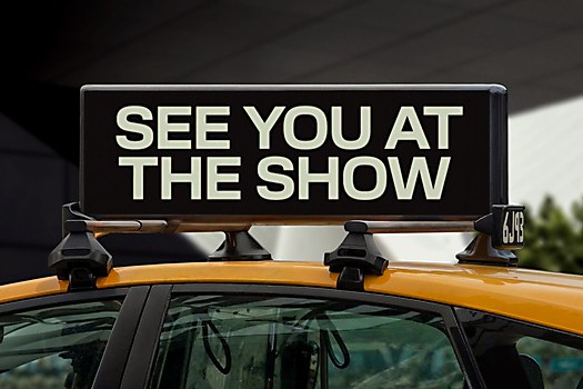
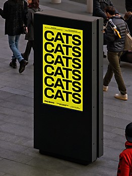
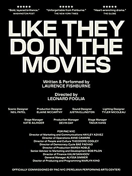
Visual influences: We drew from PAC NYC’s iconic architecture. In creating the logo, we meticulously designed each letter in the be a square ratio to mirror the cube shape of the building. References to 19th-century gothic street signage informed the design of the custom typeface, called PAC Display, utilizing a flexible approach to typesetting and layout that ensures it can become synonymous with the institution over time. Taking that same square, we imbued it with vibrancy through a motion system that literally opened up to house a range of content: the energy of artists and audiences, food, and entertainment.


