Responses by Christine Gertsch, type designer.
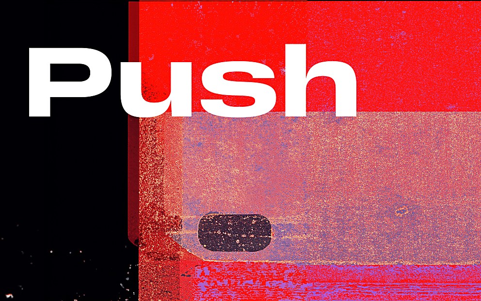
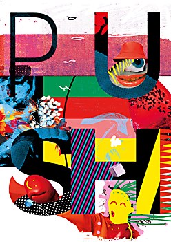
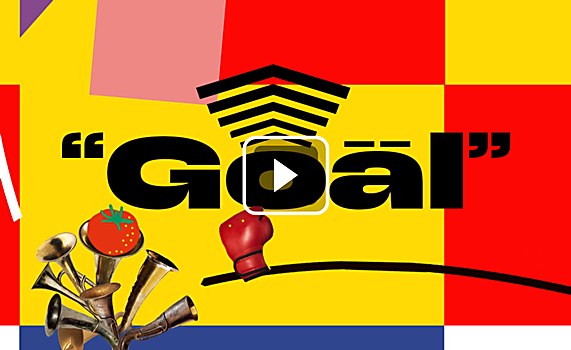
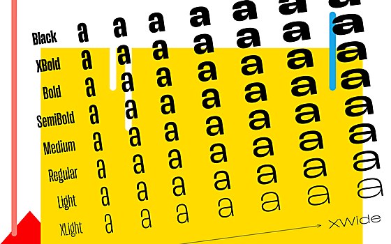
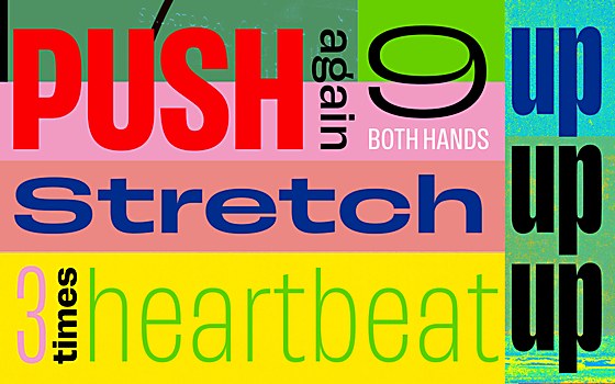
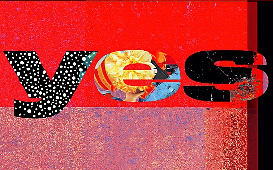
Background: Push is a sans serif type family of eight weights at seven widths, as well as an accompanying variable version. My goal was for the individual styles to show subtle differences in characteristics while sharing a common core—for example, the wide styles become more bulky, the regular widths more rounded, and the extra light styles a little more curved and more delicate. Push is designed to perform in bold headlines, distinctive branding applications and demanding editorial settings.
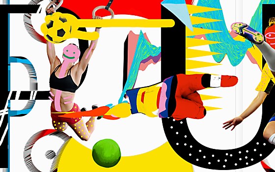
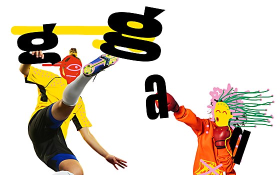
Design thinking: I hope that these style variations lead to a versatile type family that offers some interesting typographic possibilities in terms of style combinations—a sturdy headline with a delicate lead, for example, accompanied by a more austere body text. An analogy to this concept can be drawn from athletes: depending on what is important in their discipline—speed, strength or endurance—they require different physical qualities.
Challenges: When you design a variable font, you need to control every instance within the design space. It is more about designing a system than individual weights, which I find to be an interesting challenge. Since the curvature evolves into different tonalities along the weight and width axes, I had to figure out how many masters I needed and where to place them on the axes.
Favorite details: I am glad that the concept of variable curvatures was feasible. It took a few tests to find out how many masters to draw and where to place them in the design space, but in the end, everything worked out as I intended. I also think that the stylistic alternates such as thin accents and thin punctuation can be interesting features. They catch the eye a bit in a rather reduced typesetting.
New lessons: I learned a lot about the technical aspects. Fontwerk’s Olli Meier, who did the font engineering, was a great help when it came to testing and finalizing everything.
One particular phenomenon I encountered for the first time was the appearance of kinks. Under certain circumstances, outlines would break during interpolation. The trick to avoiding this was to keep the ratios between the points identical in all masters. This was a rather tedious and time-consuming process, and I had to turn on some good music to keep me motivated.
Visual influences: I like the bold and graphic style of early 20th-century grotesques and looked at various historic specimens of that period. However, Push is not a revival or reinterpretation of an existing typeface. My goal was to incorporate some elements that lend a contemporary look to the typeface, such as thin joins or the vertical ear of the g.


