Responses by Jon Dowling, cofounder, Counter Print.
Background: The purpose of Optic is to provide a comprehensive survey of optical effects in graphic design and celebrate the beauty and impact of optical illusions. The target audience for the book is graphic designers and design enthusiasts who are interested in exploring and incorporating optical effects into their work. Through curated sections and insightful interviews with influential designers, Optic aims to guide readers through an exploration of optical artistry, deepen their understanding of the power of optical effects and inspiring them to create their own.
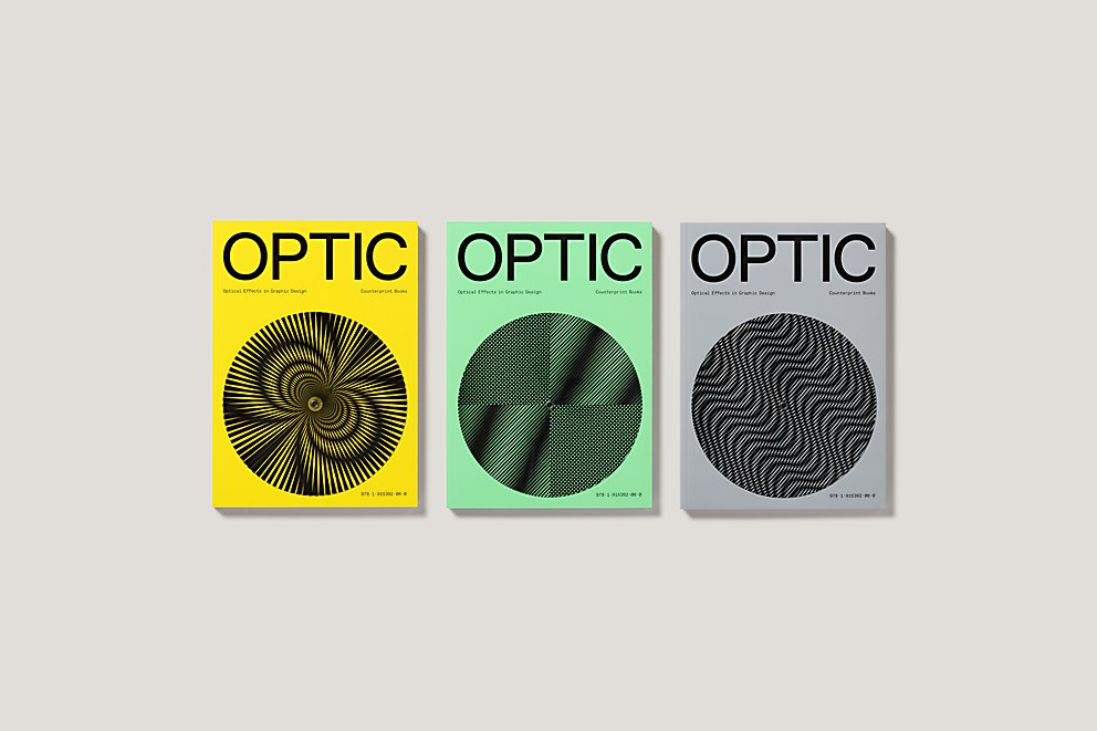
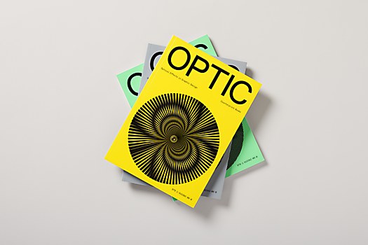
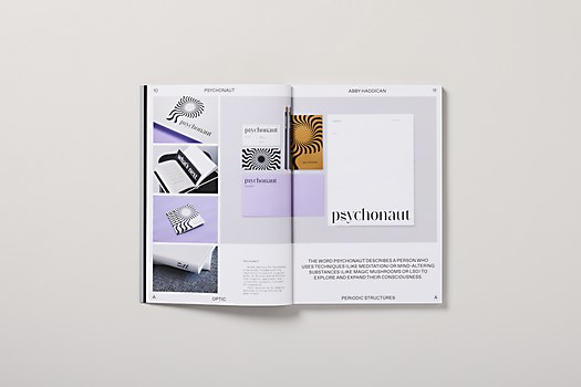
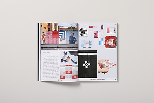
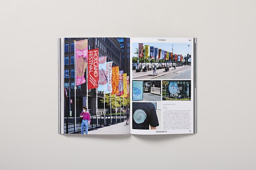
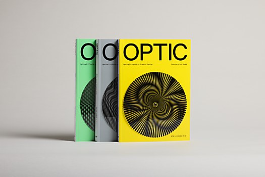
Design thinking: Optic involved a multitude of design considerations from both a publishing and design perspective, hopefully resulting in a visually captivating and thoughtfully curated experience. The three covers in different colors, adorned with hypnotizing moire patterns that appear when spun, were intentionally designed to immediately seize the reader’s attention and invite further exploration. Throughout the book, vibrant and eye-catching imagery showcases a diverse range of projects incorporating optical effects, creating an immersive visual journey.
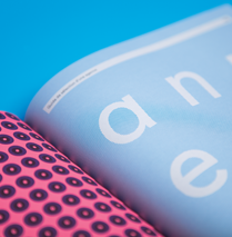
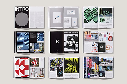
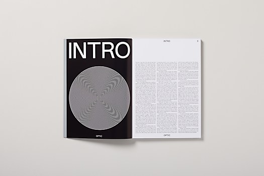
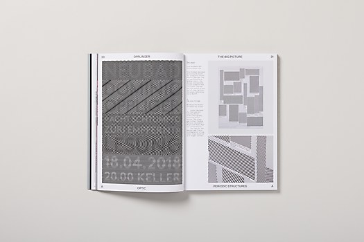
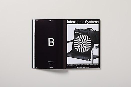
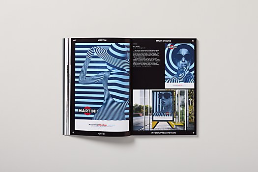
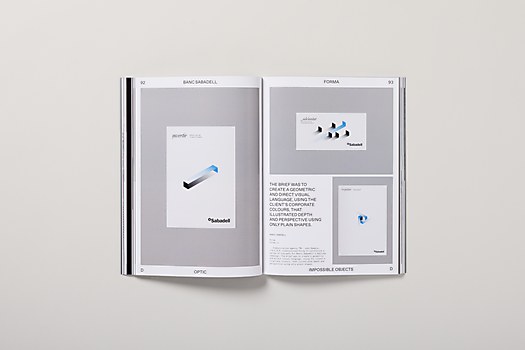
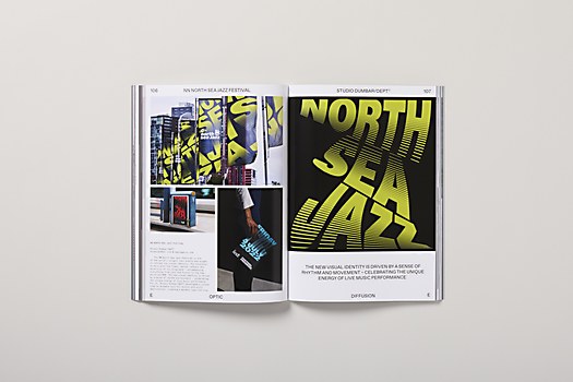
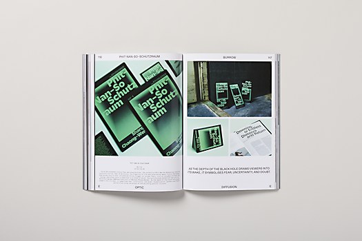
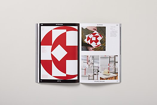
The internal spreads of Optic adopt a deliberately sparse design, ensuring that the focus remains on the showcased work rather than overpowering it. The color palette, limited to classic black and white, pays homage to the historical significance of op art, the two key colors historically associated with the movement.
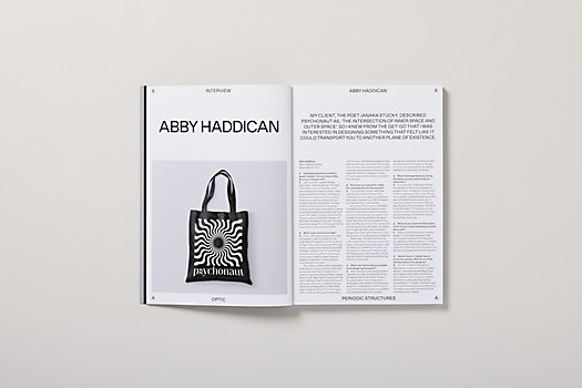
The book’s curation follows a thoughtful organization with curated sections dedicate to various aspects of optical artistry. This approach enables readers to delve into specific areas of interest and gain a better understanding of the innovative applications and techniques employed by graphic designers. Moreover, the inclusion of insightful project descriptions and interviews with renowned creatives and influential designers adds depth to the book. These interviews not only showcase their exceptional use of optical illusions, but also provide invaluable insights and inspiration, enabling readers to learn from industry leaders and apply their wisdom to their own designs.
Challenges: The construction of the cover presented a challenging task. Our goal was to create a simple yet fully functional spinning disk that could withstand the printing process without rubbing off or causing damage to the book itself or other books within the packaging. This required extensive experimentation to ensure a high-quality result.
To curate the content of the book, we also invested significant time in studying and analyzing the wide array of optical illusions prevalent in contemporary graphic design. Through our research, we identified several prominent forms such as periodic structures, interrupted systems, relief, impossible objects, diffusion, illusory contours, figure-ground, proximity and isometric illusion. These carefully selected forms served as a guiding framework for populating the book with exemplary works that showcase the power and creativity of optical effects.
Favorite details: The most challenging part is also the part we are most proud of. The book has three covers in different colorways with moire patterns that create optical illusions when spun. This design element immediately captures the reader’s attention and reflects the central theme of the book. The careful construction of the spinning disk on the cover hopefully showcases our dedication to creating an interactive, visually engaging experience.
New lessons: I enjoyed writing the foreword and establishing the thread that lead to the op art–inspired designs seen within the book. Op art’s origins date back many years, with influences from artists since the neoimpressionist paintings of Georges Seurat and manifestations in movements such as futurism, Bauhaus and prewar abstraction. Additionally, I learned about the key figures and pivotal moments in the development of op art, including the influential exhibition The Responsive Eye at the Museum of Modern Art in 1965.
Our research highlighted the significance of black and white in op art, both for its ability to achieve optical effects and create dramatic contrasts. I also explored how color became a focus of experimentation for some op artists, offering different effects on the viewer’s perception.
Throughout the research for this written piece, I encountered numerous examples of op art’s influence on graphic design, ranging from iconic identities like The Woolmark Company and Olympic Games’s logos to contemporary explorations by today’s designers. This reaffirmed the enduring impact of op art on the discipline and its continued expansion and innovation.
Specific project demands: The task of curating a book on optical illusions inherently posed challenges due to the intricacies of visual perception. Our primary challenge was to establish a framework that would effectively accommodate a wealth of information while maintaining focus on the content.
To address this, we adopted a rigorous, structured design approach. The grouping of projects and page layouts were meticulously organized to ensure a coherent presentation. The design intentionally embraced a rigid structure to provide a clean, unobtrusive backdrop for the showcased content. By adopting this approach, we aimed to create a balance where the design supports the content without overshadowing or overpowering it.


