Responses by José Pablo Cardone, writer, DAVID Buenos Aires.
Background: This is the agency’s first project for Grindr, a dating app for the LGBTQ+ community, so we wanted to create a powerful message that resonates with everyone—a message that celebrates the community’s natural beauty and diversity. Imagine a visual that captures the essence of Grindr: a place where everyone can find someone.
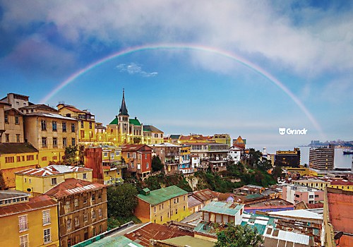
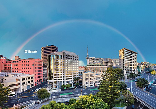
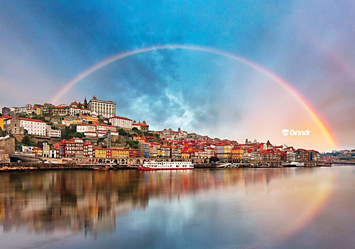
Design thinking: Today, we are surrounded by a lot of stimuli and ads from all over the world. The objective for this project was to find that simple thing that makes you think of a brand, to find a simple way to say Grindr is an LGBTQ+ app for dates. We think we found that in the rainbow. The rainbow unites one point to another, just like how the app connects people. The rainbow is something from nature, just like LGBTQ+ people. And, obviously, the rainbow is the most recognized symbol to talk about the LGBTQ+ community. Everyone can use the rainbow, but in this case, these types of campaigns are the ones that only a brand can use in its complete sense—and that brand is Grindr.
Challenges: The biggest difficulty was finding a simple icon, something that’s been right in front of us all along. It might sound a bit obvious, but yes, there it was: the rainbow. This simple element is the most recognizable symbol of the LGBTQ+ community, something everyone can use. But in our case, it becomes the perfect synthesis to say: we are LGBTQ+, we unite people and we celebrate the natural beauty of diversity.
Favorite details: The rainbow is the element that catches the eye and makes us feel proud. It’s a symbol of how the app works and an obvious element that is always in front of our noses. Those are the most difficult observations: the ones that are always there, waiting for the moment to be used in the best way.
Visual influences: For these types of campaigns, you only need nature’s inspiration. Nature will provide you with the best images around the world. This is real—it can happen in your city, your friend’s city, anywhere! That’s the beauty of it. Nature provides the elements to communicate the message of the app, which promotes LGBTQ+ relationships wherever you can find a rainbow.


