Responses by Matt Burns, executive creative director and cofounder, Thirst.
Background: Bruichladdich is the most iconic values-led whisky in the world, but with this reputation comes an expectation in behavior—rule breaking, category defining, and inspiring the industry and consumers to explore and discover that there’s more to whisky than meets the eye.
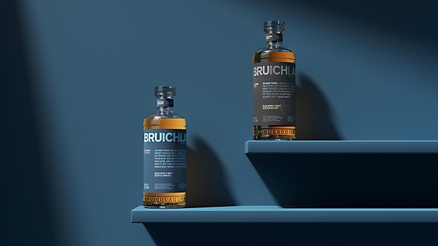
This project focused on the packaging design for The Bruichladdich Eighteen and The Bruichladdich Thirty, the distillery’s new high-provenance whiskies. With this new release, Bruichladdich sought to reach consumers seeking something greater than a liquid or product; instead, they are buying into a set of values and looking to experience something new and unexpected. To meet this challenge, we took the brand’s character and harnessed it in a way the industry had never seen before.
Design thinking: As brands move into a more prestige space in the whisky category, they tend to incorporate additional elements into the packaging design—more material, more glass and more decoration. As a values-led distillery, and the first whisky and gin distillery in Europe to become B-Corp certified, Bruichladdich needed a boldly different approach: to reduce rather than add.
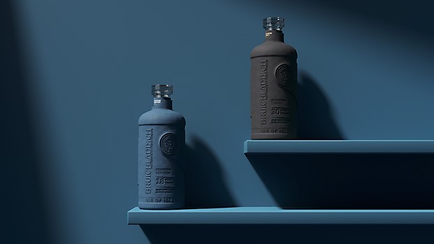
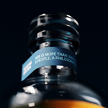
Instead, we redefined the rules of luxury, creating “more” through the power of sensorial design with a streamlined, pared-back approach, demonstrating that a high-end whisky can be both sustainable and beautiful. The result is a lightweight decanter-style bottle encased in fully recyclable paper pulp that is perfectly molded to its shape, produced using 100 percent green energy.
Challenges: In a previous partnership with the distillery, we removed the secondary pack from its core product range—The Classic Laddie, which was a huge move by Bruichladdich and fundamental in seeing its values come to life. However, this did provide a new challenge moving into the prestige end of the portfolio, competing against the glamor of traditional luxury: a naked bottle was going to have a hard time standing out.
We needed a secondary pack that didn’t sacrifice the brand’s values. So, how do you “add” without compromise? You go back to our core idea—redefine the rules of luxury. Harness the power of design to add “more.” We partnered with luxury packaging specialist James Cropper to create secondary packaging the whisky world hasn’t seen before.
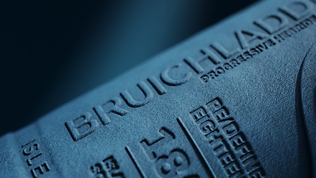
Favorite details: The outer packaging made from paper pulp is an industry first. which is hugely exciting. We delivered something entirely new for the category, and it’s hard not to be proud of that! Beyond this, one of the core highlights was crafting a beautiful, luxury, detailed finish without resorting to the traditional foils and maximalism so often seen throughout the premium spirits category. We stuck to our “less is more” approach, building tactility with blind embossing, material choices and custom clasps. It shows you don’t need all the bells and whistles to create a really beautiful design.
New lessons: Learning about the mechanics and engineering of the paper pulp technology with James Cropper was fascinating and opened up a whole new world of design opportunities. There are certainly some limitations you have to be aware of: for example, understanding how the machinery operates to achieve the level of detail in the final product. With new tech, there’s always a learning curve involved, but it’s been a hugely exciting journey. Together, we’ve achieved an incredible result.
Visual influences: Rather than aesthetic references, we found inspiration from disruptive brands in other industries that are using design as a way to create totally new experiences for consumers. For example, Away luggage: the brand looked at what’s important to the consumer both in flashy things, like USB charging, and practical elements, like design systems. So, the wheels on your Away suitcase never squeak or swivel in the wrong direction. The entire experience is simply elevated.
This is what we wanted for Bruichladdich’s luxury range: employing creative design approaches to enhance the user experience. You can see this in small but meaningful details in the bottle design like the bore, the aperture through which liquid leaves the bottle. We introduced a slight chevron for a slower, more controlled pour, always thinking about how design can improve that experience.


