Responses by Anni Koskimies, lead designer, Werklig.
Background: It’s hard to get excited when you dash into a K-Citymarket, a chain of hypermarkets in Finland, to pick up a few things at the end of a long week. But this was exactly the point with the private label design for Pirkkalan, a range of high-quality products made in cooperation with local producers. We wanted to make it clear to people busy living their lives that they had gotten their hands on something new and exciting, making the rest of an ordinary day feel a little less ordinary.
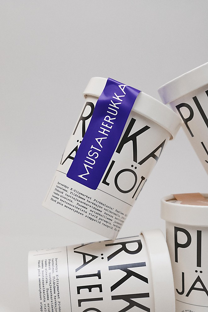
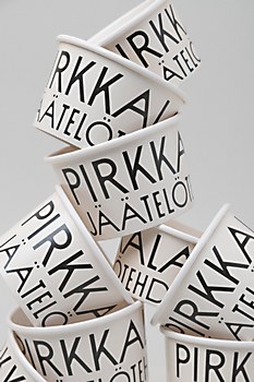
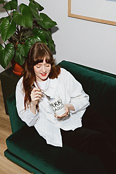
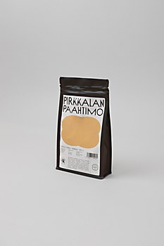
Design thinking: We wanted the Pirkkalan brand to communicate quality and locality, but we also wanted it to be different and stand out from other market brands, which are often very colorful. You won’t find many monochromatic ice cream or coffee brands in Finland, so we chose visual simplicity while highlighting the products’ artisanal quality. In this way, we elevated the brand’s visuals with a simple, distinctive elegance.
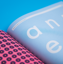
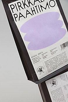
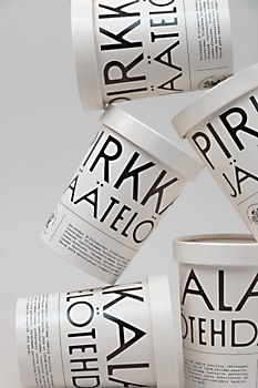
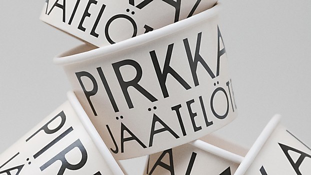
The goal was to bring a touch of nostalgia and traditional craftsmanship, inspired by old newspapers, to the identity. We wanted to contrast the brand’s monochromaticity by prominently using typography, graphic shapes and accent colors. Instead of purely going with black and white, we wanted to retain some warmth in the color scheme by opting for a softer off-white to pair with the flavor and character-based accent colors of the products.
Challenges: What was most challenging—but also really exciting—was the prospect of total creative freedom. We were lucky to have the client’s trust already as we’ve been working together for a long time—and, of course, the limits provided by the strategy work created a strong foundation for us. Visually, we were able to really think big in terms of creating a really unique private label brand that can easily scale as Pirkkalan continues to move into new categories of quality, locally produced artisanal goods.
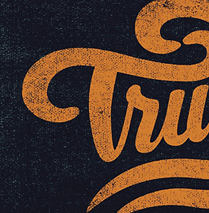
Favorite details: What I’m very pleased with is that the client trusted our minimalistic approach, which leans heavily on typographic elements. The typographic hierarchy carries the identity well, and while it’s influenced by old craftsmanship, we were still able to add some modern flourishes into the identity through color, imagery and type choices.
New lessons: This was a project where I was mainly in charge of the whole visual identity, along with execution and packaging design. We always discuss and evaluate our design choices as a team, and I got a lot of valuable feedback from our lead creative Mikko Reponen—I should mention he also created a custom illustration of Petri, too. Creating the whole visuality based on our strategy work—from visual concept to final packaging—taught me a lot about what aspects should be taken into consideration when making design choices to enliven the brand.
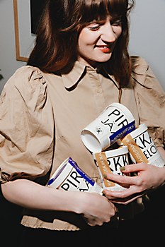
Besides design work, I also did the photography. All the photographs taken for the case are mine, from concept to execution. I wanted to challenge myself and go for more “flashy” photography to bring a more authentic, unpolished feel. Looking back, it was definitely a learning experience for me from a production angle.
Time constraints: As usual, challenges with materials along with timeline constraints caused by the packaging manufacturer’s lead times affected the final packaging. Initially, our idea was to have fully custom coffee packaging that shared the same off-white look of the ice cream cartons, but in the end, we had to go with standard coffee packs that were available faster. The result is still good, but as a designer, I’d always like to make things a bit fancier.


