Responses by Marcus Armitage, director, Studio AKA.
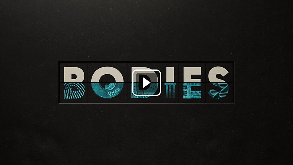
Background: For the Netflix limited series BODIES, an adaptation of comic book writer Si Spencer’s mind-bending graphic novel, our objective was to craft a captivating opening title sequence that would resonate with the show’s primary themes, span multiple time periods and seamlessly integrate the four police investigations at its core. In response to this challenge, our team delved into a graphic language that immerses the viewer in the world of BODIES by deconstructing and reassembling key elements from the original logotype of the novel. Our goal was to preserve the essence of the original BODIES logo while reimagining it to appeal to a fresh audience that might not have encountered the graphic novel before.
Challenges: Two distinct challenges stood out in the making of this sequence, one specific and one overarching. The most formidable technical challenge involved creating the blood that emerges from a bullet hole, ultimately morphing into the enigmatic three-pronged emblem from the show. This marked the sequence’s climactic musical crescendo and demanded a significant visual impact. Achieving the desired shapes and movements of the blood in these shots posed a unique challenge, often defying the laws of gravity. On a broader scale, the larger challenge was maintaining a clean, graphic sequence with no room for errors or inaccuracies. Some shots were exceptionally simplistic, requiring precise craftsmanship and lighting. The attention to detail demanded from our team exceeded what I, as a director, was accustomed to, resulting in a steep yet invaluable learning curve.
Process: In tackling the blood simulation, we approached it with a series of iterations to achieve the right look and feel for each shot. It was not a one-size-fits-all approach; each shot required a different simulation. The bullet hole shot called for a thicker, slower simulation to create a dramatic and foreboding effect, while the emblem blood needed to be thinner and flow faster to fit the required shape within seconds. This section involved a substantial amount of trial and error, but the effort was undoubtedly worthwhile. Regarding the attention to detail challenge, the entire team had to meet it collectively.
Regular screening sessions were held to review each shot, enabling multiple perspectives on the project. We were always on the lookout for details that could be perfected, resulting in a compelling, tactile image. This sequence stands out for its unwavering commitment to a tactile realm, enriched by an unmatched attention to detail at every production stage.
Favorite details: We interwove subtle clues from the show and elevated them by incorporating episodic hints. As the title concludes, a letter flips to reveal a visual clue for the episode, adding an enduring layer of mystery. Each sleek and dynamic title teases viewers with distinctive hints for the episodes, enticing them to delve deeper and unravel the enigmatic visual breadcrumbs as they tune in.
New lessons: For me, this project marked a significant departure from my previous work and led me into uncharted territory. It was a fascinating process that pushed me into the 3-D realm. We employed Unreal Engine to illuminate these scenes, providing a real-time understanding of our work and enabling us to influence the scene as though it were a live-action shoot.
Specific project demands: One distinctive feature of the title sequence is the seamless integration of credits. Rather than simple overlays, the credits are intricately woven into the movement and lighting of the puzzles—either printed on the paper or cleverly concealed and revealed by shadows. This presented a challenge as the credits changed from episode to episode, necessitating careful consideration of their placement within each scene to ensure seamless integration without disrupting the scene’s composition. While meticulous, the element weaves everything into a cohesive narrative realm.


