Responses by Cansu Dağbağli Ferreira, designer.
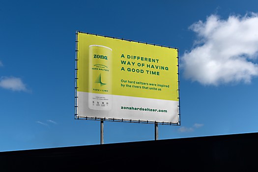
Background: The purpose of this project was to establish a unique brand identity and packaging design for Zona, the first hard seltzer brand in Angola inspired by the life-giving springs of the two main rivers in the region. The target audience is contemporary, adventurous individuals seeking a refreshing beverage with a positive impact. The brand aims to resonates wit a youthful demographic while fostering a connection to the region’s roots. The founders devote themselves to redefining the very essence of how people experience good times and embrace the fullness of life.
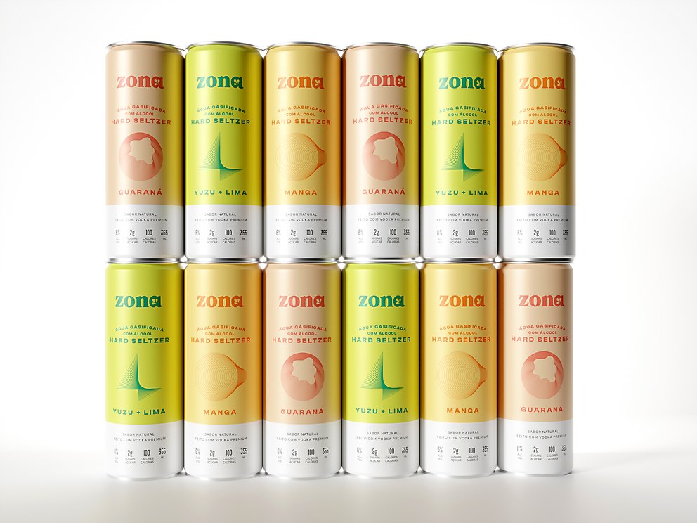
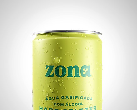
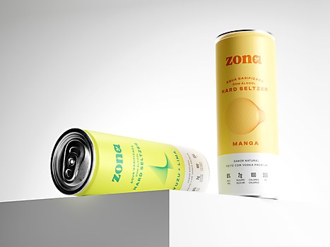
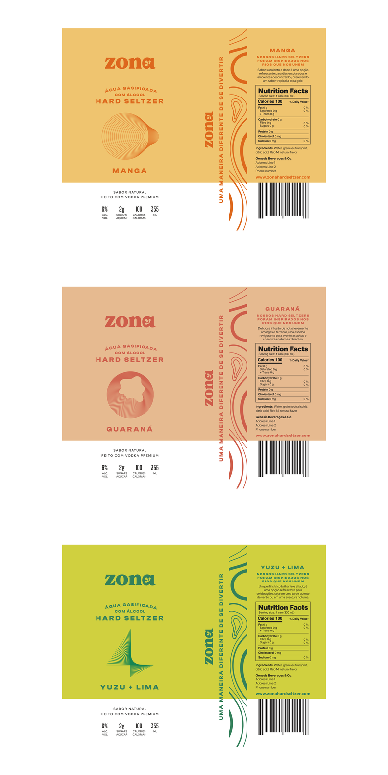
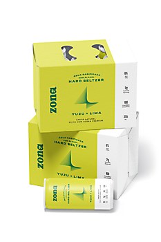
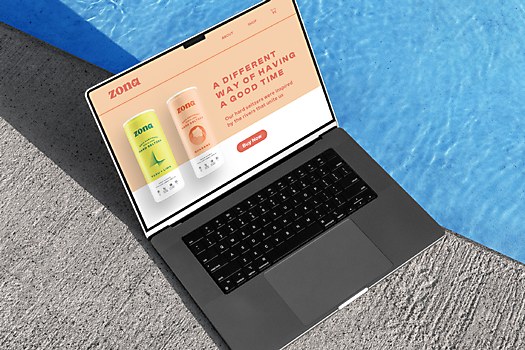
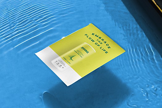
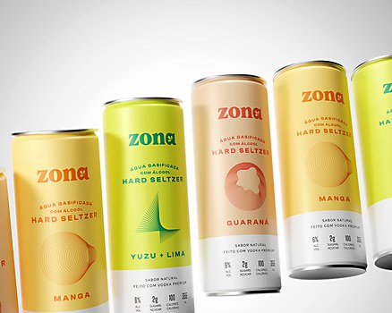
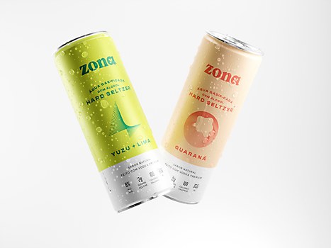
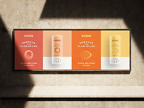
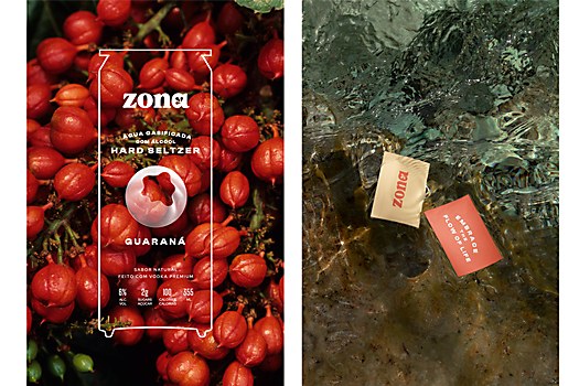
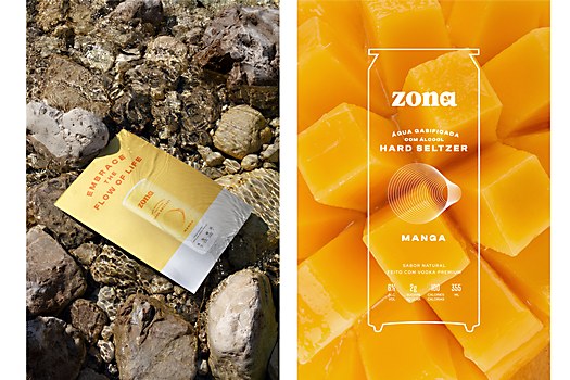
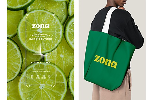
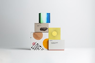
Design core: The core concept behind my solution was to visually capture the essence of unity found in the rivers of Huambo and Okavango, which serve as Angola’s lifeblood. The monochromatic palettes and geometric icons draw the eye to the center of the packaging, symbolizing the convergence of diverse influences. The clean, trendy color scheme, combined with the logo’s friendly serif typeface, creates a visually appealing and approachable aesthetic. A hidden water symbol in the logotype reinforces Zona’s commitment to the river concept and the slogan “Embrace the Flow of Life.”
Challenges: Striking the right balance between a contemporary, clean and bold design while maintaining approachability. Ensuring that Zona’s branding felt both youthful but not childish required careful consideration. Additionally, the brand owners wished to emphasize that the essence of life flows through every drop of the beverages, which posed a creative challenge.
Favorite details: I am particularly proud of the subtle yet impactful details embedded in the design. The hidden water symbol in the logotype adds depth, reinforcing the brand narrative. The use of a minimal, friendly serif typeface contributes to a warm, approachable feeling. The combination of these not only enhances Zona’s aesthetic appeal but also communicates the brand’s commitment to showcasing the rich diversity and tastes of Africa.
New lessons: This project provided valuable insights into the delicate balance required when merging contemporary design with cultural significance. It reinforced the importance of storytelling through design and the impact it can have on establishing an emotional connection with the audience. Additionally, I gained a deeper understanding of the challenges and opportunities in branding within emerging markets.
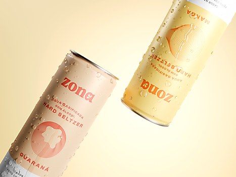
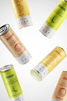
Visual influences: The contemporary design direction and vibrant cultural tapestry of Angola. The color palette matches the drink’s aromas. By integrating geometric line illustrations, I balanced vibrancy with the essence of an adult alcoholic beverage. The illustrations don’t precisely replicate the fruits but rather draw inspiration from their inherent geometry. Examining the nature of the lines reveals a subtle resemblance, subtly mirroring the form and structure of the fruits. This fusion of modernity with cultural symbolism creates a visually compelling solution that resonates with Zona’s narrative and its target audience.


