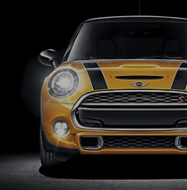
How did you get started in the field? I’m not a designer by trade—more one of the most creative suits you’ll ever meet. I more fell into the industry as I had a passion for design from an early age. I once picked up a Porsche 911 ‘Carrera’ badge off the roadside and fell deeply and madly in love with the typography. It adorned my bedroom wall next to my Pete Sampras Sergio Tacchini poster.
It was also fueled in part by a childhood spent in the Middle East and its love of luxury brands back in the 1980s where I was growing up in Dubai, Iran, Kuwait and Saudi Arabia.
What led you to establish the brand consultancy Brandon? My wife Abi and I met fifteen years ago. She was starting her life as a junior designer, and I was leading business growth at an agency in Leeds. We then followed each other’s career to the Middle East and back to London.
In 2012, we decided it was time to set our own path and venture into the unknown and set up Brandon. Our ambition was to take the best bits of all the agencies we’d worked at and wrap them up into one new home where we’d offer something new to the market. At the core, it was “helping the human in front of us,” which is why humankind is one of our leading brand values today.
We wanted to marry the family agency feel with transformational strategy and design, and we continually strive to achieve just that. It has resulted in the business growing from just the two of us in an attic to now having a London studio in Clerkenwell, and we’re about to move into a new Manchester studio later this year.
At the beginning, our work mainly focused on helping clients in the north of England, whereas now we work with international and multinational clients. Great British design travels well, and we continue to push the envelope in all that we do. We help our clients take the next stage—be that shifting brand perceptions, securing market positions or scaling—through work that delivers commercial success.
Tell us about some of your favorite projects you’ve created at Brandon. What did you like about them, and how did they change your perception of what you can accomplish with design? That’s like picking my favorite daughter (and I have three)!* Sometimes I struggle to stand still and reflect on the past, so my favorite program is always the next one—and there are two of those currently being worked on behind the scenes.
In terms of the last year, I’d say working with the team at pizza restaurant chain PizzaExpress, a true partnership where we bounce ideas and there hasn’t been a supplier mentality. The work has been critically acclaimed; we’ve leveraged their number one position in market. It’s also helping the brand to continue its dominance in the retail category and drive new people to the brand.
For me, it’s about great people working together in harmony to deliver outstanding results. That is the power of great branding, so I’m proud of that one!
*My favorite daughter depends on the day and who is being nicest to me. A moving beast.
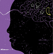
One area of interest you have is bringing neuroaesthetics into graphic design and branding. Can you briefly describe the sixteen neuroaesthetic triggers and why they’re important for capturing human attention? We as human beings naturally react to the senses that are put in front of us; we can’t help but do so instinctively. Knowing these sixteen triggers helps us to decode pieces of communication, removing human subjectivity and empowering discussions in a more objective way to inform better decision making.
One great example is the power of “orientation” as a trigger. Human faces are powerful. Remember the last time you were on a bus or train: you couldn’t help but look at people, and they couldn’t help but look back. Leveraging eyes and faces in communication draws people’s eyes (and often away from a competitor sat next to you). It’s why we see so many successful examples of brands using animals and why animals are held as one of the strongest distinctive brand assets for commercial growth.
Another trigger where you can leverage the power of design is “cusps and curves.” Curves are soft and calm, taking us into a soothing space, whereas cusps are sharp and spiky pointing to power and dominance. Monster Energy uses sharp cusps in its visual language to point to its product efficacy and extreme nature, while malted milk drink brand Horlicks uses soft curves on its packaging to take you to a calm, relaxed state of mind.
One that is often underutilized is “error,” where brands purposefully go out of their way to trick your brain with a mistake. You get a dopamine hit from it, just like when Starbucks baristas are told to misspell your name.
How have you incorporated neurodesign into your own work, and how do these principles work together to convey brand principles? Design, like any form of communication, is highly personal and subjective. We all have our individual sensibilities and tastes when judging work, and that can become troublesome in large multinational organizations. Our use of neurodesign helps bring in that objective rigor to better inform decisions. In the case of Pizza Express, we took the distinctive brand asset findings and leveraged them. The round filigree illustration was the most important asset in people’s minds and, at the time, was being used at the size of a postage stamp. So, it wasn’t leveraging this powerful memory structure. We supersize-amplified it for growth.
What do you think holds legacy brands back from rebranding, and what do you think they stand to gain from change? There has to be a problem to be solved when rebranding. It’s usually when a brand is in rapid decline that someone screams: “Get the brand design agency in!” Great legacy brands have a habit of constantly evolving and investing in design (think Coca-Cola or Shell) but many just get left on shelf to slowly lose their relevance in the world.
We awaken brand potential across three business challenges: secure, when a brand is starting to decline and we need to preserve its position and ideally stretch its lead; shift, when brands lose relevance to their audience or has an aging audience—or worse still, a combination of both; and scale, a product portfolio within a brand can lose its relevance. Quaker Oats in the United Kingdom had an aging audience and needed to recruit a younger one to ensure the brand survived. It did so with a convenient microwavable pouch format that you could slip in your bag on the way to work: “Oats so Simple.”
Every category has a dusty brand that needs rejuvenating to protect its future. It’s a case of identifying this before it’s too late, and the brand gets delisted forever. British Airways is one that I look at and, when compared to the progressive Virgin Atlantic, think: ‘Crikey, someone needs to get hold of that and drag it into the 21st century.’
With three decades of experience in the design industry, what would you say your experience has taught you? One of my favorite brands is The North Face. The outerwear apparel brand’s mantra is to “never stop exploring,“ and that is something I hold true to my core. Richard Branson once summed it up far better than I ever could: “The brave may not live forever, but the cautious do not live at all.” So, go take a swing of the bat. What’s the worst that could happen?
The industry is rapidly using technology to derisk subjectivity, and that can only be a good thing for the future of design. Especially at the top table, influencing C-suite decision makers with facts and not fiction. AI is a great tool to speed up design and drive efficiency and effectiveness, but it’s not going to drive original thought like a human. I’m excited by its future and how we empower it to drive that efficiency.
Do you have any advice for people just entering the profession? Follow your passion. If you aren’t passionate about design, then don’t do it. Design isn’t easy; it takes hard graft. Too many walk into the industry with ambitions of grandeur but a lack of understanding as to the hard work and continuous learning needed to take you to the next level of your career. Never stop learning! ca


