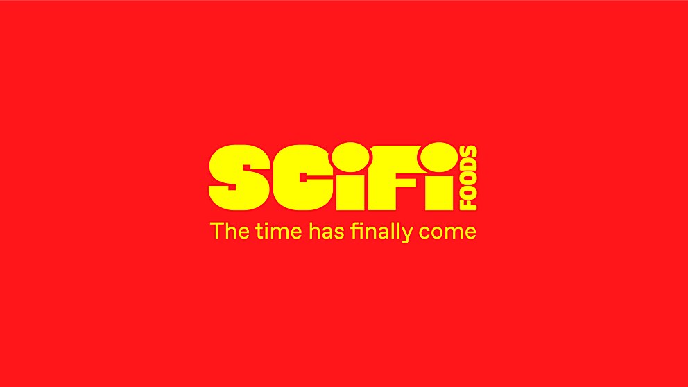
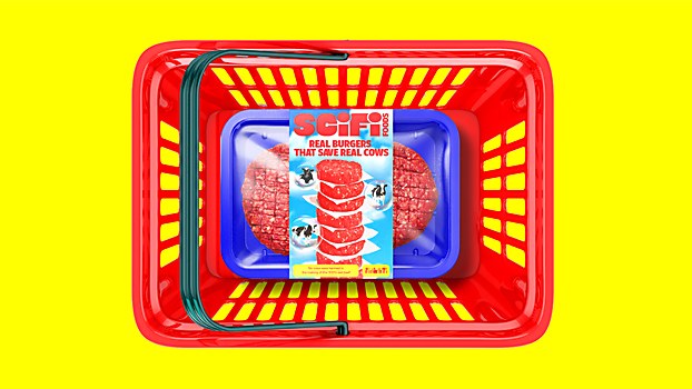
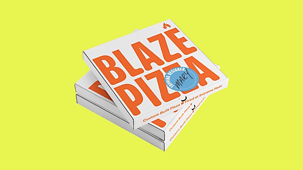
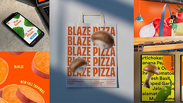
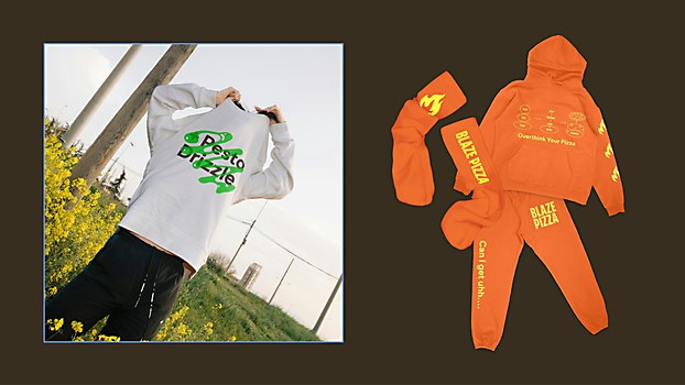
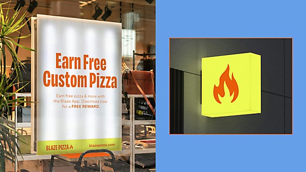
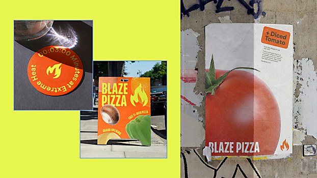
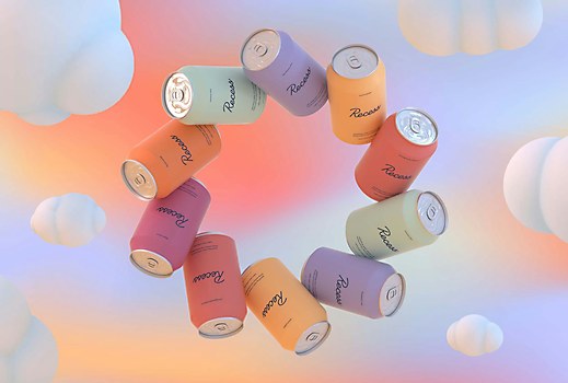
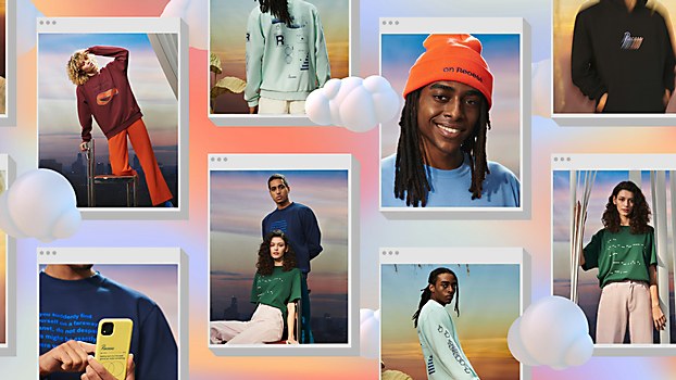
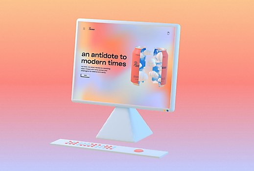
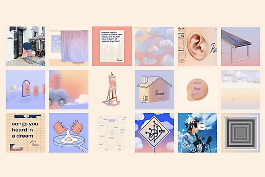
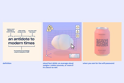
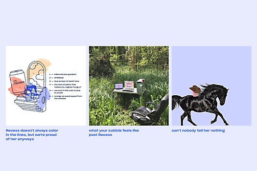
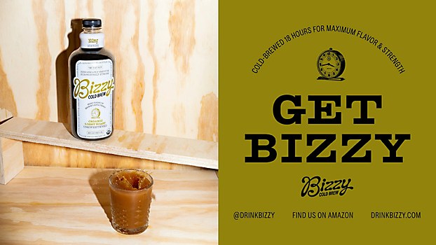
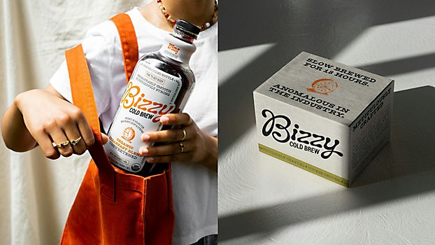
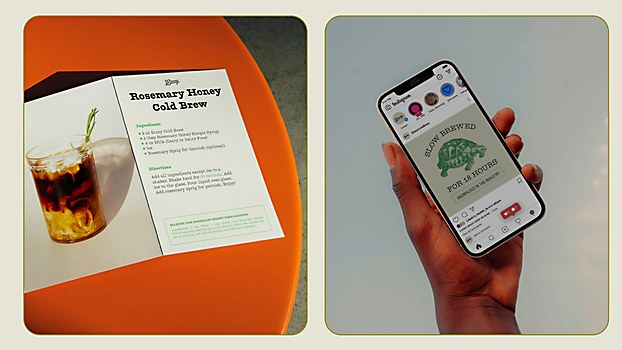
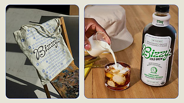
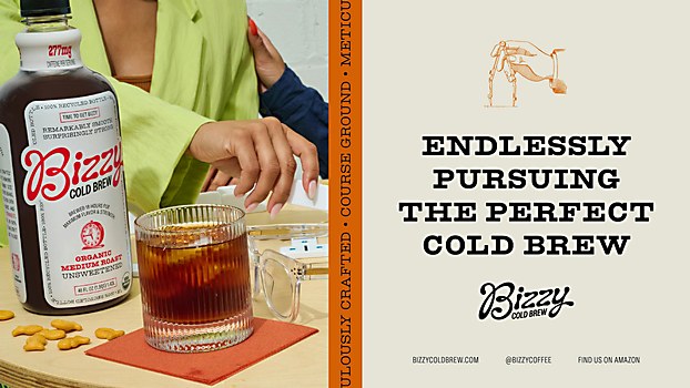
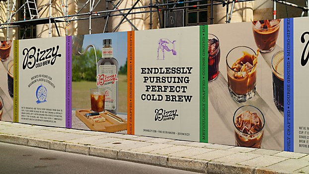
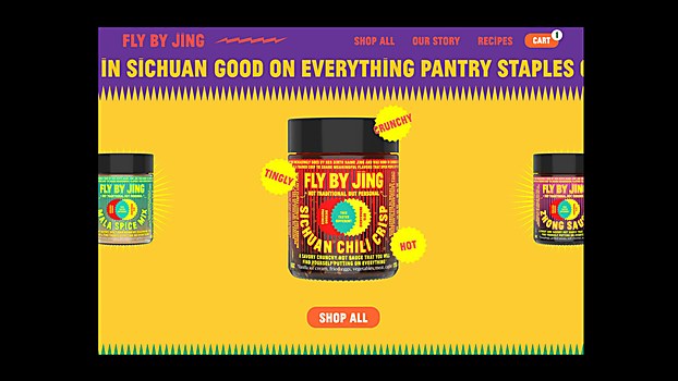
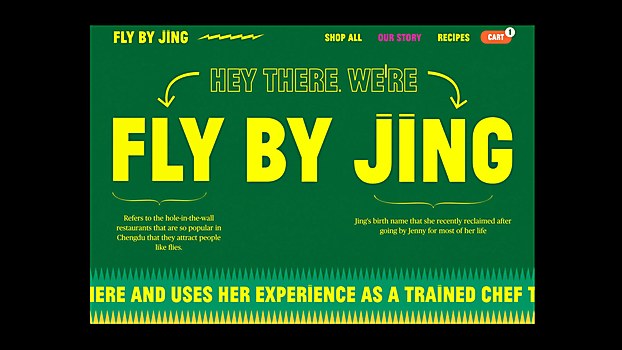
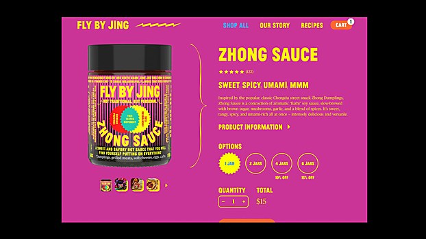
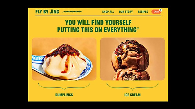
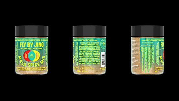
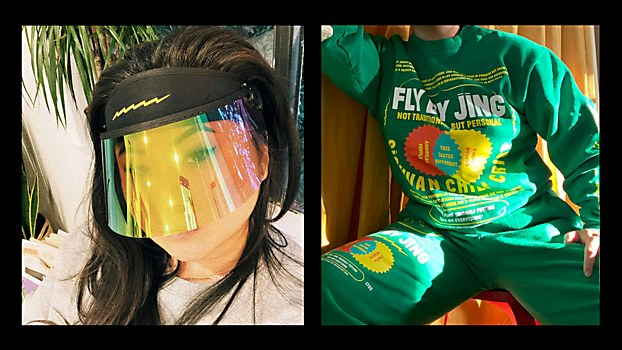
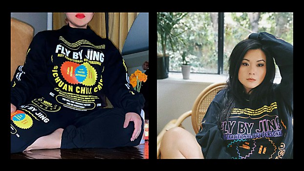
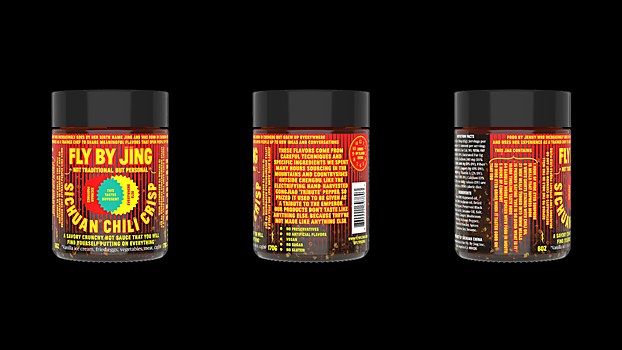
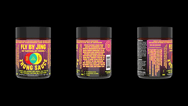
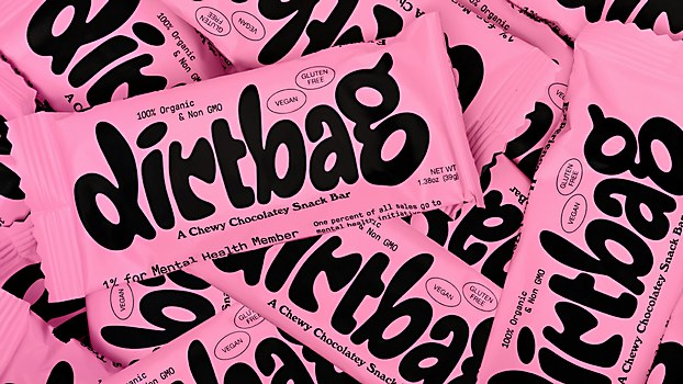
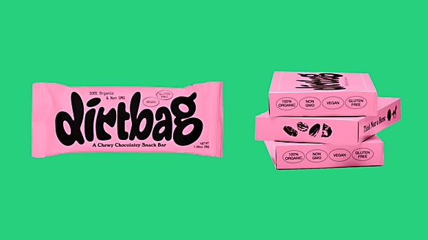
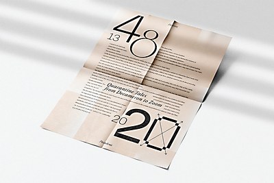
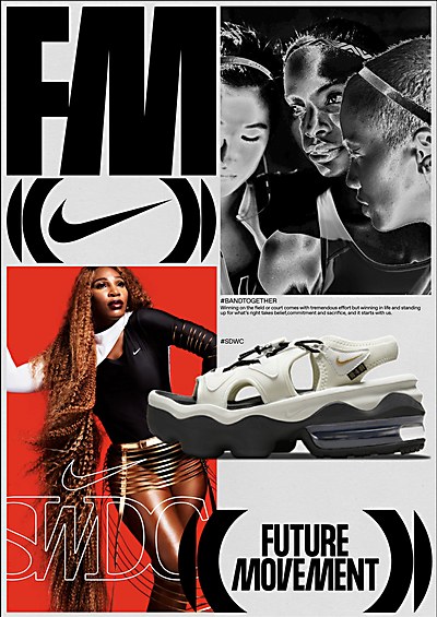
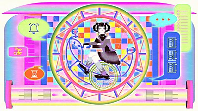
In Los Angeles–based creative agency Day Job’s mission statement, activated when you click on a README.txt button on its Windows 95–inspired website, it boldly states: “We hate [branding, e-commerce, advertising, etc] which is why we’re good at it.” And when looking at its highly diverse portfolio, full of neon-soaked environmental design, affable typography and punchy copy, it’s clear that the agency’s creative team has the right approach to create distinctive branding that sticks in the mind. “Everyone at the studio brings their own perspective to the table,” says cofounder and creative director Rion Harmon. “We all have different backgrounds, but I think an urge to make the world a little more interesting, make a little more (or less) sense, and show some more subjectivity and idiosyncrasy underpins all of us.” For each of its clients, Day Job prefers to deep dive into aesthetics that make sense for the character of the brand, eschewing industry trends for more bespoke visual strategies. “Each project and brand we work on requires finding new—or old—inspiration for what might make that particular project interesting,” Harmon says. “We always need a confluence of ideas, contrasting and juxtaposing each other, from different eras and disciplines—not just graphic design or advertising—to make something cool.” It’s a core tenet that, as Harmon explains it, cements that a working relationship with Day Job ties the client’s success together with the success of the agency. “We’re not artists; we’re an investment you make in a business’s short- and long-term success,” he says. “We don’t just do graphic design or web development. There needs to be substance, body language, tonality, a way of looking at the world. Design comes from that.”
Teeming with imagination, the work of this Pasadena-based designer represents his openness to utilizing all kinds of media.


