Responses by Claire Dawson, cofounder and creative director, Underline Studio.
Background: The purpose of the stamp was to celebrate the amazing career of hockey trailblazer Willie O’Ree. O’Ree was the first Black person to play for the National Hockey League (NHL), and following his time on the ice, he has worked tirelessly as the NHL’s diversity ambassador. The stamp, sold at post offices across Canada, needed to appeal to a broad audience that included history and sports enthusiasts as well as stamp collectors.
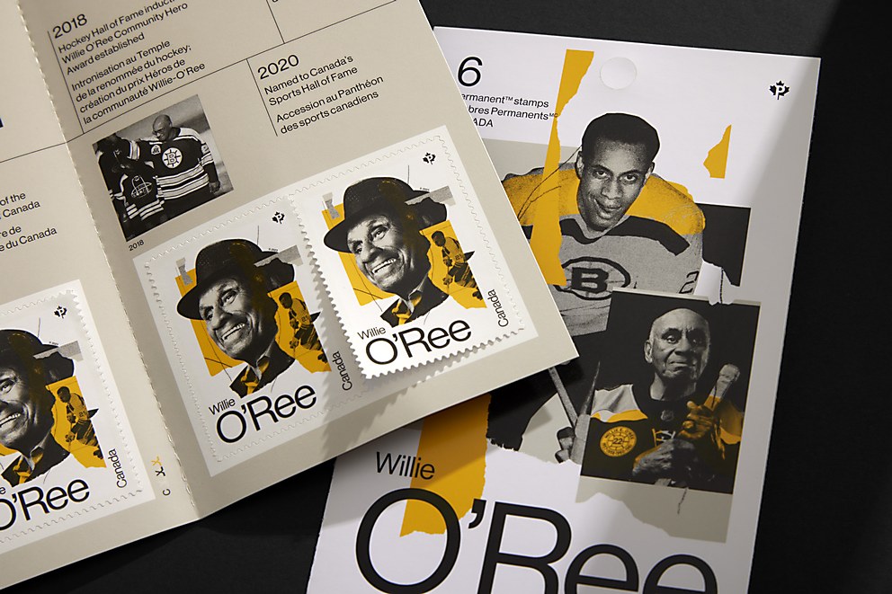
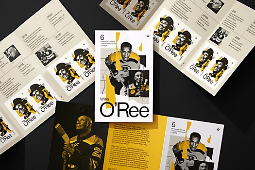
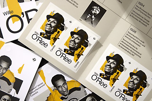
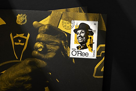
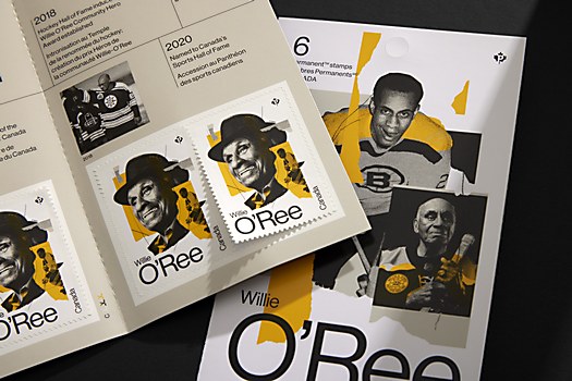
Design thinking: Our goal was to represent both sides of O’Ree’s career—his time on the ice and his important work in making hockey more inclusive. The collage work of Mike McQuade let us combine present-day photos alongside historical shots of O’Ree on the ice. The typography and layout were meant to evoke a sports style, and the color palette drew from the Boston Bruins—the team O’Ree began his career with.
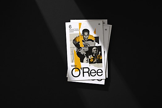
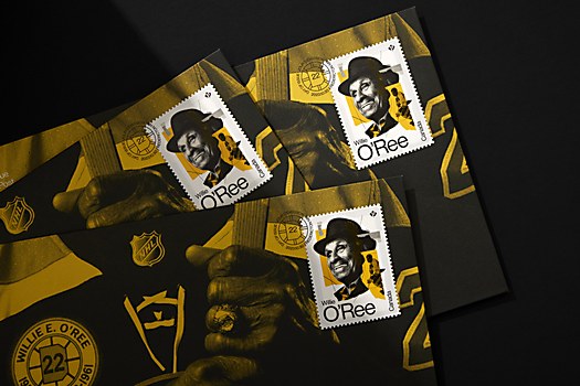
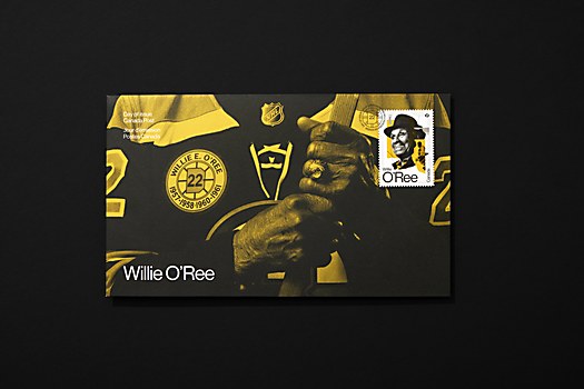
Challenges: The usage rights for images. Canada Post requires a significant usage, and with the NHL owning many of these images, it became very difficult to find ones we could actually use. We made many versions of the illustrations as usage was negotiated. The original plan did not include a present-day commissioned photography, but because of these usage challenges, we arranged for original photography by photographer Philip Cheung of O’Ree at his home in San Diego. This ended up being a wonderful asset as we utilized Philip’s photos across the stamp booklet and the official first day cover.
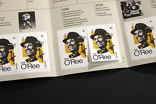
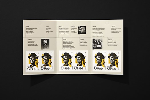
Favorite details: Canada Post is great to work with in that it welcomes ideas on how to think differently about stamps and the information presented in the larger package. For the stamp booklet, for which we had carte blanche, we presented the idea of a timeline as a way to highlight the wide range of O’Ree’s accomplishments. The client loved it, and we worked back and forth with Canada Post’s editorial team to create the final piece.
New lessons: The printing process of stamps is very fascinating. Since they are considered currency, there is a very high level of security at the printing press. Extraordinary care is taken in the special mixes of colors, finishes and the printing of images. You are not allowed to take any sheets from the printers afterward, as it can become a valuable collectible. No photography is allowed. Everything is very top secret until the stamp is publicly launched.
Visual influences: As we worked on concepts, we researched a lot of sports memorabilia. We wanted to find ways to evoke a sports context and weave in that storytelling while still being contemporary and broad enough to appeal to a wide audience. There are a lot of subtle details that have been incorporated, like the design of the cancellation mark that draws from O’Ree’s Boston Bruins crest.


