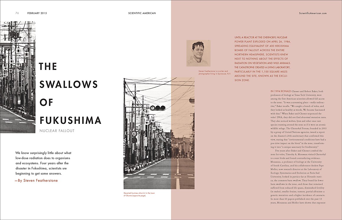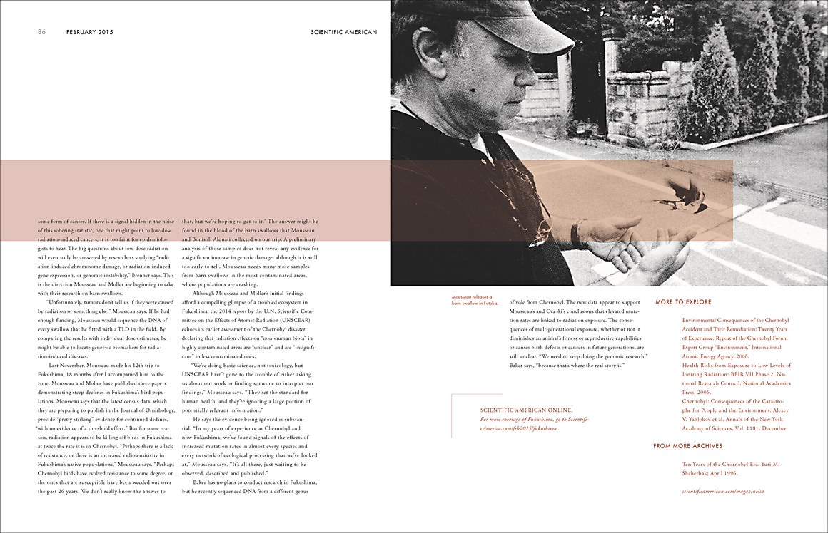

"This layout design reimagines an article originally published in Scientific American. I clarified the infographic and unified its color tone, using an unsaturated red inspired by the red of the swallows of Fukushima. My new redrawn layout design better fits the theme of the article."

