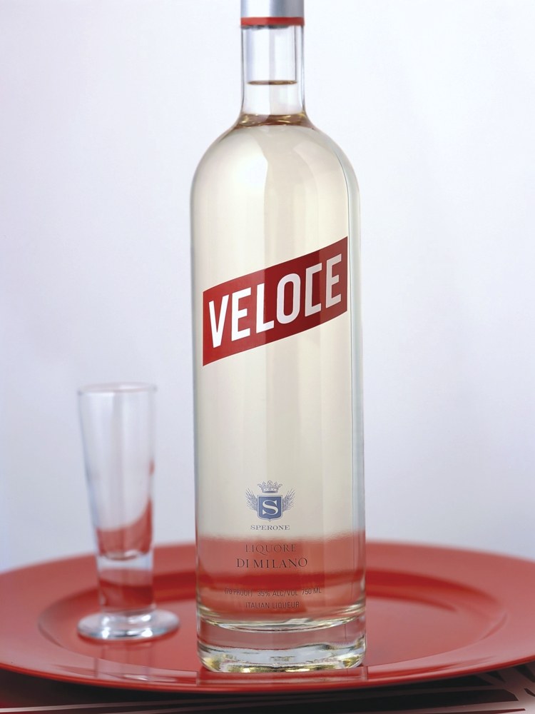
The client asked us to create a brand identity and package for a new Italian liquor that would be sold in the USA. The product needed to fit within the range of upscale vodkas currently available in the marketplace, while remaining genuinely Italian. Our solution for the brand mark was inspired by historical typography of classic Italian brands like Vespa and Campari. Ferrari Red seemed the perfect color for the brand and the angle of the logo was the final touch needed to bring the brand to life and visually express the translation of veloce —Swift.
