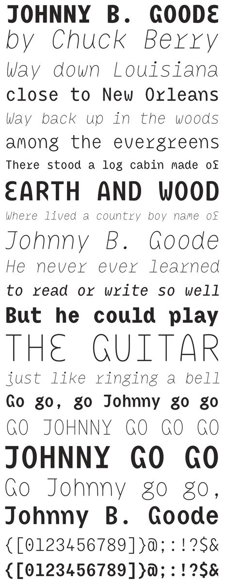
“We rank both contemporary and historic typefaces according to established definitions and categories. If we attempt to describe Mikser by these habitual means, we can say that it is a monolinear, dynamic, sans serif typeface with a uniform character width (in other words, monospaced), combining a vertical axis with distinctive modeling of the drawing. We thus acquire a tortuous mix, or rather ‘miks,’ which demands the creation of its own typeface category.”
