“It was very interesting to notice how illustrators from around the world think and how distinct composition and density are used to tell stories,” says juror Kako. “Western artists tend to be more conceptual, searching for minimalism, while Eastern artists give us a plethora of ideas on every inch of the paper. I love it.”
“I found the strong Asian cultural identity interesting,” juror Laura Varsky says. “Unfortunately, I don’t have much contact with what is happening in the field of illustration on the Asian continent, and I was surprised by the quantity of work presented from there.”
“This is the first time I’ve judged an illustration competition for CA, but I’ve noticed quite a few entries that were clearly from China and Taiwan and, in the illustration themselves, had lettering in Mandarin,” says juror Amy Ng. “The inclusion of a foreign language is not something that I notice from illustrators from other parts of the world.”
I asked the jurors what most surprised them about the entries.
“I was surprised to see so many quality images in students’ work,” juror Laurent Pinabel says. “A very fine maturity in general.”
“I was surprised by something I always sensed but now see very clearly: serialized work, the kind that enables you to move beyond a single illustration and work on a narrative series, is always much more powerful and interesting,” says Varsky.
“The dominance of fantastical subjects and worldbuilding—from anthropomorphic animals to mermaids to everything in between,” juror Rinee Shah says.
“Colors,” says Kako. “Some illustrations had really bold color choices. So bright! So acidic!”
“I saw a lot of influences from the ‘60s and ‘70s,” juror Fernando Ambrosi says. “Maybe the new is the old.”
I also asked the jurors what most disappointed them about the entries.
“In many illustrations, there were the use of texture and duplicated elements to occupy the space rather than drawing something more,” says Ambrosi.
“This is the first time I’ve felt a huge number of artists are working in the same style—I mean, a number so big that really got my attention,” Kako says. “It is not about quality—many artists spiced up [this style] to call it their own, and many illustrations were still technically stunning—but there is something there that, to me, felt lacking.”
“In the category of personal projects, I felt there was a lack of communicative substance,” says Varsky. “Of course, there were very interesting exceptions, but overall, I would have expected more content waiting to be conveyed through the images.”
“I judge an entry based on the combination of both the description and the image submitted because I feel that context is very important in the field of illustration,” Ng says. “So, conflict arose when some pieces were beautiful but didn’t let on to what the piece was about or what the impetus behind it was. I feel that the inclusion of a short, pertinent description is important as it helps us understand why illustrators made the choices they did. Even if a piece was not technically proficient, I would be able to understand them better and why they’ve arrived at the piece they’ve made.”
“I have a sensibility that leads me more toward images that have content, a concept or a double meaning,” says Pinabel. “As a result, I found it harder to judge certain images that reflected nothing more than dexterity. For some, I was so impressed—also by the emotion that came out of them—that I couldn’t help but select them, but sometimes, I felt that skill shouldn’t be an end in itself.”
“Sometimes, the need to make something beautiful hurts the need to make something interesting, and I saw that in quite a few entries,” Shah says.
When talking about the illustration industry, I asked the jurors what should illustrators explore beyond commissioned work.
“In this globalized world, the ‘grassroots’ arts are missing—like the underground scene, fanzines and low-budget projects,” says Ambrosi. “Get out from the ‘tame’ illustrations that social media offers us.”
“As an animation producer, I know there is a huge need for talented illustrators that can create work for animation,” juror Mike Holm says. “I know many great freelance illustrators who are constantly booked with animation projects and keep a steady flow of work coming in to supplement commissioned work. It requires quick turnaround and files prepared specifically for animators, but there is no shortage of work there
for illustrators.”
“There is a beautiful world coming from spatial computing,” says Kako. “We will rethink the interior design of our houses, our communication systems, how we play games, and how we make and collect art, among other things. I think artists should give it a try, both individually and collectively.”
“I’m a big proponent of art entrepreneurship,” Ng says. “I think that illustrators should try their hand at finding their own niche and audiences through the creation of art products. In this day and age, everything may seem to live online, but I feel that we shouldn’t discount the beauty of in-person connections. Having a booth at an art market, for example, can showcase your work among a community of other like-minded artists while exposing you to ways in which your audience can reach you directly and experience your work—and you—close up.”
“I believe illustrators should always have a personal line activated and understand their personal interests, the topics that they are passionate about and the ways of storytelling that resonate with them,” says Varsky. “Always have material emerging from a personal interest to showcase. It helps build a personal imprint as a professional and attracts the best commissions.”
“For an illustrator, it’s not always easy to have the time to explore new media or new approaches outside of commissions,” Pinabel says. “Through the competition, I’ve been able to see many explorations that reduce the boundary between the visual arts and illustration. What matters most is honesty about oneself and one’s work. Remain as authentic as possible in your essays and commissions.”
Lastly, I asked the jurors where they think the field of illustration is going.
“The proliferation of social media enables illustrators to explore and be privy to a lot more variety of artists’ styles and execution internationally,” says Ng. “What I’m hoping will happen is a cross-pollination of these ideas and techniques to create new, exciting forms of imagemaking that can come alive in different contexts, further blurring the line between art and illustration.”
“I’ve been noticing a resurgence of handmade illustration and art,” Holm says. “I think a lot of artists, especially illustrators, were seduced by the ease and convenience of an iPad, Procreate and an Apple Pencil. These are absolutely incredible tools for personal and commercial work alike—they make producing and revising work, preparing deliverables and scaling art so easy—but there is no comparison to the satisfaction of picking up a pencil, a marker, a pen or a brush, with some good quality paper or canvas. A lot of artists are suffering digital burnout and turning back to traditional mediums, and the industry may follow suit—at least, to a certain extent.”
“I see opposing trends,” says Ambrosi. “On the one hand, a simplification of forms and concepts, and on the other, a lot of complexity. Also, in coloring—black with a few colors, or illustration with many colors and psychedelic effects. It’s also yet to be understood what the influence
of AI software will be. We’ll see if illustrators will have to draw hands with six fingers.”
“AI is changing illustration way quicker than we expected, and I’m still on the fence regarding if it will be good or bad,” Kako says. “But we, as creators and as a community, will have to deal with it and learn how to accept it because it is not going away. There is a lot to be done, especially regarding the legal aspect of the use of AI.”
“With the emergence of AI-generated imagery, we’re going to start seeing illustrators’ personalities and quirks coming out more in their work to help them stand out and feel authentically unique,” says Shah.
“I think two lines will begin to be more strongly defined,” Varsky says. “Today, there is personal work struggling to become visible alongside works that overuse certain technological tools. The novelty lies in the hyperrealistic and aestheticized image of AI. I believe the industry will split between cheap, hegemonic AI versus illustrators and their gestures representing cultural diversity. I hope the emergence of the artificial provides an opportunity to revalue diversity.”
A minimum of five out of eight votes was required for a project to be awarded in this year’s competition. Judges were not permitted to vote on projects with which they were directly involved; I voted in their stead. I would like to extend our grateful appreciation to our jurors for their conscientious efforts in selecting our 65th Illustration Annual. —Patrick Coyne ca

Fernando Ambrosi is the art director of Mondadori Children’s Books, an imprint of the Mondadori Group, Italy’s leading publishing group that includes imprints Battello a Vapore and Geronimo Stilton. With more than 30 years of experience, Ambrosi has worked with a generation of Italian illustrators and watched them grow and become well known in Italy and abroad. He has designed several historic children’s book series (including Oscar Junior), served on the juries of several international competitions and has received three Awards of Excellence from Communication Arts. He currently lives in Romeo and Juliet’s city of Verona, Italy.

Deanna Donegan is an award-winning art director, illustrator and designer at the New York Times. She currently directs visuals for the Well section. Donegan established the New York Times’s annual illustration portfolio reviews—now in its second year—that take place in the fall. Prior to joining the New York Times, she spent six years at The New Yorker magazine where she commissioned countless illustrations and designed the magazine’s popular tote bag. She received a bachelor’s degree from the School of Visual Arts in graphic design and illustration and is based in Queens, New York, where she lives with her husband and cat.
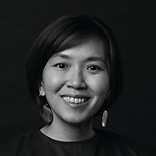
Amy Ng is an arts educator specializing in the intersection between illustration, creativity and arts entrepreneurship. Since 2009, her website Pikaland has become a resource for students and artists interested in learning how to create meaning, purpose and a sustainable career through art. As a self-educated illustrator and writer, she is passionate and curious about the process and psychology of learning in visual-based curriculums. She recently completed her masters in arts pedagogy and practice, focusing on opportunity creation for visual artists through
self-directed projects and its effects on student confidence and motivation.
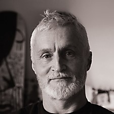
Laurent Pinabel has designed and produced numerous visuals for the French and Québec cultural communities. After studying fine and applied arts in Paris, he began working in 1994 as a graphic designer and then an art director for various agencies in the cultural and music industries. Based in Montréal since 2001, he has since become freelance and continued his exploration of images and illustration, always favoring an artistic and human approach. His illustrations now appear on books, murals, packaging, editorial, theater, TV, animation and skateboards. He is also an author, published by Éditions les 400 Coups, and his work regularly wins national and international awards.

Mike Holm grew up admiring his grandfather’s cartoon strip and his dad’s career in advertising. After design school, Holm spent a year as an agency art director in Seattle before joining a start-up production studio that ignited his passion for production and animation. Over the years, he has worked with many talented creatives across illustration, live action film, stop-motion, 2-D and 3-D animation. In 2015, Holm founded Anchor Point, a full-service animation production house partnering with dozens of talented directors and studios worldwide. Outside of work, he is building an eclectic art collection, and he enjoys illustrating and painting.
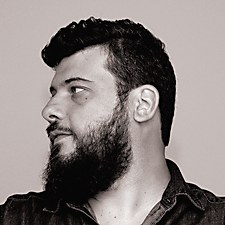
Kako is an illustrator with an extensive portfolio ranging from editorials to advertisements to comics and book covers. His distinguishable style has brought him clients from all over the world, and he has been recognized in annuals and award shows such as Cannes Advertising Festival, Communication Arts and the Society of Illustrators, among others. He was recently selected to be included in the book 100 Illustrators, written by Steven Heller and Julius Wiedemann and published by Taschen. Kako currently lives in São Paulo, Brazil, and works as a production designer and creative director of virtual reality games at Arvore Immersive Experiences.
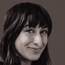
Rinee Shah is an award-winning illustrator and advertising creative director at Oatly, based in northern California. Her illustration has focused on books and editorial commissions. She is the author and illustrator of LOL 101: A Kid’s Guide to Writing Jokes and The Made-Up Words Project and illustrator of Off: The Day The Internet Died. Additionally, she is the resident illustrator for the Los Angeles Times’s relationship column. Her illustration clients include Apple, Inside Hook, the Los Angeles Times, the New York Times and Simon & Schuster, and she is a 2023 Ad Age 40 Under 40 honoree. She’s also a former writer for San Francisco’s legendary sketch comedy group Killing My Lobster.
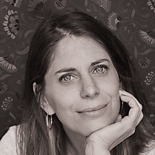
Laura Varsky is a graphic designer in Buenos Aires, Argentina. Specializing in album and book design, she won the Latin Grammy Award for art direction in 2006, the Award of Excellence from Communication Arts in 2015 and the second national design prize from the National Fund for the Arts in 2018. As an illustrator, she has published books and earned distinctions including the Chilean Amster Coré award. Codirector of the postgraduate program for professional illustration at the University of Buenos Aires, she has been involved in undergraduate teaching for more than ten years and has delivered lectures and workshops internationally.