“When you’re exposed to such a diverse range of work in such a short amount of time, the differences between styles and cultures, student and commercial work, and the trends of inno-vation become clearer to see,” juror Bianca Dumitrașcu says.
“Overall, [the entries had] a high level of quality and a varied approach to the typographic image,” says juror Ben Kiel. “There weren’t any super prominent typographic trends, other than maybe a lot of sans serif, but one style didn’t seem to dominate the entries.”
“I think we are in a golden age of typography, and this year’s group of entries reflected that,” juror Trevett McCandliss says.
Several judges commented on the quality of the student work.
“I found that the student entries were much more modern, daring and innovative than the commercial ones,” says Dumitrașcu. “It’s a reminder that we often lose our courage and playfulness over time, and all [our creativity] can just become a daily job.”
“Many student designs capitalized on the great variety of eclectic new typefaces available today,” McCandliss says. “Quite a few student projects embraced the trend toward a whimsical, fluid and multiculturally influenced neo-psychedelia we see in today’s cutting edge graphic design.”
I asked the jurors what, if any, visual trends became apparent during judging.
“Geometric typefaces, grunge, undefined handwritten titles or messages, and a lot of AI-generated letters,” says Dumitrașcu.
“Bright poppy colors and sans serifs were common, but they didn’t seem to dominate,” Kiel says. “It was great to see a good bit of display serifs again. I feel like we are coming out of an ‘only sans for all eternity’ period—thankfully!”
“We continue to see a mixture of 19th- and 20th-century ideas combined with expressive idiosyncrasies in a wide range of contemporary grotesque and neo-slab typefaces,” says McCandliss. “These typefaces seem to work particularly well in branding, where their solid chassis provide structure and functionality.”
As contrast for all their positive remarks, I asked the jurors what their biggest disappointments were with the entries.
“I can’t say it’s a big disappointment, but it’s rare to see something you’ve never seen before,” Dumitrașcu says. “There are many styles, trends and executions that we can find repeated in many of the projects.”
“There is a constant ode to the past,” says juror Joana Monteiro. “We miss the times we didn’t live in and want to go back there. That’s what most of the graphic work presented in this contest says.”
“In several instances, the work nailed a big, bold move well but didn’t follow through with the same attention to micro-typographic details—ragging and justified text settings that did not demonstrate typographic control,” Kiel says. “Maybe it’s because I’ve taught Typography 1 for so many years, but seeing this lack of attention was disappointing.”
I also asked the jurors to speak about the technological develop-ments that may change the way we use typography in the future.
“It’s clear that we’ll see more AI-generated content, a lot of animation and various experiments,” says Dumitrașcu. “These innovations will be applied with a creative perspective.”
“We are just at the cusp of seeing how variable fonts will change how we approach screen- and motion-based work,” Kiel says. “I’m excited to see what designers do with typefaces that don’t have one fixed style or a set of fixed styles.”
“Even though they have been around since 2016, variable fonts still seem to be the big technology people are talking about,” says McCandliss. “I believe we will see this technology come into its own as more high-quality typefaces for languages with massive character sets come online.”
Finally, I asked what challenges future type designers will face.
“There is a great need for more high-quality non-Latin typefaces that will be filled in the coming years,” says McCandliss. “The good news is there are more people learning graphic and type design now who are fluent in languages that use both Latin and non-Latin character sets. These will be the people developing fonts that unify these sets in one graphically cohesive typeface.”
“So much high-quality typeface design is being done now that the challenge is connecting with typeface users to get your work known and used,” Kiel says. “It shouldn’t be a secret to designers, but you’ll find exciting work by looking for foundries, not distributors. And while talking to foundries can take longer, they will often give you a better deal. Support your living independent type designer!”
A minimum of four out of six votes was required for inclusion in this year’s Typography Annual. Jurors were not permitted to vote on projects in which they were directly involved; I voted in their stead. I would like to extend our appreciation to our jurors for their conscientious efforts in selecting our 14th Typography Annual. —Patrick Coyne ca

Anthony De Leo lives and breathes design exploration and inquisition. Hailing from Adelaide, Australia, with a bachelor of visual communication from the University of South Australia, this deep-diving creative director and cofounder of Voice Design has won more than 300 awards; been published in more than 70 titles; and judged, chaired or presented at top-tier design conferences such as the AGDA Awards and Ken Cato’s AGIdeas Conference. De Leo abhors mediocrity and has remained steadfastly focused on micro-details and relentless excavation over a 25-year career designing books and creating brand identities and packaging.

Bianca Dumitrașcu is a designer and art director specializing in lettering and typography. Based in Bucharest, Romania, she received her formal training in graphic design from the National University of Arts in Bucharest and obtained a master’s degree in advanced typography from EINA School of Art and Design in Barcelona, Spain. Dumitrașcu shares her expertise through workshops and courses while advocating for the importance of graphic design and a healthier visual environment alongside various design associations. Her projects have garnered honors from Art Directors Club Romania, Communication Arts and the Type Directors Club.

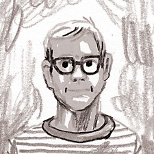
Ben Kiel is a St. Louis, Missouri–based typeface designer, educator and partner in XYZ Type, which he cofounded with Jesse Ragan in 2017. After receiving his MA in typeface design from the University of Reading in the United Kingdom, Kiel kicked off his career at House Industries, where he designed and developed custom and retail fonts. He then had a solo design practice for several years before joining forces with Ragan. When he’s not making fonts or unraveling thorny issues at the intersection of design and technology, Kiel teaches at Washington University in St. Louis and Type@Cooper in New York. He loves 19th- century type and has the library to prove it.

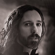
Trevett McCandliss is a partner at McCandliss and Campbell, an art direction and design team that combines innovative typography and conceptually driven fashion photography to create award-winning editorial design. McCandliss and Campbell’s clients include Earnshaw’s, Footwear Plus, MR, Parents and Yankee. McCandliss and cofounder Nancy Campbell have received more than 350 design and photography awards from Communication Arts, Creative Quarterly, Graphis, HOW, Print, the Society of Publication Designers and the Type Directors Club. McCandliss also teaches typography and editorial design at Kean University.

Joana Monteiro, a graphic designer and art director based in Coimbra, Portugal, works mainly with clients in the cultural sector. She received her masters in graphic design at University of the Arts London and studied at the Royal College of Art, where she experimented with video and letterpress. Through her work, one can recognize a passion for typography. Monteiro is founder of Clube dos Tipos, a type club, and collaborates with a local letterpress, Tipografia Damasceno, where she builds most of her images. She also owns Editora dos Tipos, a small independent publishing company for letterpress-printed books.

Man Wai Wong is group creative director of design at Leo Burnett Toronto, where she launches brands, develops in-store experiences, directs video and animations, and creates print and digital executions. Having trained at York-Sheridan Design in Toronto and Bauhaus University in Weimar, Germany, she has rooted her design sensibilities in combining strategy, experimentation and craft. Her work has been recognized in publications and awarded by the Advertising and Design Club of Canada, Applied Arts, the Art Directors Club, Cannes, Clios, Communication Arts, D&AD, London International Awards, Marketing and the One Show, among others.